
Your landing page’s weakest score is Mobile web.
How TraceRoot.AI ranks
66Growth scoreupdated
category scores
category scoresShowHide
Score over time
Mobile web
58FairThe phone experience as a first-class citizen.
 1234
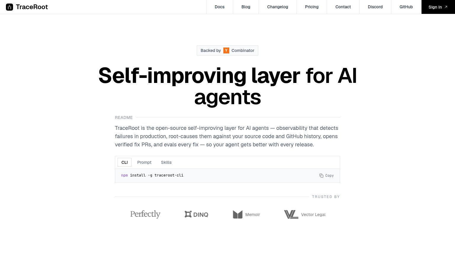
- CLI install block — The only conversion action is a copy-paste npm snippet pushed below the fold — no tappable full-width CTA exists on mobile.
- Hero headline — Headline barely scaled down, wrapping into three huge lines that consume roughly a third of the first viewport.
- README paragraph — Six lines of dense desktop copy push the install action well past the first screen.
- Clipped logo row — The 'Trusted by' logos overflow the viewport with a logo cut off at the right edge.
CTA
62FairCopy, size, verb, cost-feel — does the primary CTA earn the click?

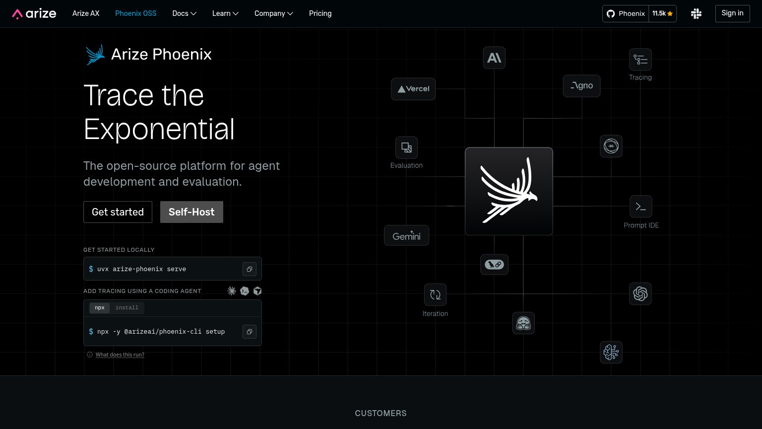
Problems
- 'Copy' submit promises no payoff
- no 'free' despite open-source
- no dominant button alternative
- no payoff copy near the command
Trust
68FairProof that the product is real, competent, and safe to try.
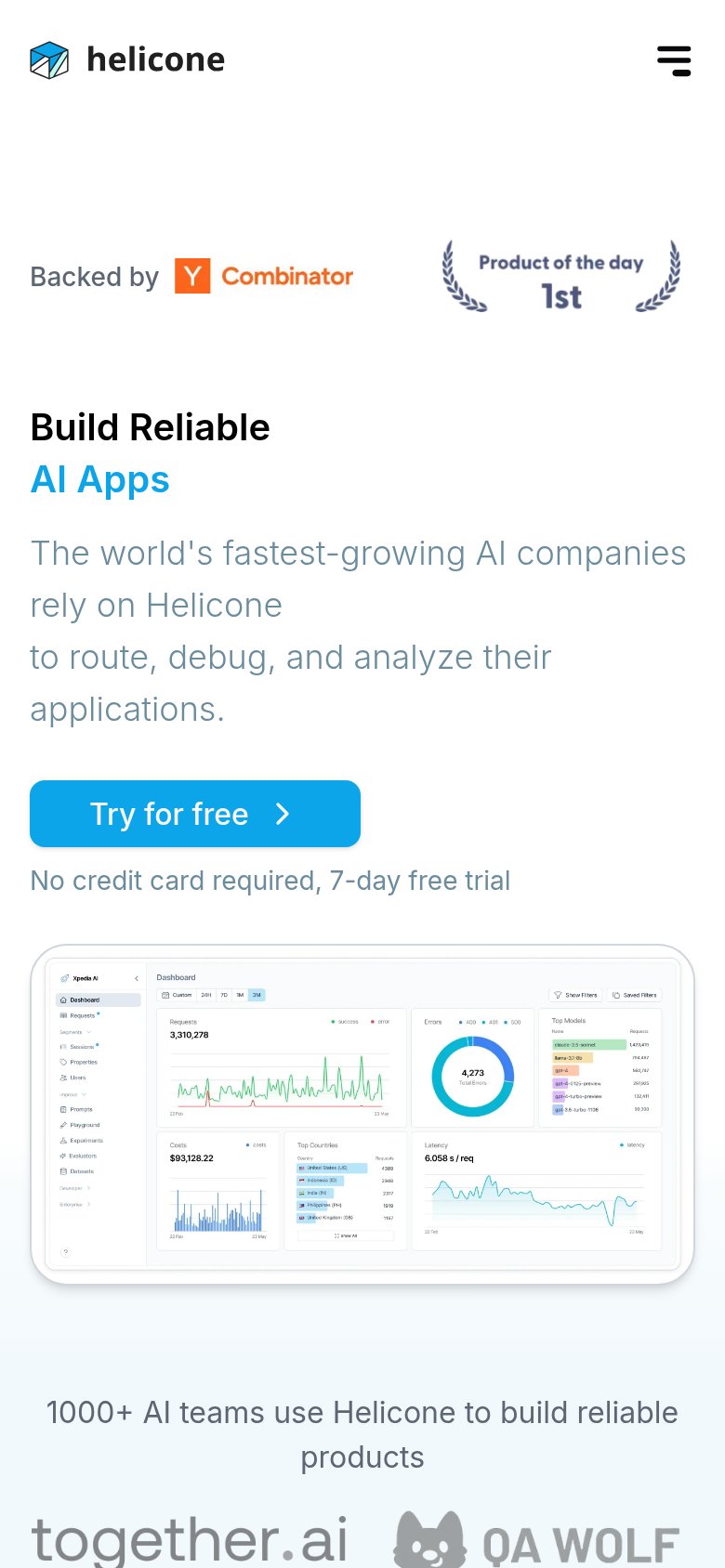
| Trust read | |
|---|---|
| TraceRoot.AI | "Backed by Y Combinator" badge above the headline |
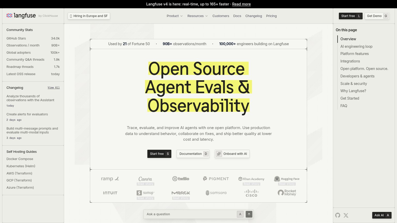
| Used by 21 of Fortune 50 · 90B+ observations/month · 100,000+ engineers building on Langfuse | |
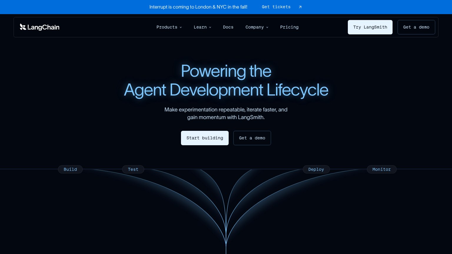
| 'Interrupt is coming to London & NYC in the fall!' conference banner | |
| GitHub star badge "Phoenix 11.5k ★" in the navigation | |
| "1000+ AI teams use Helicone to build reliable products" with customer logos (together.ai, QA Wolf) | |
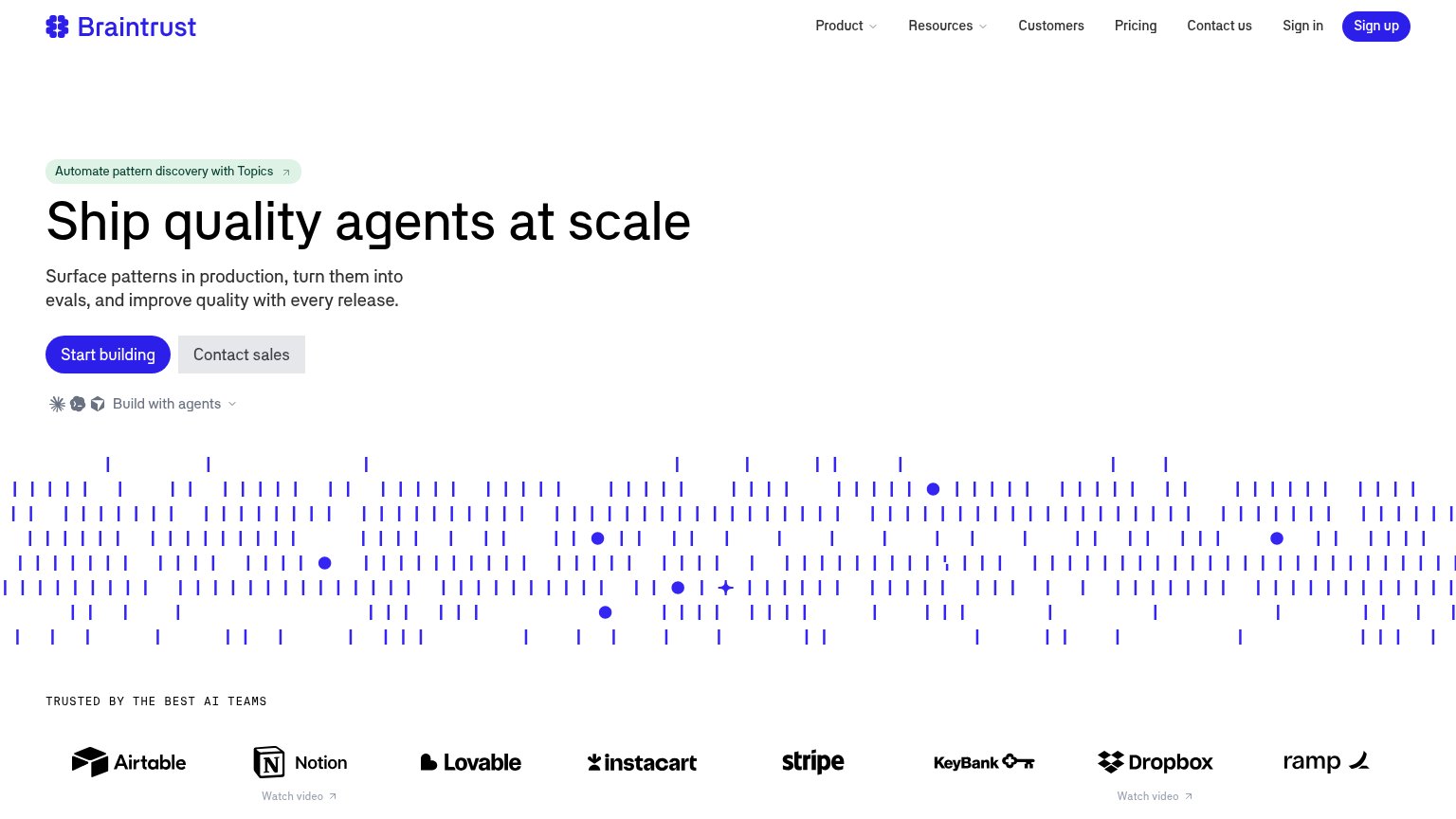
| "TRUSTED BY THE BEST AI TEAMS" logo wall (Airtable, Notion, Stripe, Instacart, Dropbox, Ramp) |
Information hierarchy
72FairDoes the design help or inhibit what the page is trying to say?
1234- Eight-link nav bar — Docs through Sign In offer eight equal-weight exits before any conversion action exists in the fold.
- npm install block — The de facto primary action is styled as passive code, not a button — no visual weight pulls the eye to it.
- Sign In button — The only button-styled element in the fold routes to login, stealing the visual role a primary CTA should own.
- CLI/Prompt/Skills tabs — Three tab choices ask the visitor to make a decision before the single install action is clear.
Value props
72FairTitle, subtitle, hero — do they sell the product's true value?
TraceRoot.AI’s headline undersells
Self-improving layer for AI agents
TraceRoot is the open-source self-improving layer for AI agents — observability that detects failures in production, root-causes them against your source code and GitHub history, opens verified fix PRs, and evals every fix — so your agent g
Working
- Subhead names concrete pipeline: detect, root-cause, fix PR
- YC badge plus four customer logos add proof
- npm one-liner shows instant, real adoption path
Could improve
- Headline is category jargon, not an outcome
- No numbers anywhere in the fold
- No hero visual showing the product working