
Your landing page’s weakest score is Trust.
How Sira ranks
60Growth scoreupdated
category scores
category scoresShowHide
Score over time
Trust
48PoorProof that the product is real, competent, and safe to try.


| Trust read | |
|---|---|
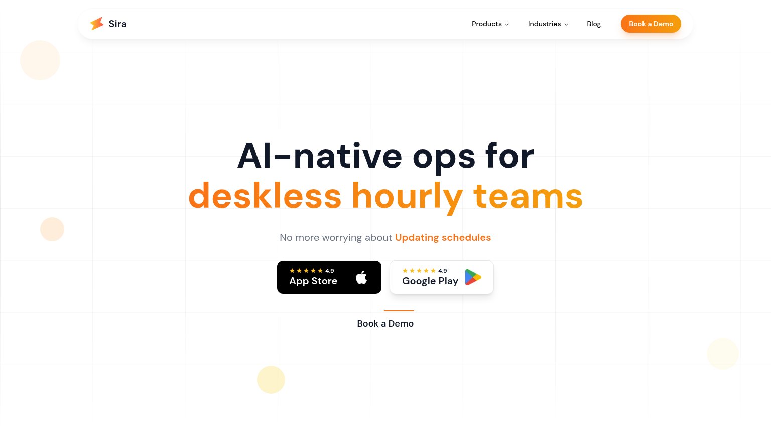
| Sira | 4.9-star App Store and Google Play rating badges |
| ★★★★★ 4.8 94k App Store reviews | |
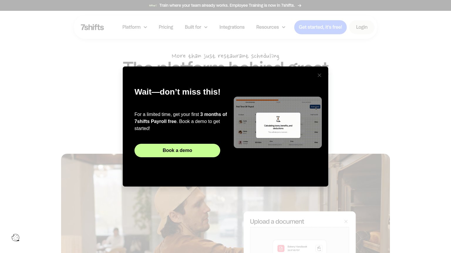
| "Sling is trusted by tens of thousands of customers just like you" with logo wall (Subway, Amazon, AMC Theatres, The UPS | |
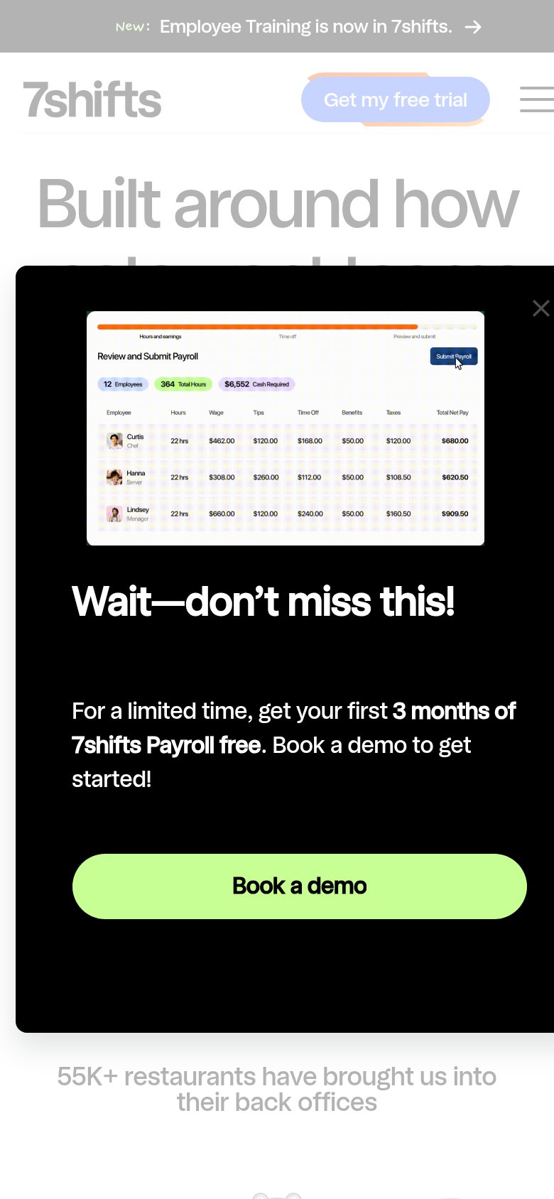
| "55K+ restaurants have brought us into their back offices" | |
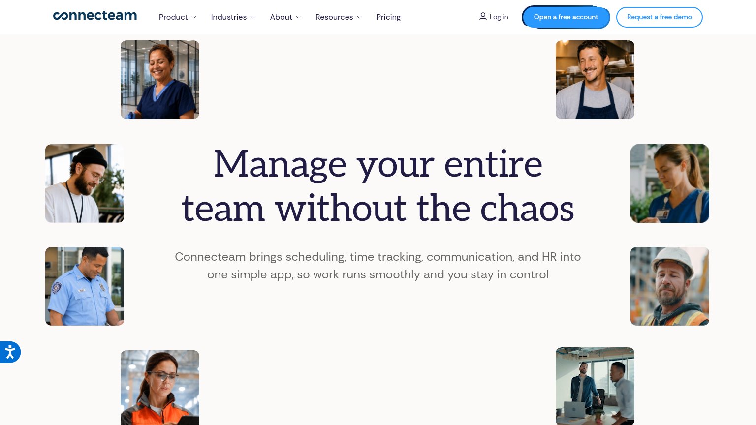
| implicit context Connecteam may benefit from pre-existing familiarity among its target audience. | |
| Customer logo row beneath the signup form (Dunkin' Donuts, Wendy's, Ben & Jerry's, Aspen Snowmass, Lake Lanier Islands R |
Value props
58FairTitle, subtitle, hero — do they sell the product's true value?
Sira’s headline vague
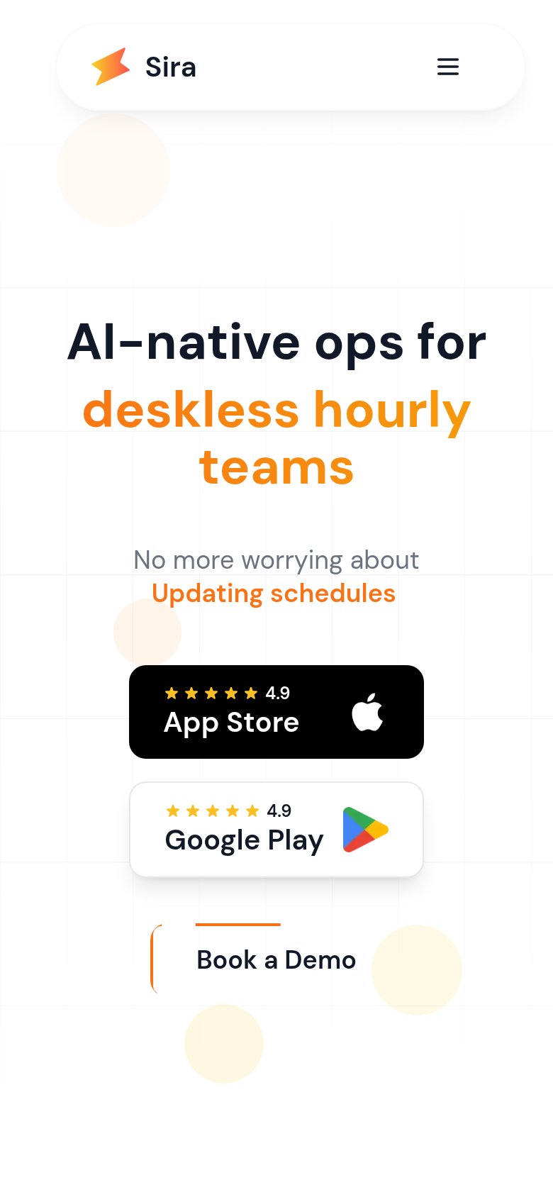
AI-native ops for deskless hourly teams
No more worrying about Updating schedules
Working
- Names a precise audience
- Subhead cites a real pain point
- 4.9-star ratings add proof
Could improve
- 'Ops' is a category, not an outcome
- No numbers or quantified results
- No hero image showing the product
CTA
62FairCopy, size, verb, cost-feel — does the primary CTA earn the click?

Problems
- hero CTA styled as plain text link
- demo booking feels costly/committal
- app badges outweigh the hero CTA
- smaller than rating badges above it
Information hierarchy
64FairDoes the design help or inhibit what the page is trying to say?
1234- App store badges — Two same-weight store badges sit above the demo CTA and pull attention toward an app-download path that competes with the booking goal.
- Book a Demo text link — The primary in-hero CTA is a small text link with a thin underline — far weaker than the black App Store badge directly above it.
- Duplicate demo CTAs — The orange nav pill and the hero text link both say "Book a Demo" at different weights, splitting the scan path instead of reinforcing one target.
- Subheadline ticker line — "No more worrying about Updating schedules" reads as a rotating fragment whose orange emphasis matches the headline accent, muddying the message hierarchy.
Mobile web
68FairThe phone experience as a first-class citizen.
 12
- Book a Demo link — Primary CTA styled as a small underlined text link near the fold's bottom instead of a full-width thumb-friendly button.
- App store badges — Two large stacked store badges take the prime tap zone ahead of the demo CTA, splitting the visitor toward two competing actions.