
Your landing page’s weakest score is Information hierarchy.
How 7shifts ranks
52Growth scoreupdated
category scores
category scoresShowHide
Information hierarchy
44PoorDoes the design help or inhibit what the page is trying to say?
 1234
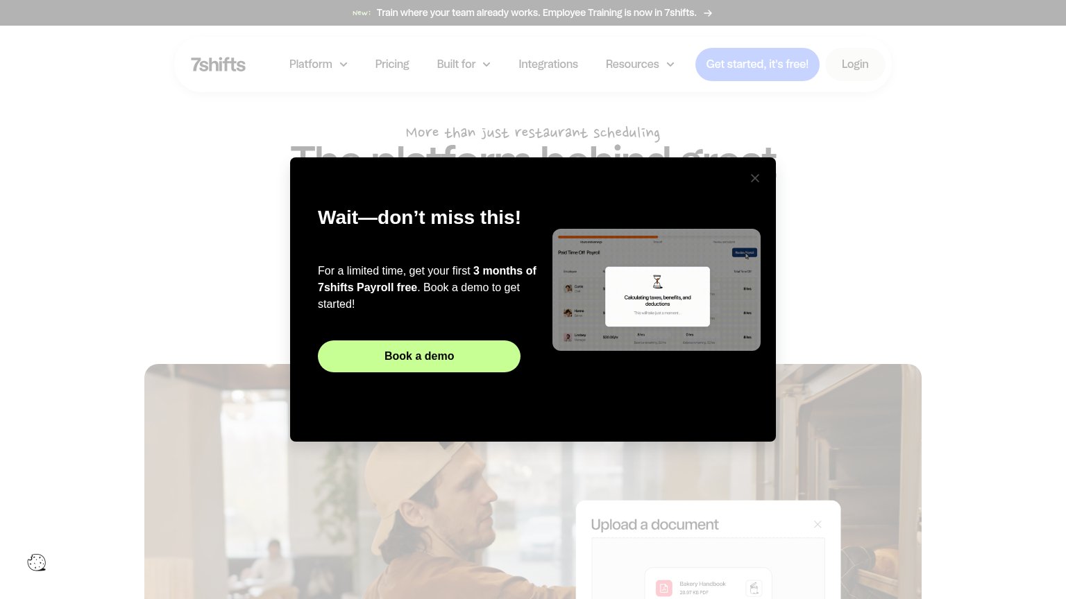
- Payroll promo modal — Interstitial buries the headline and hero before the value prop is read, hijacking the fold with a demo pitch.
- Get started nav CTA — Fights the modal's 'Book a demo' at equal prominence, so no single primary action wins the scan.
- Dimmed hero headline — 'The platform behind great...' is cut off and greyed out by the overlay, leaving the value prop unreadable.
- Announcement banner — 'Employee Training' banner is the first element seen and routes attention away before the conversion path starts.
Value props
48PoorTitle, subtitle, hero — do they sell the product's true value?
7shifts’s headline vague
The platform behind great
More than just restaurant scheduling
Working
- Names the restaurant audience
- Hints at more than scheduling
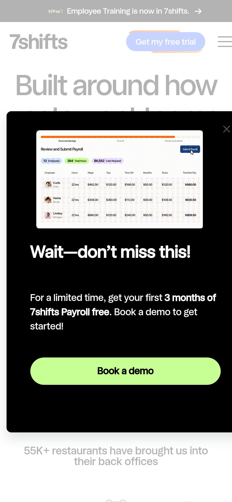
- 55K+ restaurants proof on mobile
Could improve
- Modal buries the entire hero
- Headline cut off, no outcome named
- No visible subhead with specifics
Trust
52FairProof that the product is real, competent, and safe to try.
How 7shifts compares
Trust read
Mobile web
54FairThe phone experience as a first-class citizen.
What works
What to improve
CTA
64FairCopy, size, verb, cost-feel — does the primary CTA earn the click?
How 7shifts compares
Recommended rewrites