
Your landing page’s weakest score is Value props.
How Sling ranks
75Growth scoreupdated
category scores
category scoresShowHide
Value props
72FairTitle, subtitle, hero — do they sell the product's true value?
Sling’s headline sells
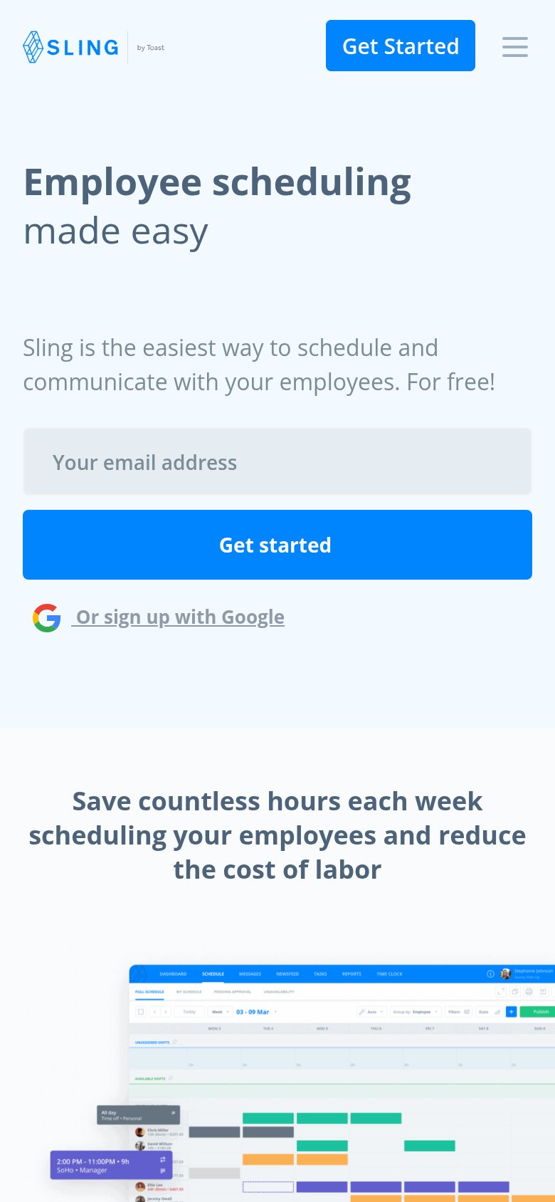
Employee scheduling made easy
Sling is the easiest way to schedule and communicate with your employees. For free!
Working
- Instantly clear category and audience
- 'For free!' removes price objection
- Hero shows real schedule UI, not decor
Could improve
- Subhead repeats 'easy' — adds no specifics
- No numbers: hours saved, labor cost cut
- Emotional payoff (time back) buried below fold
Information hierarchy
74FairDoes the design help or inhibit what the page is trying to say?
 123
- Duplicate Get Started buttons — Nav 'GET STARTED' and hero 'Get started' share identical blue weight, splitting attention between two same-styled CTAs.
- Six-item navigation row — EMPLOYEE SCHEDULING, FEATURES, WHY SLING?, PRICING, RESTAURANTS and LOGIN offer six exits before the email capture.
- Overlapping product screenshots — The phone mockup layered on the dense schedule grid crowds the right half with two competing UI surfaces cropped at the edge.
CTA
76FairCopy, size, verb, cost-feel — does the primary CTA earn the click?
How Sling compares
Recommended rewrites
Trust
76FairProof that the product is real, competent, and safe to try.
How Sling compares
Trust read
Mobile web
78FairThe phone experience as a first-class citizen.
What works
What to improve