
Your landing page’s weakest score is Trust.
How Quotain ranks
72Growth scoreupdated
category scores
category scoresShowHide
Score over time
Trust
58FairProof that the product is real, competent, and safe to try.
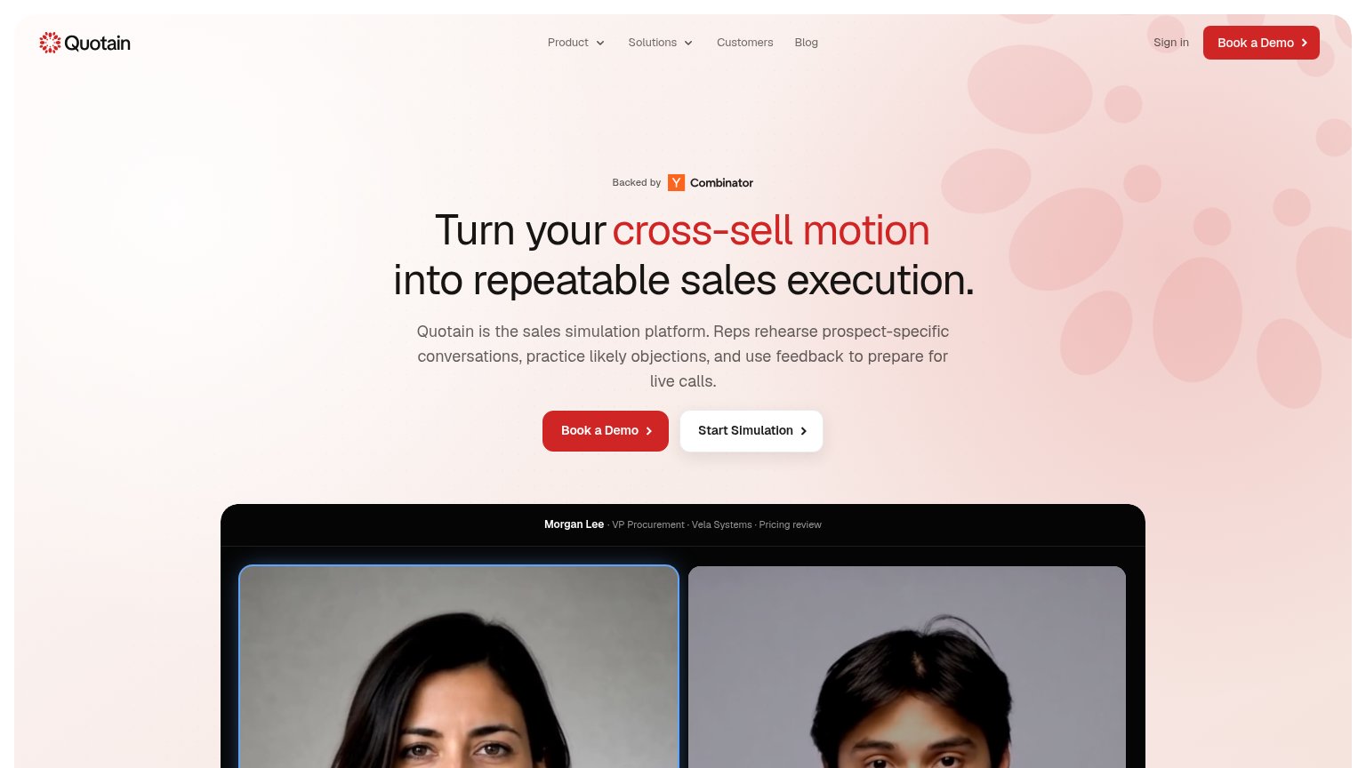
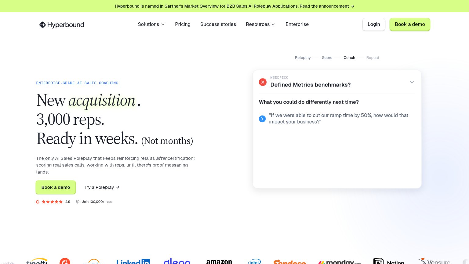

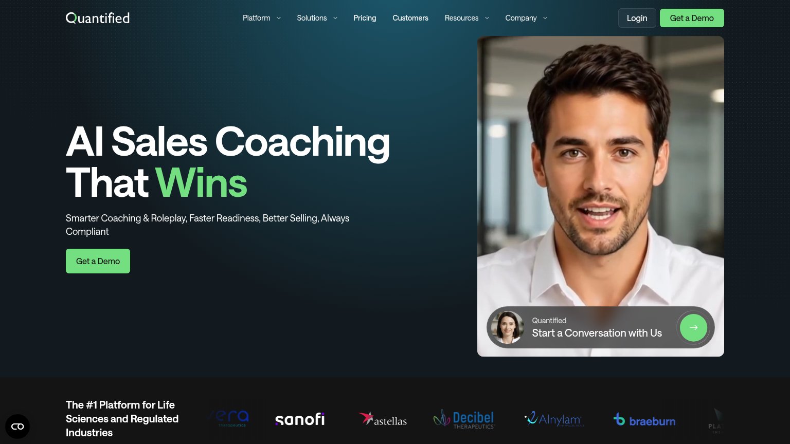
| Trust read | |
|---|---|
| Quotain | "Backed by Y Combinator" badge above the hero headline |
| Hyperbound is named in Gartner's Market Overview for B2B Sales AI Roleplay Applications | |
| Interactive AI role-play demo with scenario list ("Moving Avatar Discovery Call") and "Try Now" avatar card | |
| Customer logo strip (Sanofi, Astellas, Alnylam, Decibel Therapeutics, Braeburn) under "The #1 Platform for Life Sciences | |
| "Trusted by 300K+ reps from World's leading teams" with Lenovo, ABB, Salesforce, Syngenta, Foxtons logos | |
| Real product UI screenshot of the Luster "Sessions" dashboard with practice cards and named personas |
CTA
68FairCopy, size, verb, cost-feel — does the primary CTA earn the click?

Problems
- high-cost demo ask leads
- cheaper product action demoted
- no payoff or free framing
Value props
68FairTitle, subtitle, hero — do they sell the product's true value?
Quotain’s headline undersells
Turn your cross-sell motion into repeatable sales execution.
Quotain is the sales simulation platform. Reps rehearse prospect-specific conversations, practice likely objections, and use feedback to prepare for live calls.
Working
- Subhead names rehearsal, objections, feedback
- Hero shows a real simulated call scenario
- "Start Simulation" CTA lets visitors try it
Could improve
- Headline hides simulation behind jargon
- No numbers or proof beyond YC badge
- Mobile H1 is vaguer than desktop
Information hierarchy
82StrongDoes the design help or inhibit what the page is trying to say?
123- Start Simulation button — Styled at near-equal weight beside Book a Demo, splitting the primary action into two funnels.
- Nav Book a Demo — Duplicates the hero CTA inches away, diluting which red button is the one to click.
- Simulation preview crop — The fold cuts the product demo to two anonymous headshots, hiding the UI that proves the promise.
Mobile web
82StrongThe phone experience as a first-class citizen.
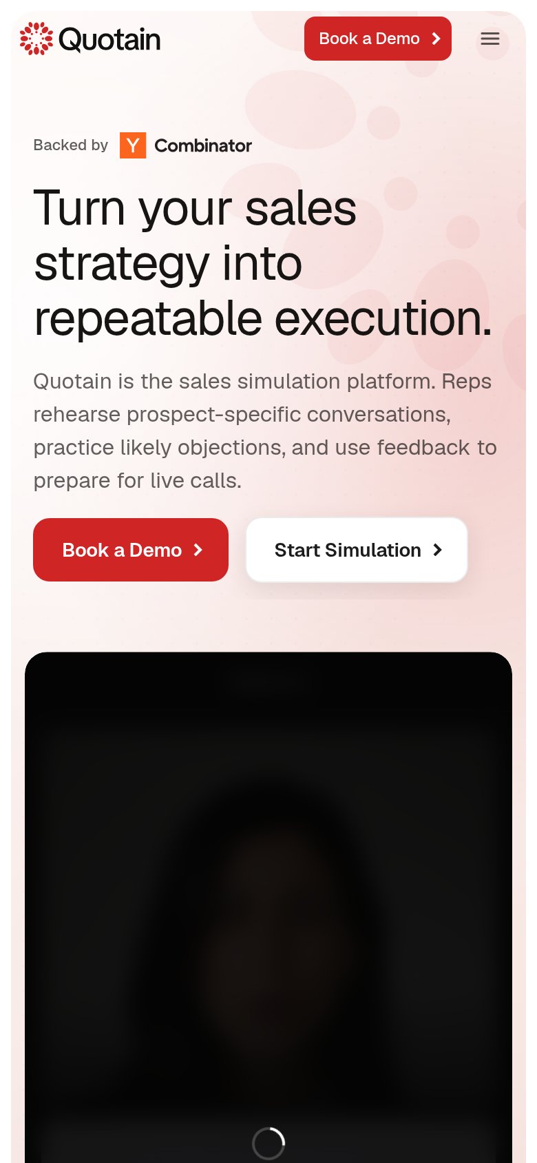 123
- Side-by-side hero CTAs — "Book a Demo" and "Start Simulation" split into two half-width buttons, shrinking the primary tap target.
- Unloaded simulation video — The demo panel renders as a black box with a spinner, spending a large fold slice on nothing legible.
- Duplicate header CTA — A second "Book a Demo" in the sticky header repeats the hero button and competes with the hamburger.