
Your landing page’s weakest score is CTA.
How Hyperbound ranks
80Growth scoreupdated
category scores
category scoresShowHide
CTA
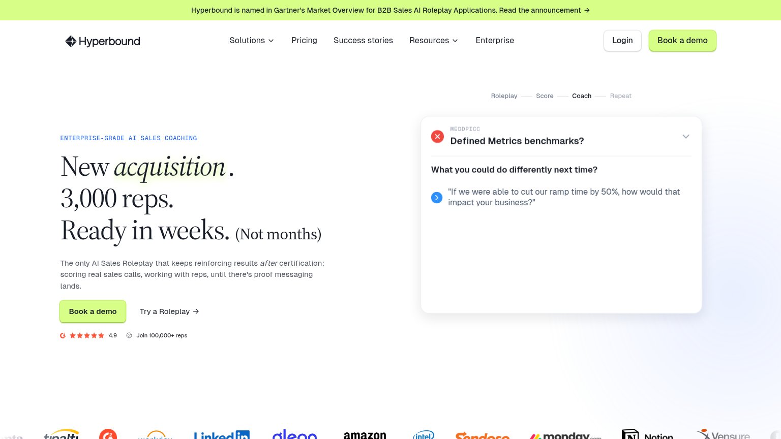
72FairCopy, size, verb, cost-feel — does the primary CTA earn the click?
Problems
- demo booking feels costly/committal
- product-try path demoted to text link
- no payoff language in the label
Information hierarchy
78FairDoes the design help or inhibit what the page is trying to say?
1234- Gartner announcement banner — Full-width lime bar shares the CTA color and pulls the first glance to an outbound link.
- Nav link row — Five nav items plus Login sit at equal weight, giving eight exits before the demo CTA.
- Coach card interior — Card shows one quote where mobile shows three, so the desktop demo reads unfinished.
- Duplicate Book a demo — Nav CTA duplicates the hero button at identical styling, splitting the primary action's weight.
Mobile web
83StrongThe phone experience as a first-class citizen.
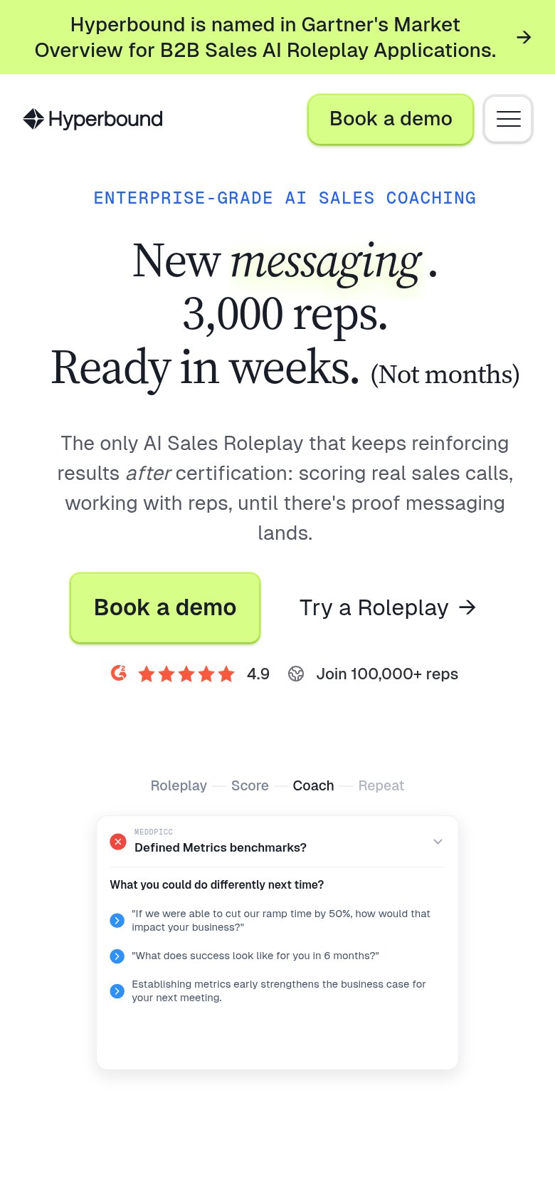
What works
What to improve
Value props
84StrongTitle, subtitle, hero — do they sell the product's true value?
Hyperbound’s headline
New acquisition. 3,000 reps. Ready in weeks. (Not months)
The only AI Sales Roleplay that keeps reinforcing results after certification: scoring real sales calls, working with reps, until there's proof messaging lands.
Working
Could improve
Trust
84StrongProof that the product is real, competent, and safe to try.
How Hyperbound compares
Trust read