
Your landing page’s weakest score is Trust.
How Luster ranks
Trust
52FairProof that the product is real, competent, and safe to try.


| Trust read | |
|---|---|
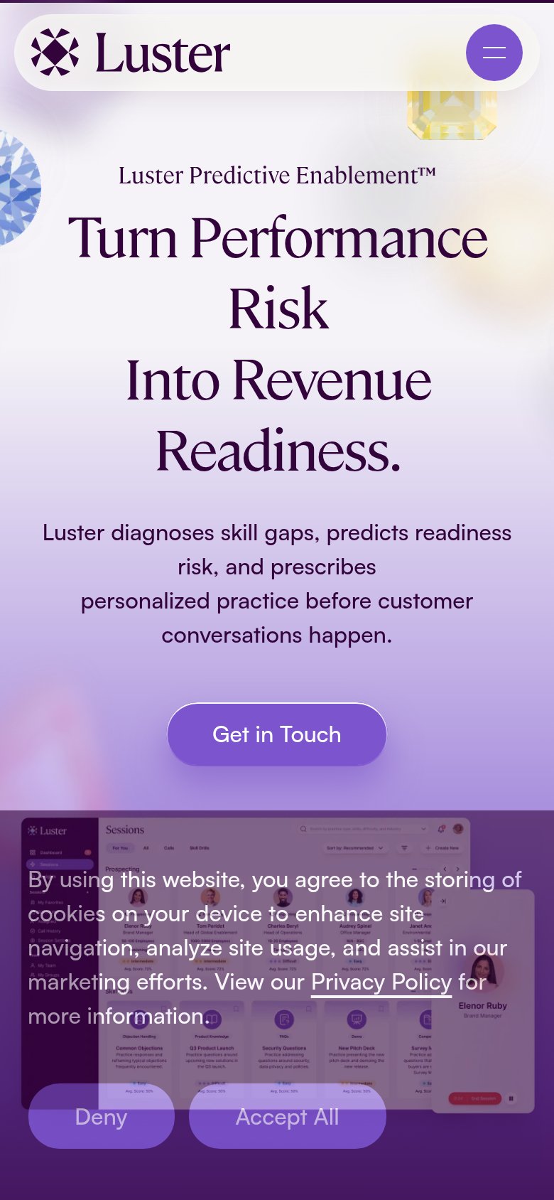
| Luster | Real product UI screenshot of the Luster "Sessions" dashboard with practice cards and named personas |
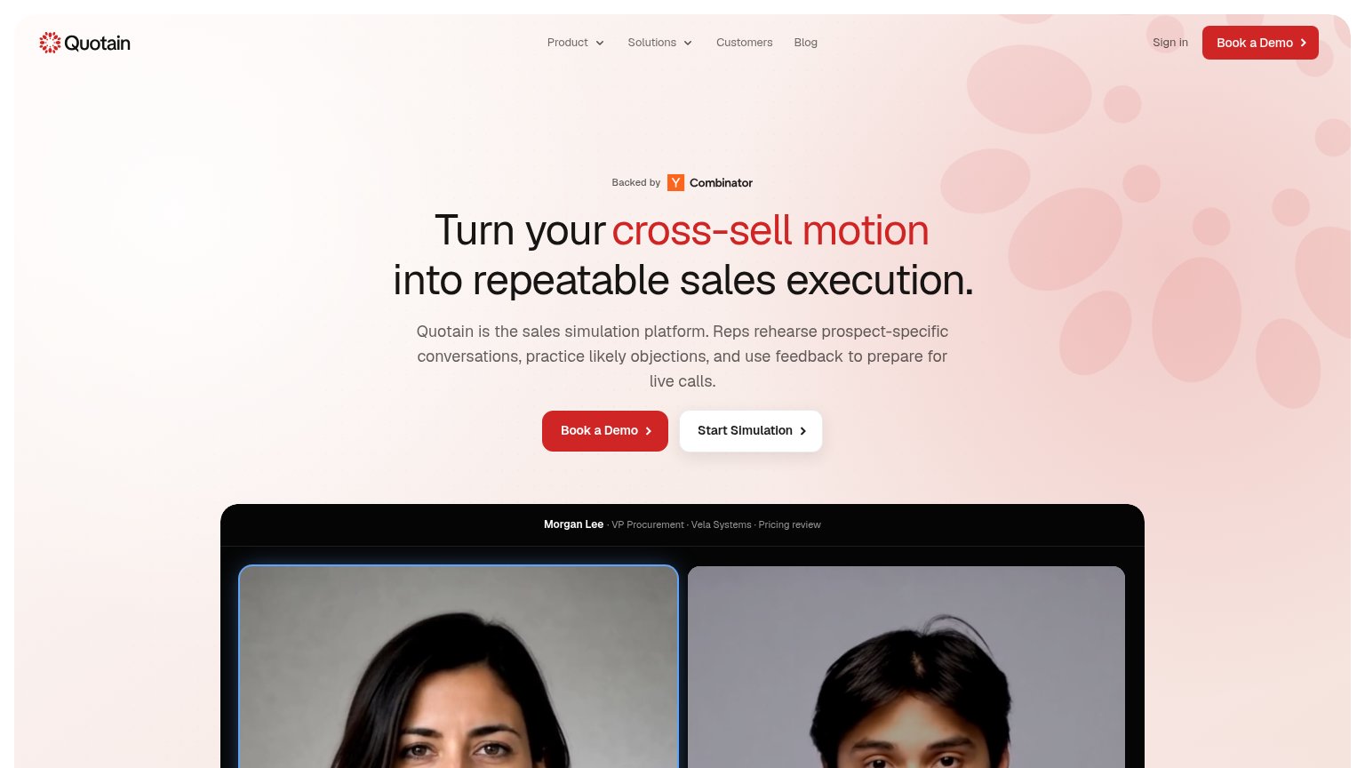
| "Backed by Y Combinator" badge above the hero headline | |
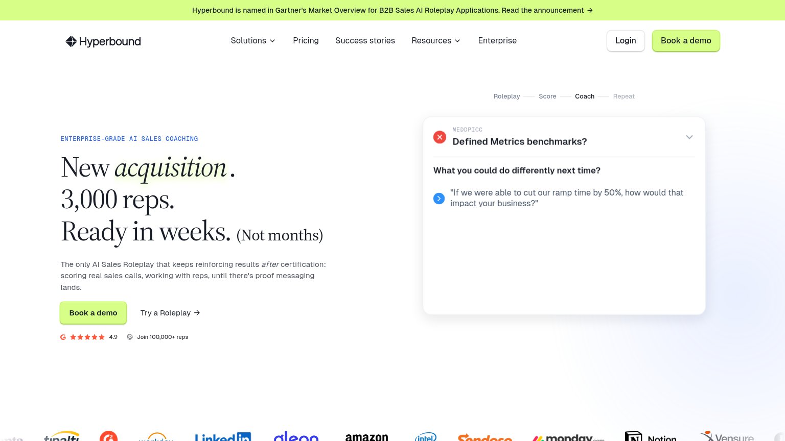
| Hyperbound is named in Gartner's Market Overview for B2B Sales AI Roleplay Applications | |
| Interactive AI role-play demo with scenario list ("Moving Avatar Discovery Call") and "Try Now" avatar card | |
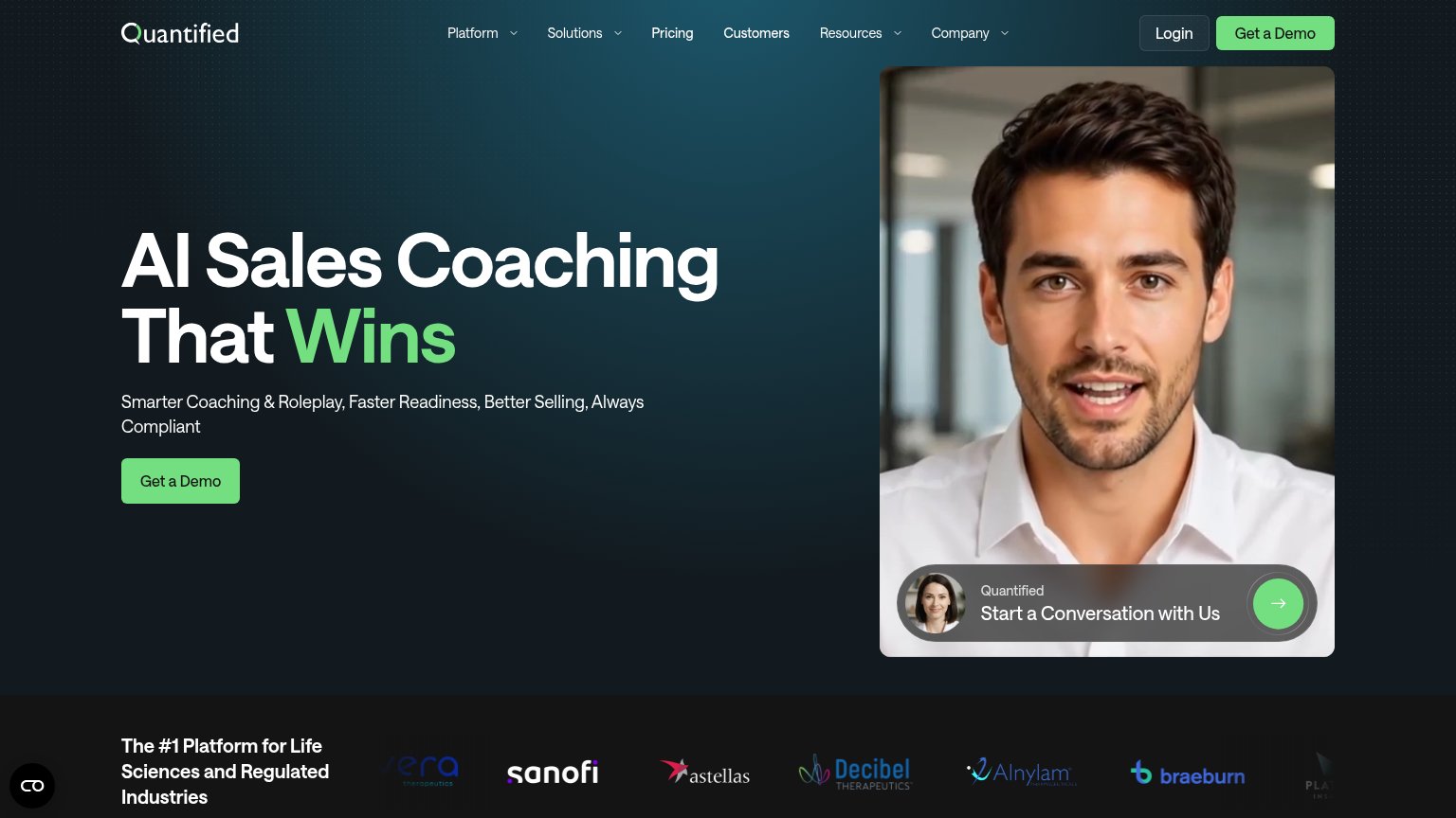
| Customer logo strip (Sanofi, Astellas, Alnylam, Decibel Therapeutics, Braeburn) under "The #1 Platform for Life Sciences | |
| "Trusted by 300K+ reps from World's leading teams" with Lenovo, ABB, Salesforce, Syngenta, Foxtons logos |
CTA
62FairCopy, size, verb, cost-feel — does the primary CTA earn the click?
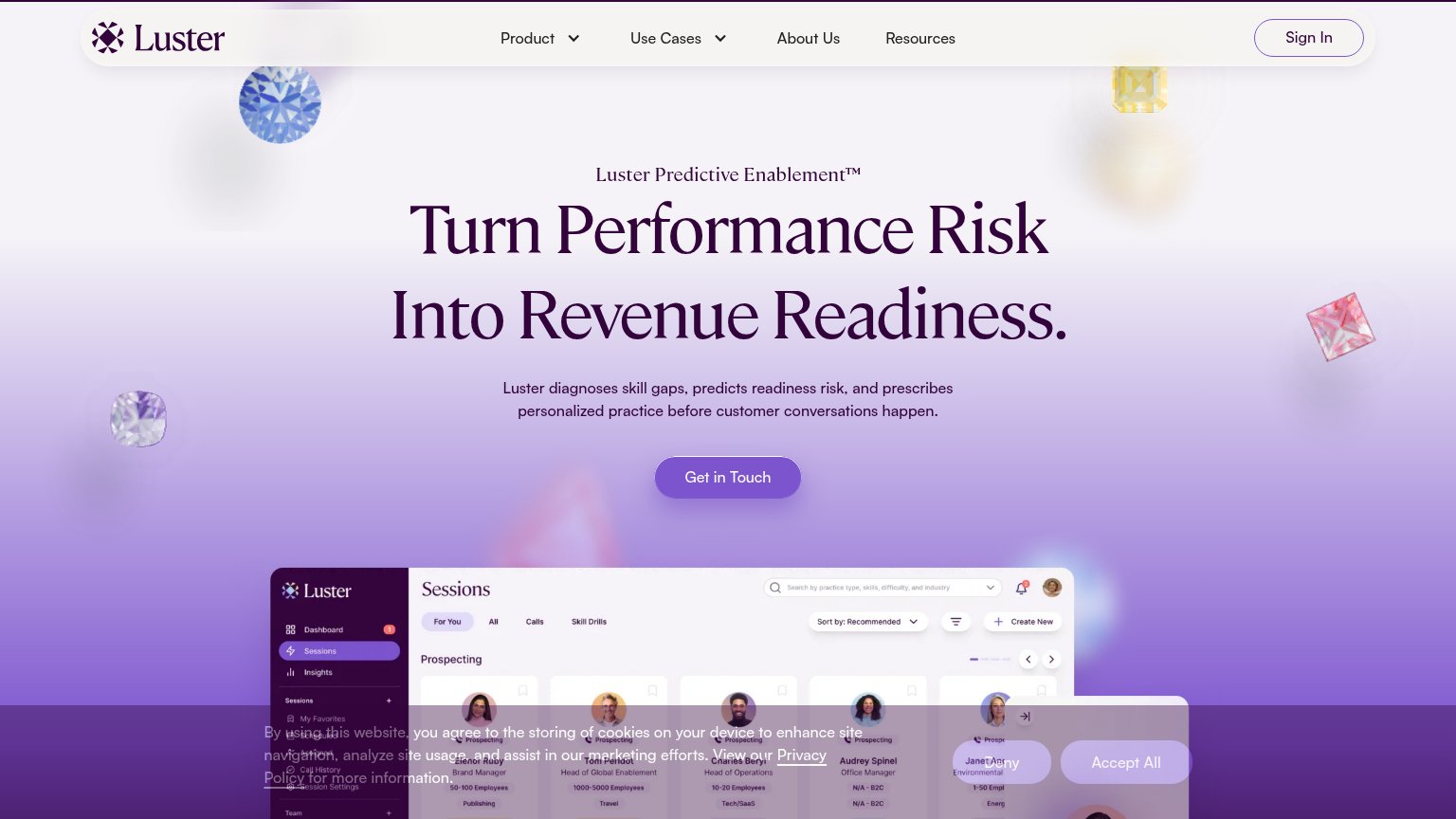
Problems
- click feels costly — implies sales talk
- no product value in the copy
- no headline echo despite strong promise
Mobile web
62FairThe phone experience as a first-class citizen.
What works
What to improve
Information hierarchy
72FairDoes the design help or inhibit what the page is trying to say?
What works
What to improve
Value props
72FairTitle, subtitle, hero — do they sell the product's true value?
Luster’s headline
Turn Performance Risk Into Revenue Readiness.
Luster diagnoses skill gaps, predicts readiness risk, and prescribes personalized practice before customer conversations happen.
Working
Could improve