
Your landing page’s weakest score is Value props.
How OnDeck AI ranks
56Growth scoreupdated
category scores
category scoresShowHide
Score over time
Value props
48PoorTitle, subtitle, hero — do they sell the product's true value?
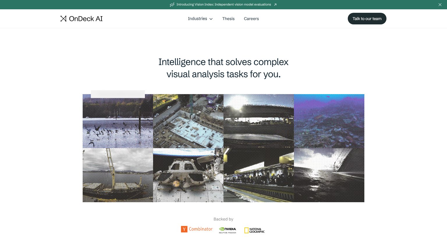
OnDeck AI’s headline vague
Intelligence that solves complex visual analysis tasks for you.
Working
- "for OnDeck AI" implies done-for-OnDeck AI service
- Backed-by logos add real credibility
- Image grid hints at industry breadth
Could improve
- No subhead adds any specifics
- "Intelligence" is a generic abstraction
- Grid shows raw imagery, not analysis output
CTA
51FairCopy, size, verb, cost-feel — does the primary CTA earn the click?
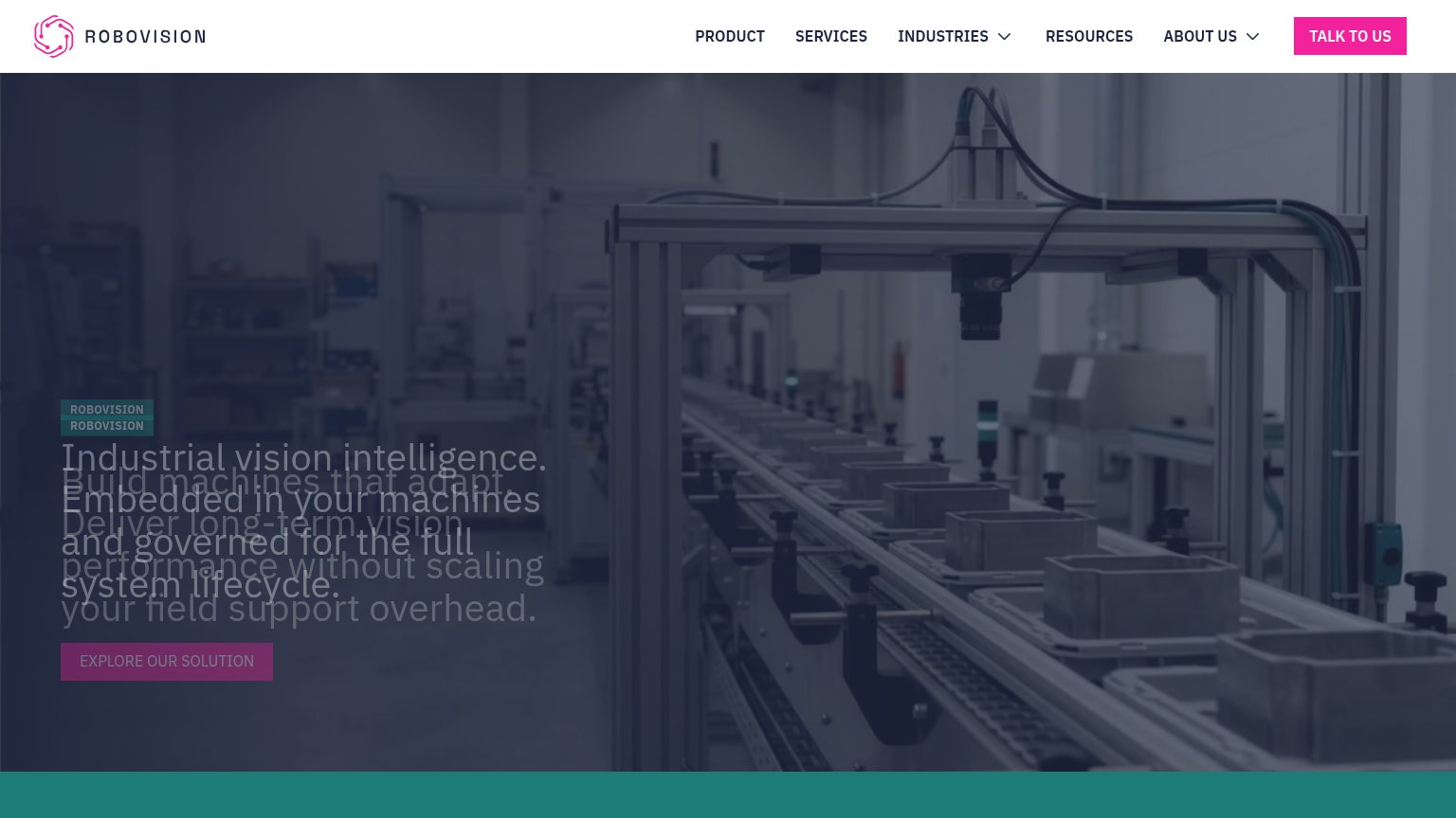
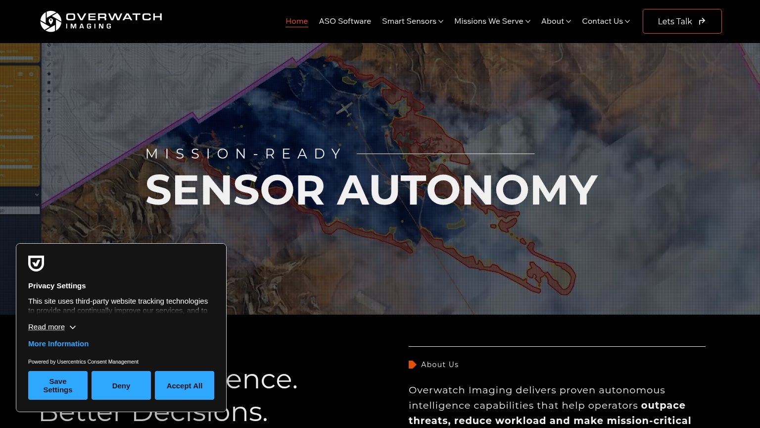
Problems
- no CTA in hero, nav-only
- hidden on mobile viewport
- sales-call framing feels costly
- 4 words, over 3-word limit
Trust
54FairProof that the product is real, competent, and safe to try.
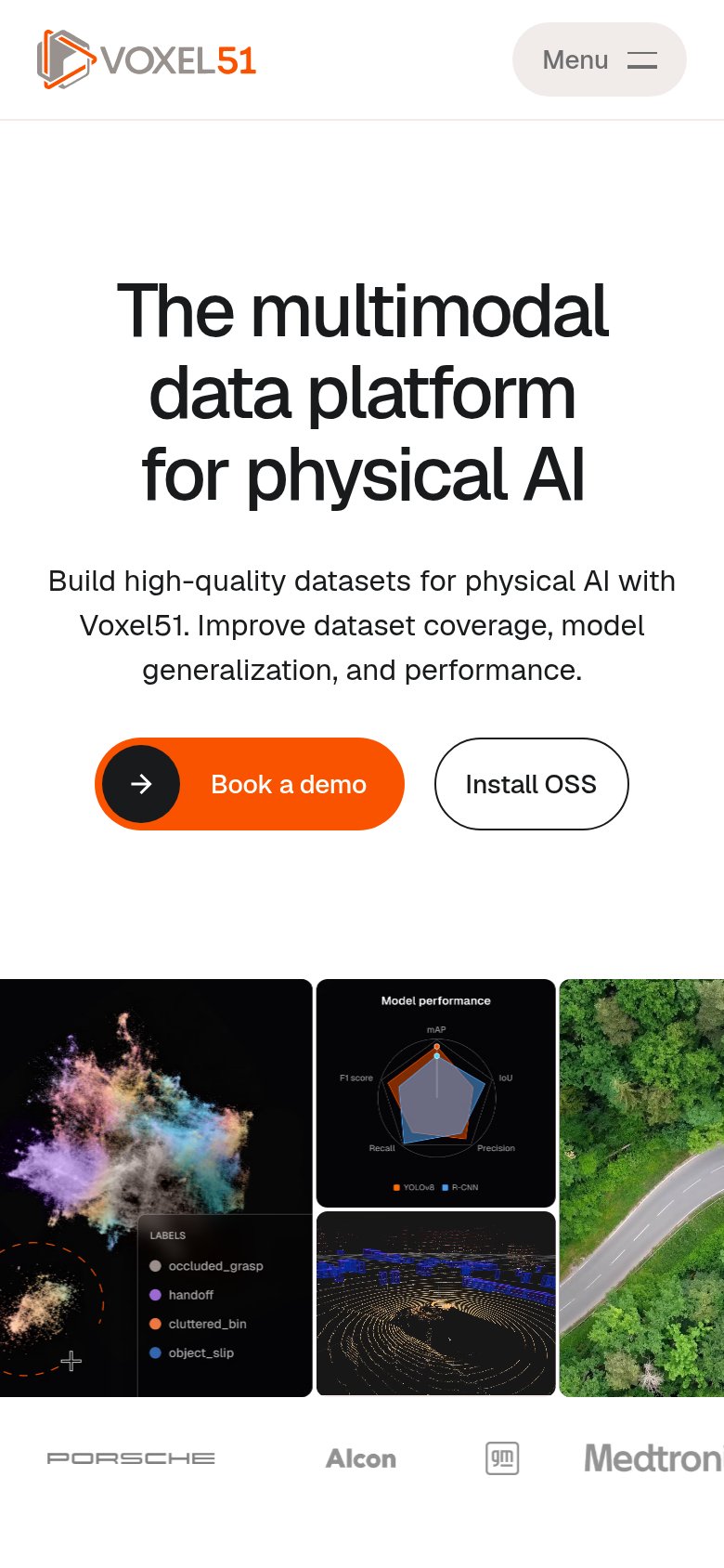

| Trust read | |
|---|---|
| OnDeck AI | "Backed by" logo strip: Y Combinator, NVIDIA Inception Program, National Geographic |
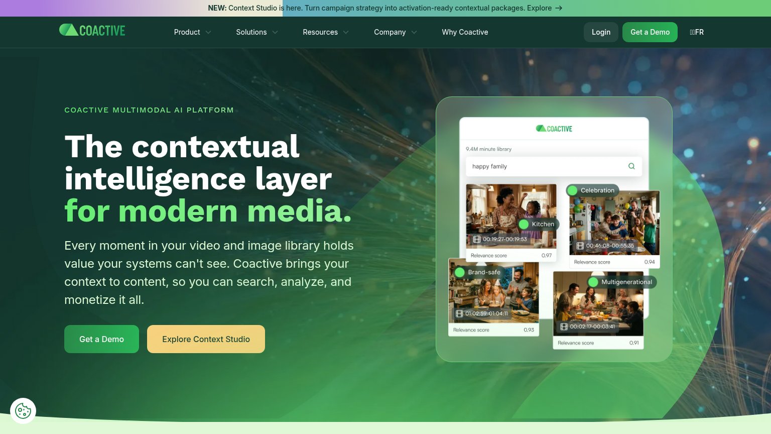
| Product UI mock showing search for "happy family" across a "9.4M minute library" with relevance scores and tags like "Br | |
| Customer logo strip showing Porsche, Alcon, GM, and Medtronic (mobile capture) | |
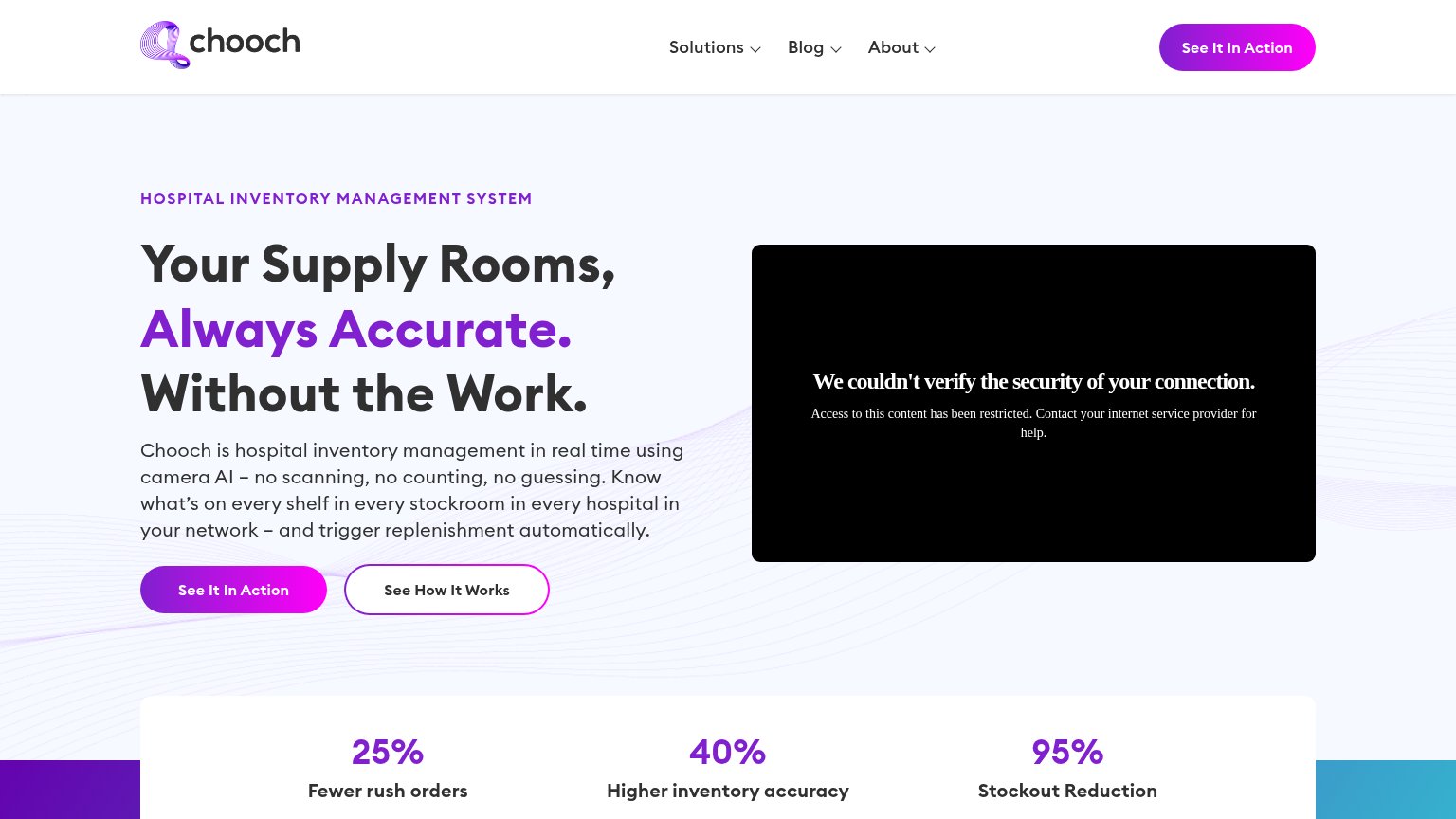
| "25% Fewer rush orders / 40% Higher inventory accuracy / 95% Stockout Reduction" metrics bar | |
| "Trusted by industry leaders" logo bar with Duravant and Key Technology logos (mobile) | |
| No visible trust signal identified. |
Mobile web
54FairThe phone experience as a first-class citizen.
 123
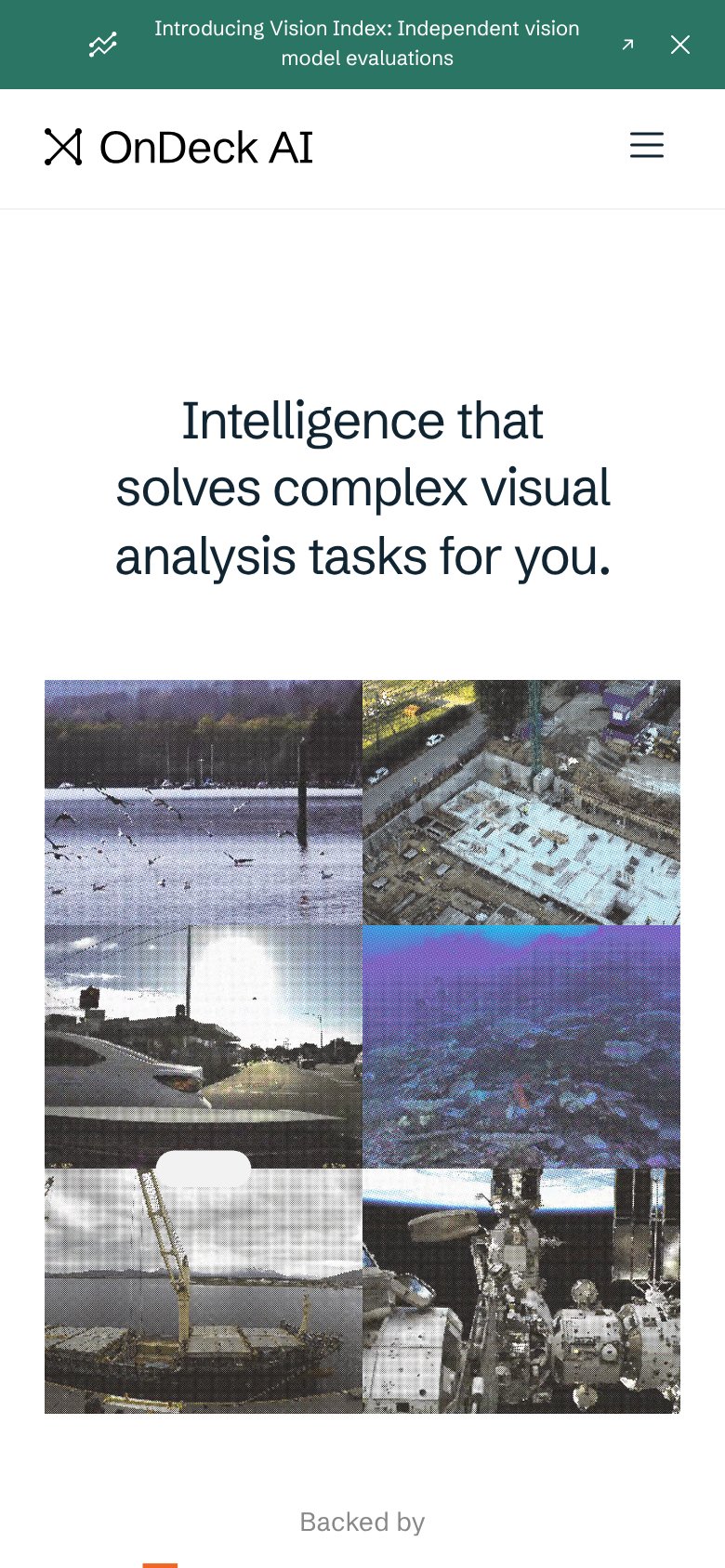
- Header without CTA — Desktop's "Talk to our team" button is dropped on mobile, leaving no tappable conversion action in the fold.
- Two-line announcement bar — The "Introducing Vision Index" banner wraps to two lines and consumes a large slice of the first viewport.
- Stacked image grid — The desktop photo grid stacks into a tall wall of images that pushes social proof and any CTA far below the fold.
Information hierarchy
72FairDoes the design help or inhibit what the page is trying to say?
123- Talk to our team — The only CTA is a small nav pill outside the headline scan path; the hero itself offers no action.
- Vision Index banner — An outbound announcement link is the first element visitors see, leaking attention before the value prop.
- Eight-image grid — Tiles are unlabeled and equal-weight, so the domains they represent go unexplained and none guide toward an action.