
Your landing page’s weakest score is Information hierarchy.
How Robovision ranks
62Growth scoreupdated
category scores
category scoresShowHide
Information hierarchy
48PoorDoes the design help or inhibit what the page is trying to say?
 1234
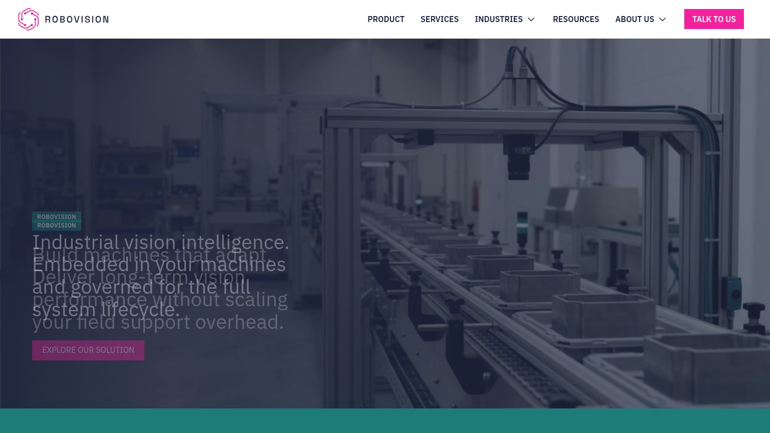
- Overlapping hero headlines — Two headline stacks render on top of each other, making the value proposition unreadable.
- Explore Our Solution button — Muted low-contrast styling makes the hero CTA nearly invisible against the dark photo.
- Doubled ROBOVISION eyebrow — The eyebrow tag renders twice, stacked, signaling a broken layout before the headline is read.
- Talk To Us button — The only high-contrast pink element sits in the nav, pulling attention away from the hero action.
Trust
55FairProof that the product is real, competent, and safe to try.
| Trust read | |
|---|---|
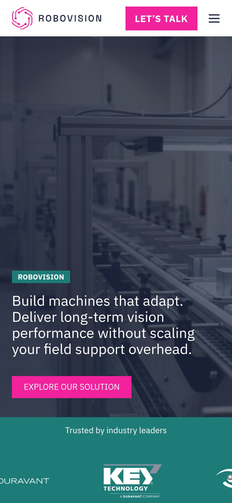
| Robovision | "Trusted by industry leaders" logo bar with Duravant and Key Technology logos (mobile) |
| "Backed by" logo strip: Y Combinator, NVIDIA Inception Program, National Geographic | |
| Product UI mock showing search for "happy family" across a "9.4M minute library" with relevance scores and tags like "Br | |
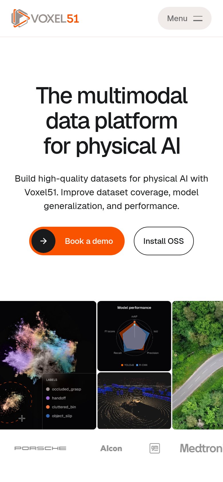
| Customer logo strip showing Porsche, Alcon, GM, and Medtronic (mobile capture) | |
| "25% Fewer rush orders / 40% Higher inventory accuracy / 95% Stockout Reduction" metrics bar | |
| No visible trust signal identified. |
Value props
58FairTitle, subtitle, hero — do they sell the product's true value?
Robovision’s headline
Build machines that adapt. Deliver long-term vision performance without scaling your field support overhead.
Working
Could improve
CTA
64FairCopy, size, verb, cost-feel — does the primary CTA earn the click?
How Robovision compares
Recommended rewrites
Mobile web
84StrongThe phone experience as a first-class citizen.
What works
What to improve