
Your landing page’s weakest score is Trust.
How Novaflow ranks
73Growth scoreupdated
category scores
category scoresShowHide
Score over time
Trust
58FairProof that the product is real, competent, and safe to try.

| Trust read | |
|---|---|
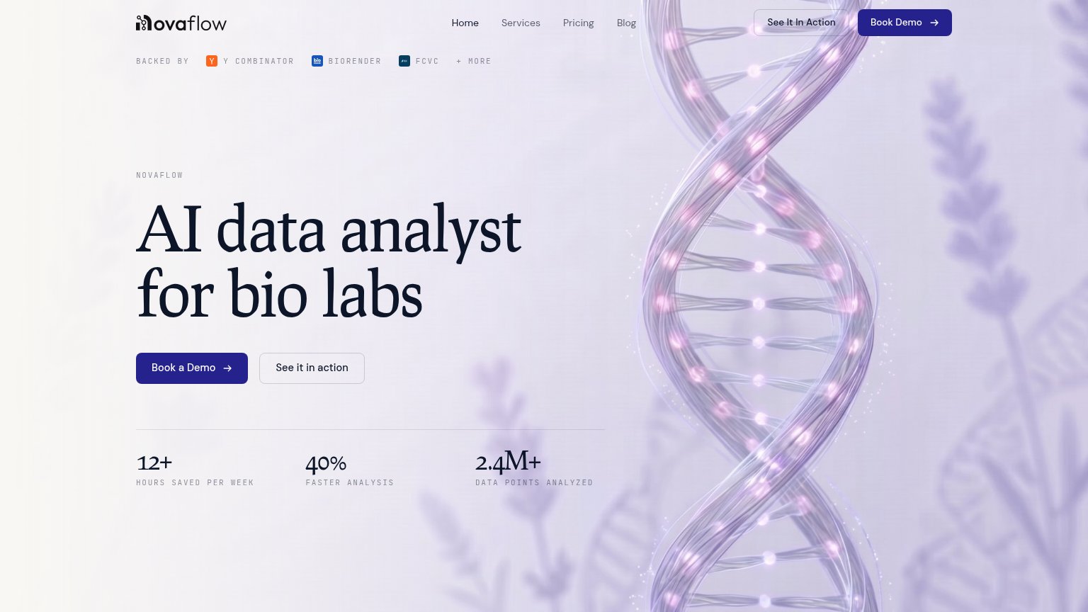
| Novaflow | "BACKED BY Y Combinator, BioRender, FCVC + more" investor strip |
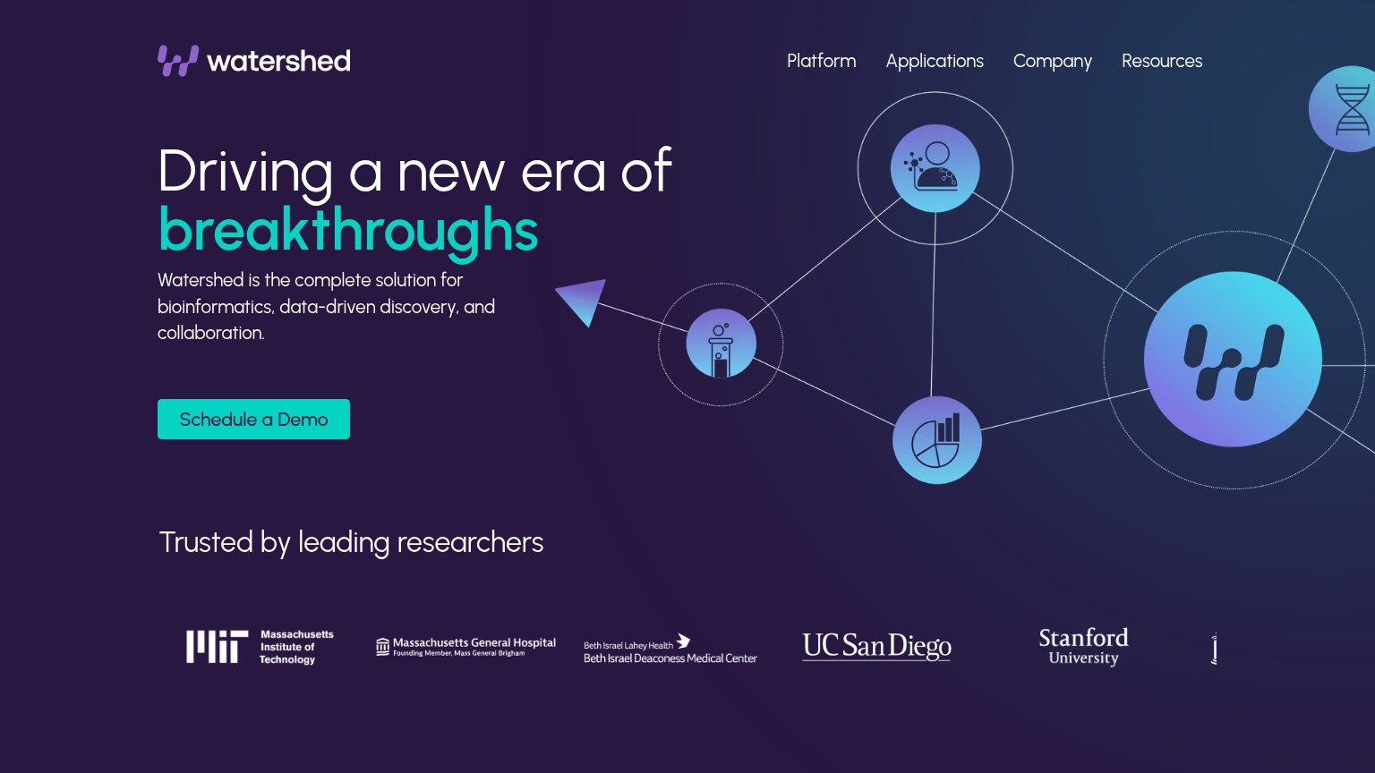
| "Trusted by leading researchers" logo strip with MIT, Massachusetts General Hospital, Beth Israel Deaconess, UC San Dieg | |
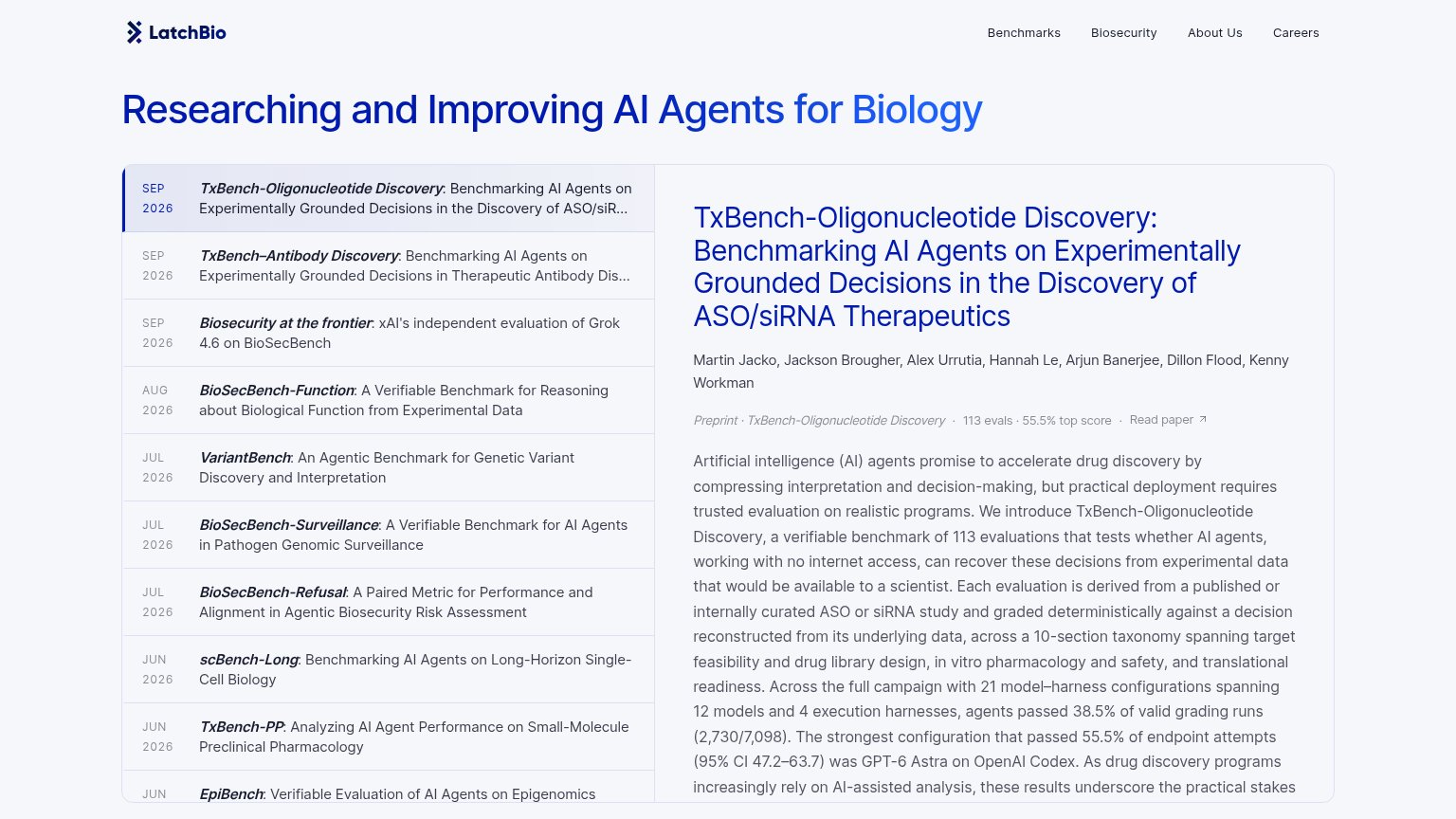
| "113 evals · 55.5% top score" preprint stat line with named authors and Read paper link | |
| Programs dashboard screenshot showing "23 programs, 17 of which are currently active" with Kanban view and drug discover | |
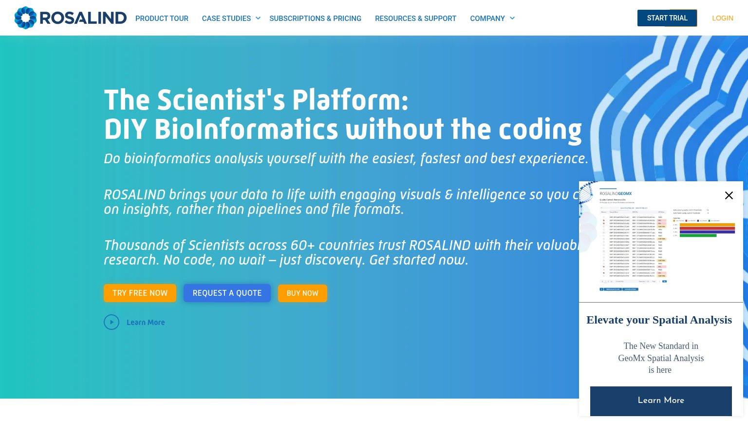
| "Thousands of Scientists across 60+ countries trust ROSALIND with their valuable research." |
CTA
70FairCopy, size, verb, cost-feel — does the primary CTA earn the click?
Problems
- demo booking feels costly
- no self-serve path to value
- label varies: 'Book Demo' in nav
Value props
72FairTitle, subtitle, hero — do they sell the product's true value?
Novaflow’s headline sells
AI data analyst for bio labs
Working
- Names audience and category in 6 words
- Stat row gives concrete proof (12+ hrs, 40%)
- Zero buzzword filler
Could improve
- No subhead explaining what it actually does
- Hero image decorates, never demonstrates
- Emotional payoff of time saved untapped
Information hierarchy
82StrongDoes the design help or inhibit what the page is trying to say?
12- Duplicate demo CTAs — "Book Demo" in the nav and "Book a Demo" in the hero are styled identically, splitting the eye between two same-weight primary buttons.
- Redundant "See It" button — "See It In Action" repeats in the nav and hero, doubling secondary paths and adding two more exits above the fold.
Mobile web
84StrongThe phone experience as a first-class citizen.
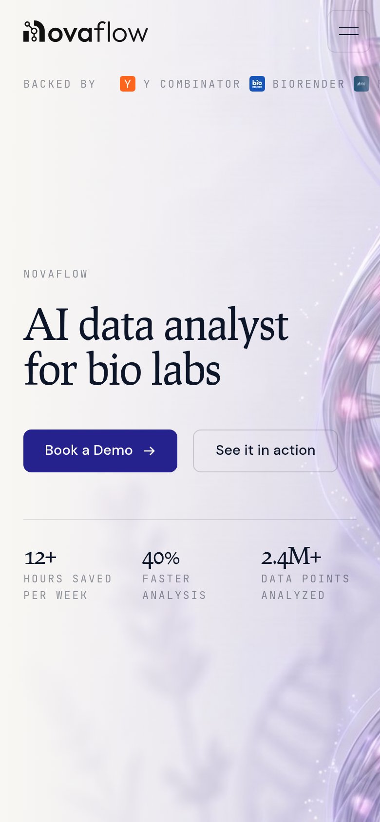 12
- Side-by-side CTA pair — Two half-width buttons shrink the primary Book a Demo tap target; stack them full-width.
- Clipped backer logo strip — The third investor badge is cut off at the viewport edge, making the trust row look broken.