
Your landing page’s weakest score is Trust.
How Nixo ranks
68Growth scoreupdated
category scores
category scoresShowHide
Score over time
Trust
56FairProof that the product is real, competent, and safe to try.

| Trust read | |
|---|---|
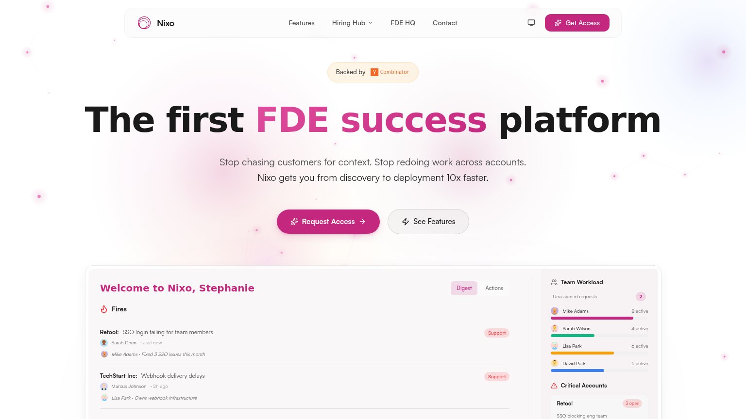
| Nixo | "Backed by Y Combinator" badge above the headline |
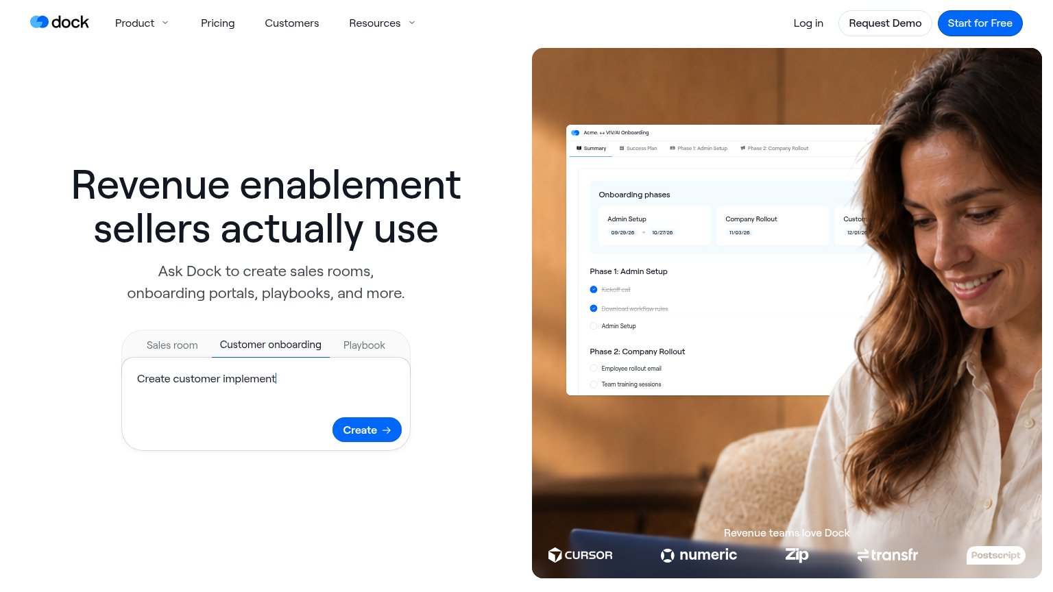
| Customer logo strip labeled "Revenue teams love Dock" featuring Cursor, Numeric, Zip, Transfr, and Postscript | |
| No visible trust signal identified. | |
| No visible trust signal identified. | |
| Customer logo strip (CVS Health, Bullhorn, Qualia, Simpplr) labeled "Trusted by Customer and Operation Leaders at top B2 | |
| "Gameplan for your deal" product UI card showing real tasks and an "Updating CRM…" toast |
CTA
68FairCopy, size, verb, cost-feel — does the primary CTA earn the click?
Problems
- 'Request' feels gated, costly
- nav says 'Get Access', hero differs
- no payoff implied in label
Value props
68FairTitle, subtitle, hero — do they sell the product's true value?
Nixo’s headline undersells
The first FDE success platform
Stop chasing customers for context. Stop redoing work across accounts. Nixo gets you from discovery to deployment 10x faster.
Working
- Subhead names real pains, not abstractions
- "10x faster" gives a concrete outcome
- Hero screenshot shows product doing its job
Could improve
- Headline is a category label, not a benefit
- "FDE" jargon gates comprehension
- "First" claims novelty, not value
Mobile web
72FairThe phone experience as a first-class citizen.
 123
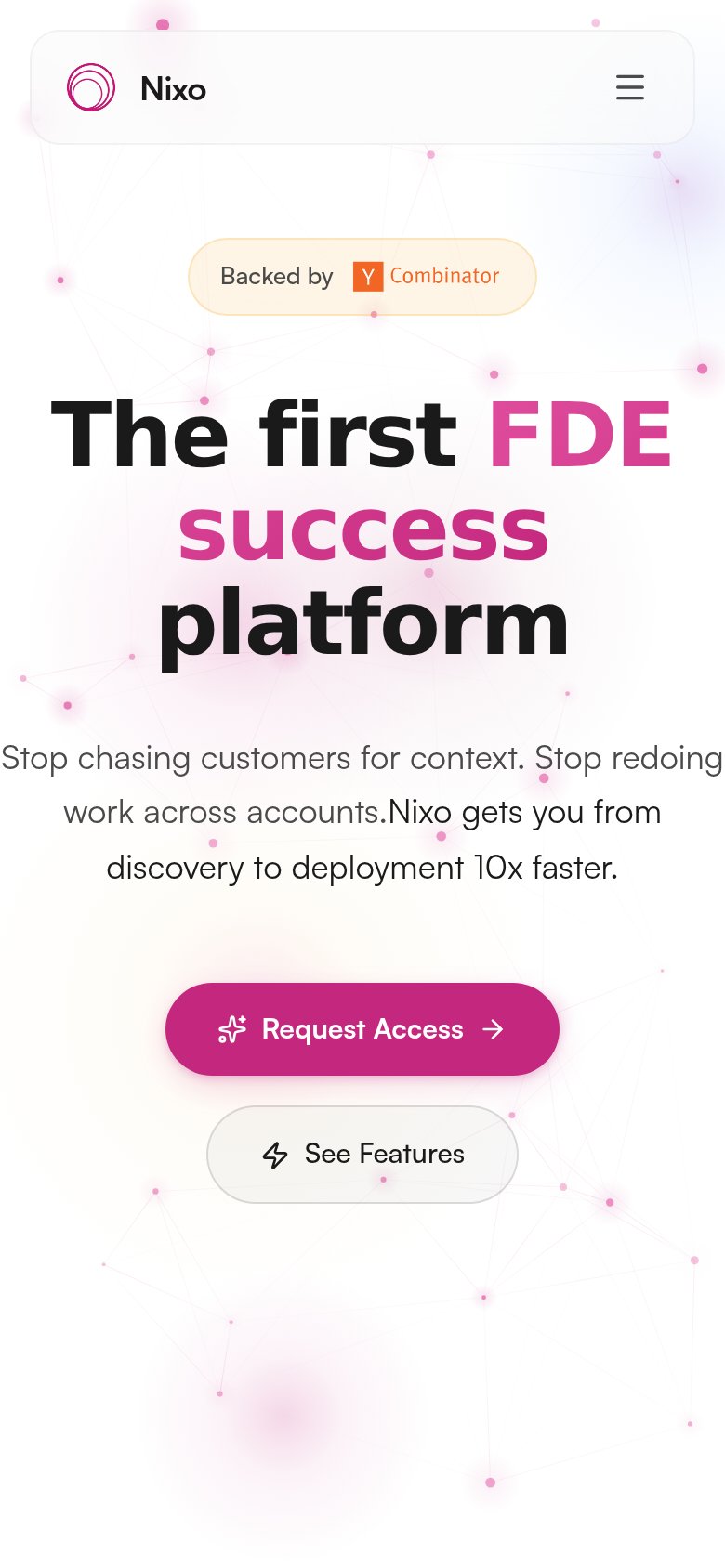
- Subhead text bug — Two sentences run together as 'accounts.Nixo' — a visible responsive copy break in the hero.
- Oversized wrapped headline — Headline barely scales down, wrapping into three heavy lines that consume ~25% of the fold.
- Request Access button — Primary CTA floats at roughly half viewport width instead of a thumb-friendly near-full-bleed bar.
Information hierarchy
78FairDoes the design help or inhibit what the page is trying to say?
1234- Nav Get Access button — Same magenta weight as the hero CTA, splitting the one action into two competing targets.
- See Features button — Sized and shaped like the primary CTA, halving its visual authority at the decision point.
- Cropped dashboard preview — The fold cuts the panel mid-row, so the product proof shows fragments instead of one legible outcome.
- Hiring Hub dropdown — A multi-item dropdown in the fold adds exit paths before the value prop has landed.