
Your landing page’s weakest score is Trust.
How Dock ranks
75Growth scoreupdated
category scores
category scoresShowHide
Trust
68FairProof that the product is real, competent, and safe to try.
| Trust read | |
|---|---|
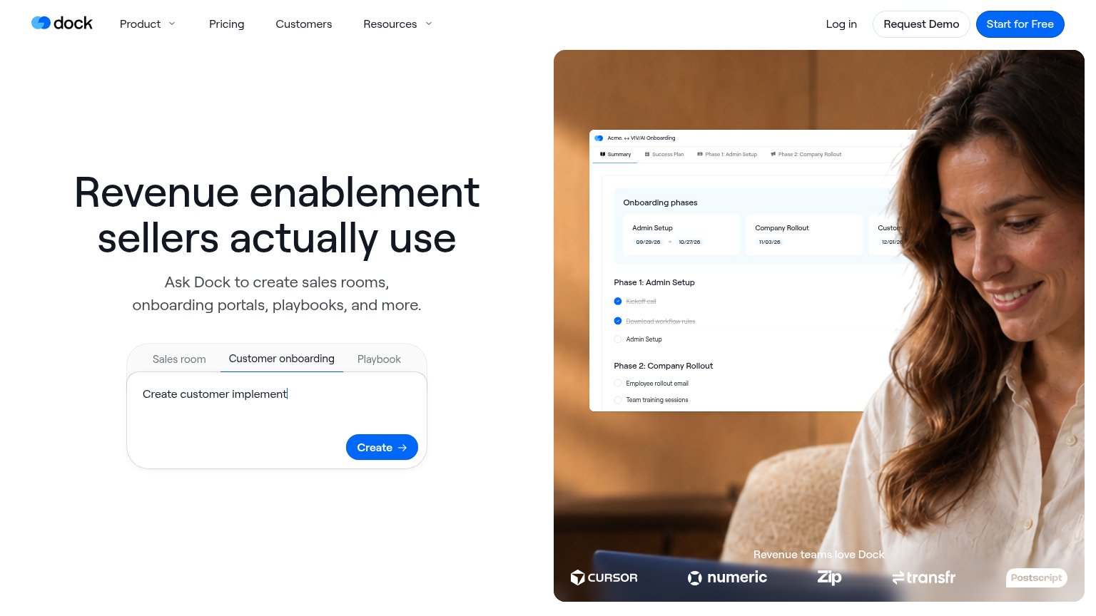
| Dock | Customer logo strip labeled "Revenue teams love Dock" featuring Cursor, Numeric, Zip, Transfr, and Postscript |
| "BACKED BY" Y Combinator badge | |
| No visible trust signal identified. | |
| No visible trust signal identified. | |
| Customer logo strip (CVS Health, Bullhorn, Qualia, Simpplr) labeled "Trusted by Customer and Operation Leaders at top B2 |
Information hierarchy
72FairDoes the design help or inhibit what the page is trying to say?
 123
- Header CTA pair — "Request Demo" and "Start for Free" sit at equal weight beside the hero's "Create" button, splitting the primary action three ways.
- Create prompt box — The interactive prompt with three tabs asks visitors to compose input before converting — higher friction than a one-click CTA and it competes with "Start for Free".
- Customer logo strip — Logos like Cursor and Zip are overlaid on a busy photo edge, and "Postscript" nearly disappears against the light shirt.
Value props
72FairTitle, subtitle, hero — do they sell the product's true value?
Dock’s headline
Revenue enablement sellers actually use
Ask Dock to create sales rooms, onboarding portals, playbooks, and more.
Working
Could improve
Mobile web
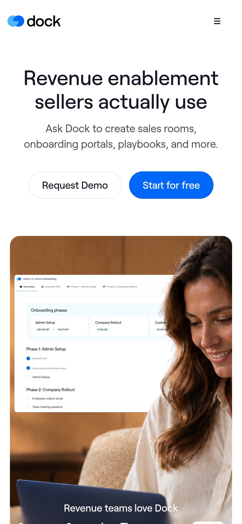
78FairThe phone experience as a first-class citizen.
What works
What to improve
CTA
84StrongCopy, size, verb, cost-feel — does the primary CTA earn the click?
How Dock compares
Recommended rewrites