
Your landing page’s weakest score is Trust.
How Rocketlane ranks
Trust
42PoorProof that the product is real, competent, and safe to try.
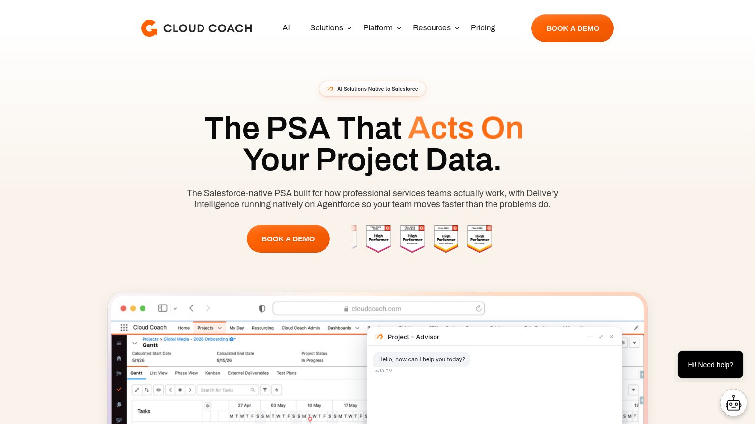
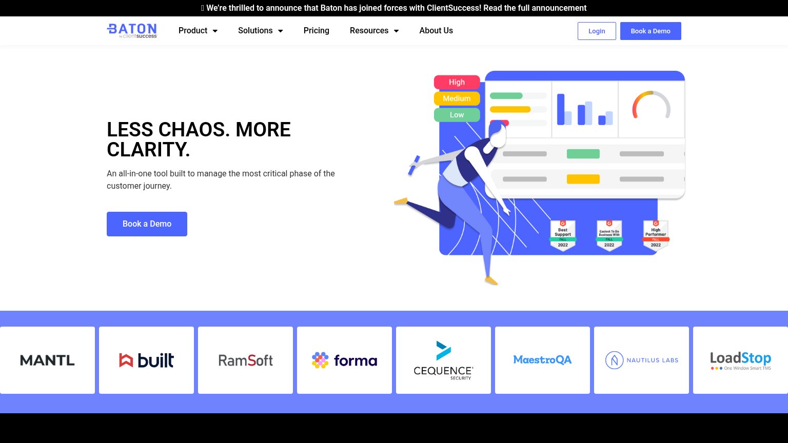

| Trust read | |
|---|---|
| Rocketlane | No visible trust signal identified. |
| Embedded product demo with the typed prompt "Turn this discovery call into a partner-ready proposal package" | |
| RUNS ON SALESFORCE | |
| No visible trust signal identified. | |
| Customer logo strip: MANTL, Built, RamSoft, Forma, Cequence Security, MaestroQA, Nautilus Labs, LoadStop | |
| G2 Fall 2026 badge row ("High Performer", "Fastest Implementation", "Best Support") next to the BOOK A DEMO CTA |
Mobile web
58FairThe phone experience as a first-class citizen.
 1234
- Six-line hero headline — Desktop headline barely scales down, wrapping into six oversized lines that push the CTAs to the bottom of the fold.
- Triple-decker sticky header — Promo banner plus a Contact sales/Support/Log in row plus the logo/hamburger row consume roughly a fifth of the first viewport.
- Side-by-side CTA pair — 'Free trial' and 'Book a demo' sit as two desktop-proportioned buttons instead of stacked full-width taps, and the outlined 'Free trial' vanishes into the imagery.
- Chat bubble overlay — Floating chat widget hovers over content with no conversion value, adding friction near the scroll path.
Value props
62FairTitle, subtitle, hero — do they sell the product's true value?
Rocketlane’s headline
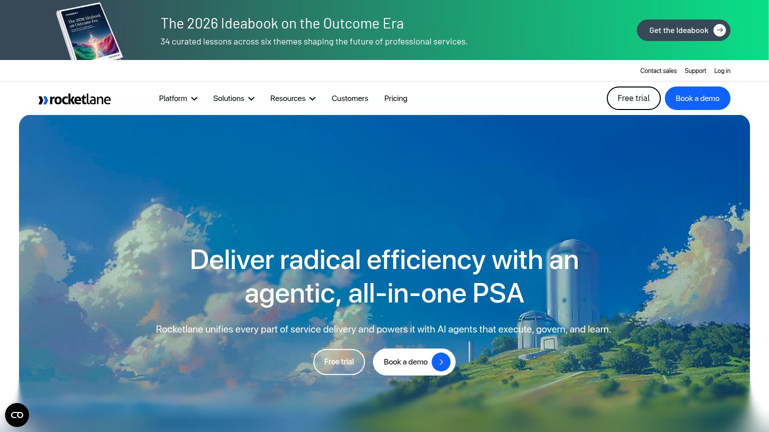
Deliver radical efficiency with an agentic, all-in-one PSA
Rocketlane unifies every part of service delivery and powers it with AI agents that execute, govern, and learn.
Working
Could improve
Information hierarchy
64FairDoes the design help or inhibit what the page is trying to say?
What works
What to improve
CTA
68FairCopy, size, verb, cost-feel — does the primary CTA earn the click?
How Rocketlane compares
Recommended rewrites