
Your landing page’s weakest score is Value props.
How Hera ranks
72Growth scoreupdated
category scores
category scoresShowHide
Score over time
Value props
68FairTitle, subtitle, hero — do they sell the product's true value?
Hera’s headline sells
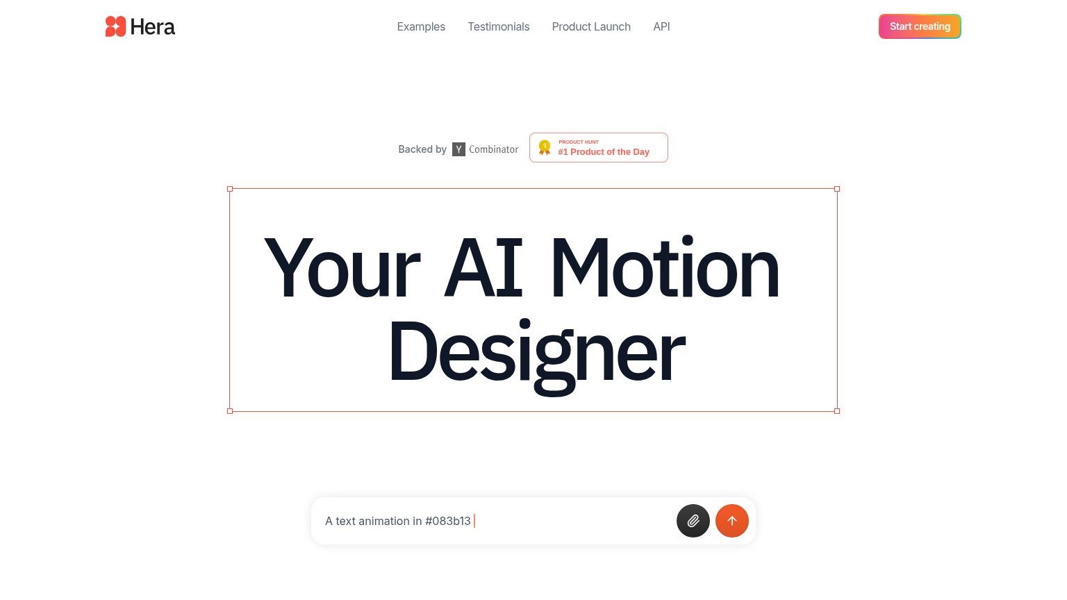
Your AI Motion Designer
Working
- Headline names the role Hera replaces
- Selection-box hero demos the canvas itself
- YC + Product Hunt badges add real proof
Could improve
- No subhead — output and speed unstated
- Zero concrete numbers or outcomes
- Prompt bar demo easy to miss as the demo
Trust
68FairProof that the product is real, competent, and safe to try.


| Trust read | |
|---|---|
| Hera | "Backed by Y Combinator" badge alongside a Product Hunt "#1 Product of the Day" award above the hero |
| "Over 20,000 creative teams use Jitter" above a logo wall with Google, Spotify, TikTok, Deliveroo and Perplexity | |
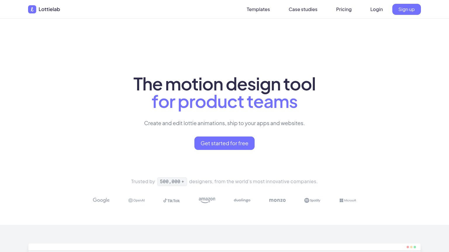
| "Trusted by 500,000+ designers, from the world's most innovative companies." with logos of Google, OpenAI, TikTok, Amazo | |
| Trusted by Spotify Wrapped, Duolingo, and products reaching 2 billion users. | |
| Interactive demo input pre-filled with "Try glossier.com/products/cloud-paint" | |
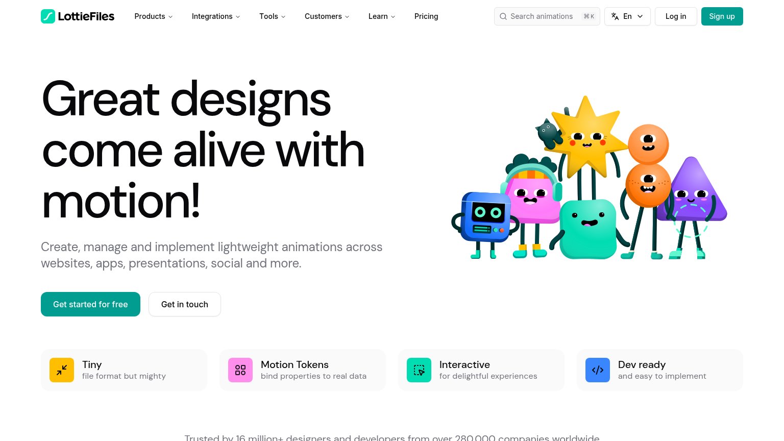
| "Trusted by 16 million+ designers and developers from over 280,000 companies worldwide" |
Mobile web
72FairThe phone experience as a first-class citizen.
 123
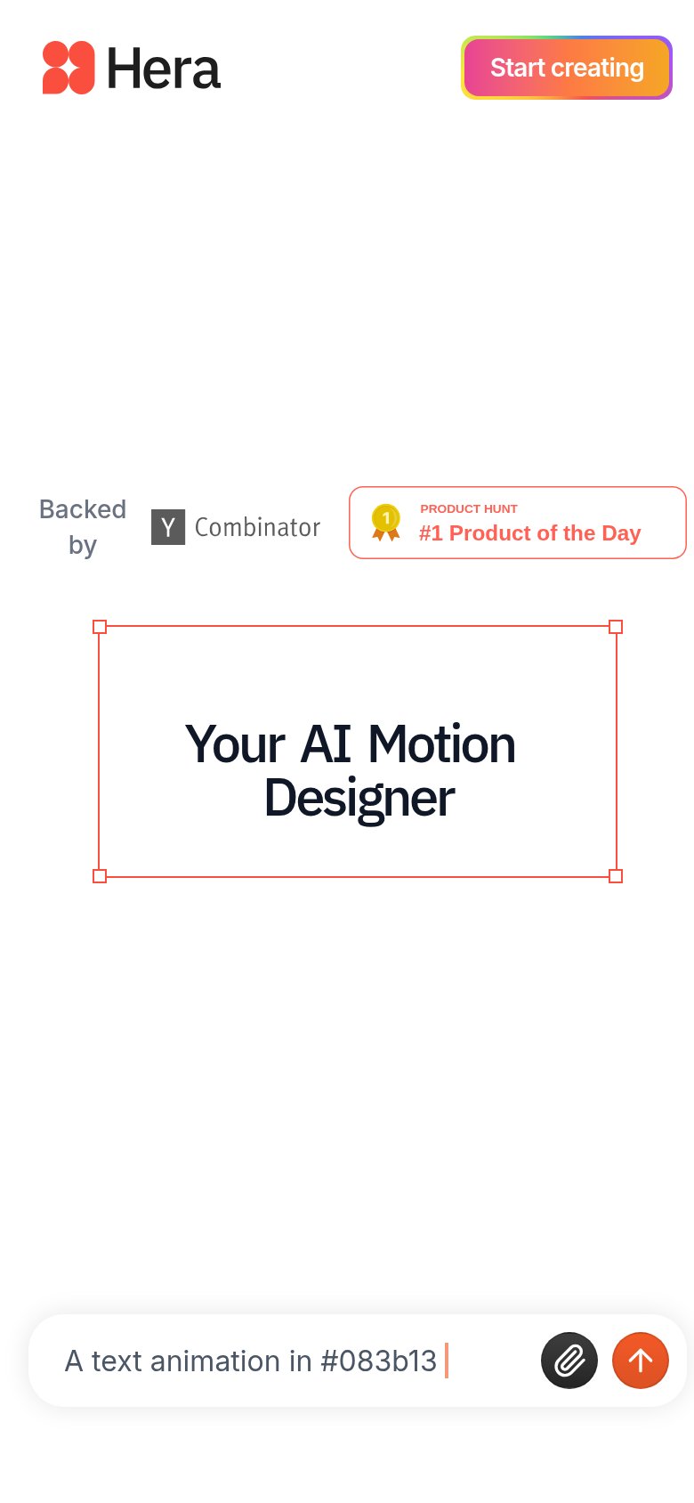
- Prompt bar CTA — The primary prompt input sits pinned at the very bottom of the viewport, far from the headline with no full-width action button in between.
- "Backed by" badge row — Desktop badge row wraps awkwardly on mobile — "Backed by" breaks over two lines and the Product Hunt card nearly overflows the right edge.
- Start creating button — The gradient CTA keeps its desktop pill proportions instead of expanding toward full-bleed, leaving a small tap target in the header.
Information hierarchy
74FairDoes the design help or inhibit what the page is trying to say?
123- Prompt input CTA — The actual conversion action — the prompt box — sits at the very bottom edge with no label telling visitors to type here, so the fold's real CTA reads as an afterthought.
- Headline selection handles — The red bounding-box handles around 'Hera's AI Motion Designer' read as a broken editor state rather than a deliberate demo cue, muddying the value prop.
- Nav link row — Four same-weight links (Examples, Testimonials, Product Launch, API) offer exits before the visitor reaches the prompt input or 'Start creating'.
CTA
78FairCopy, size, verb, cost-feel — does the primary CTA earn the click?
Problems
- icon-only submit, no promise
- placeholder lacks action verb
- no payoff stated in microcopy
- nav button label differs from input