
Your landing page’s weakest score is CTA.
How Rive ranks
CTA
62FairCopy, size, verb, cost-feel — does the primary CTA earn the click?


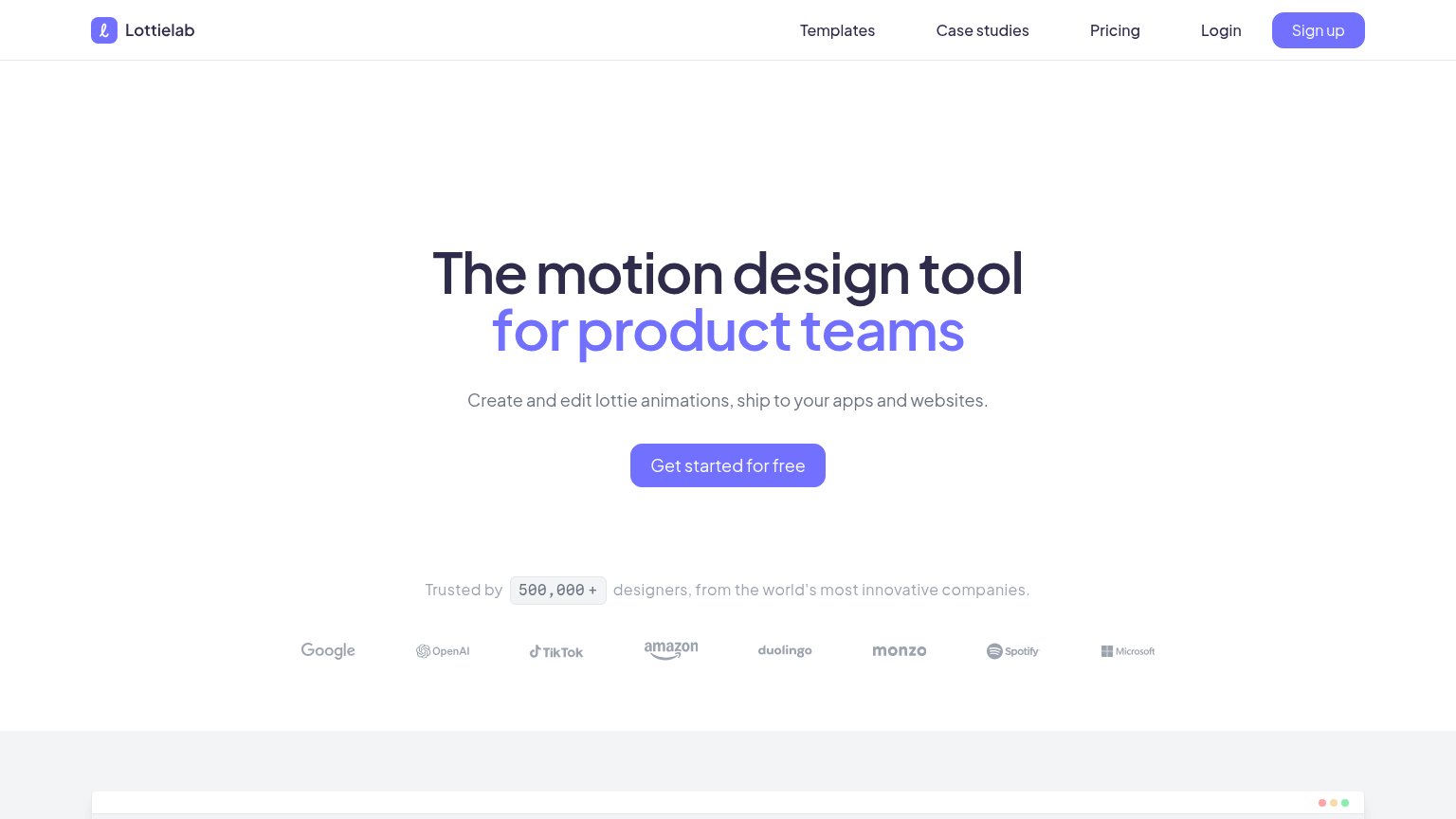
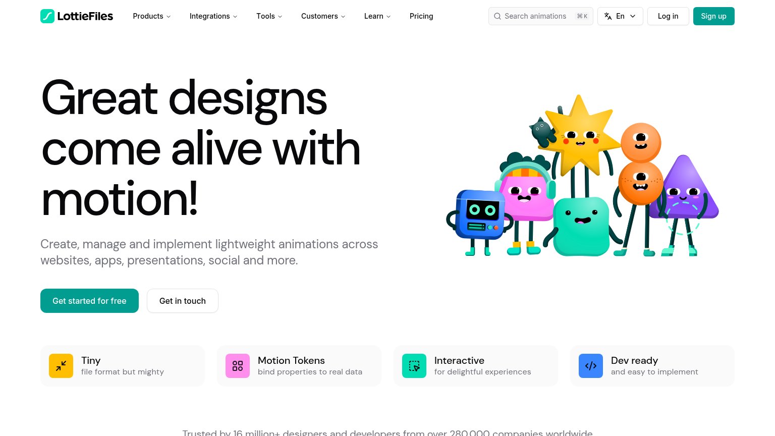
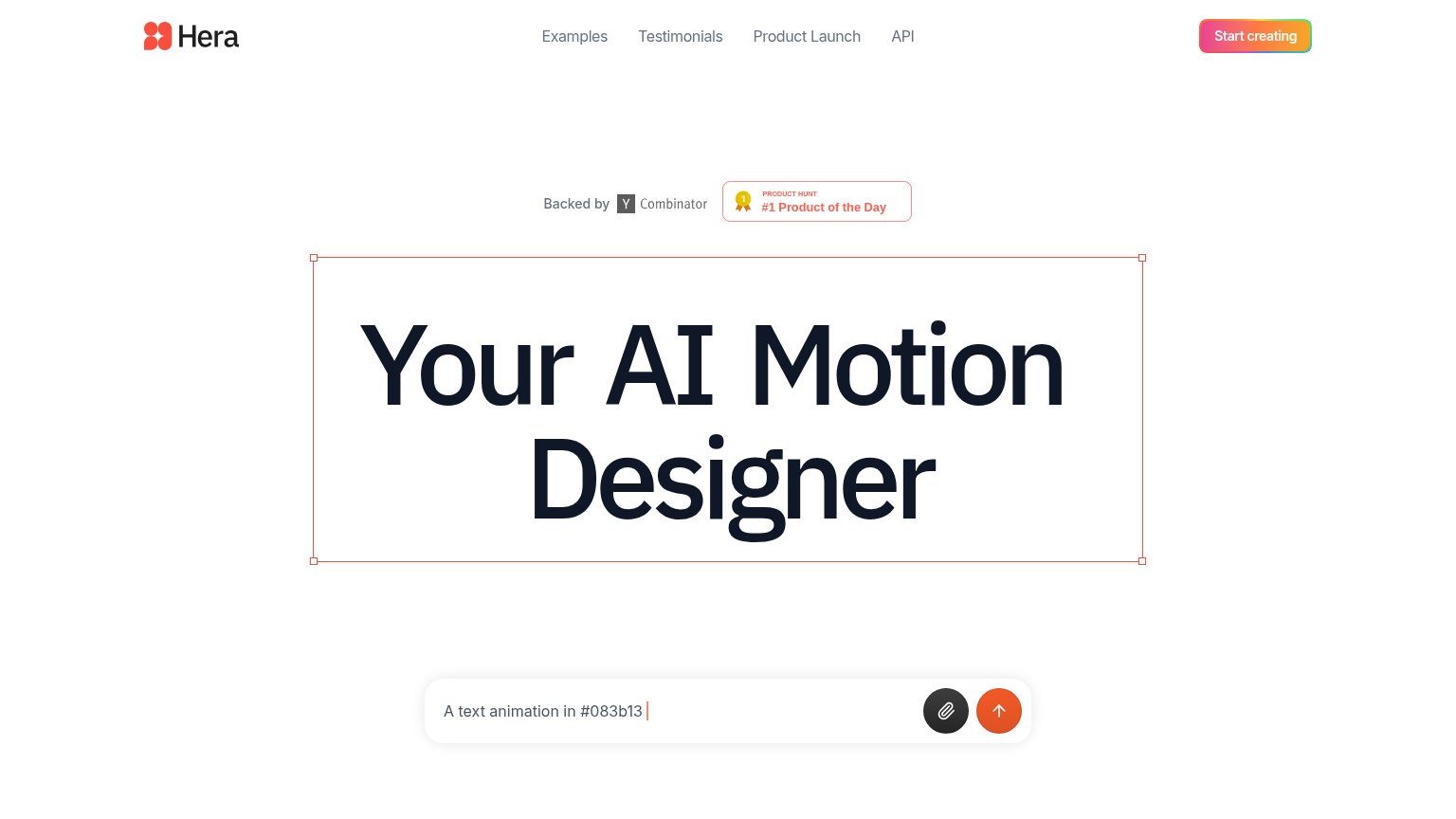
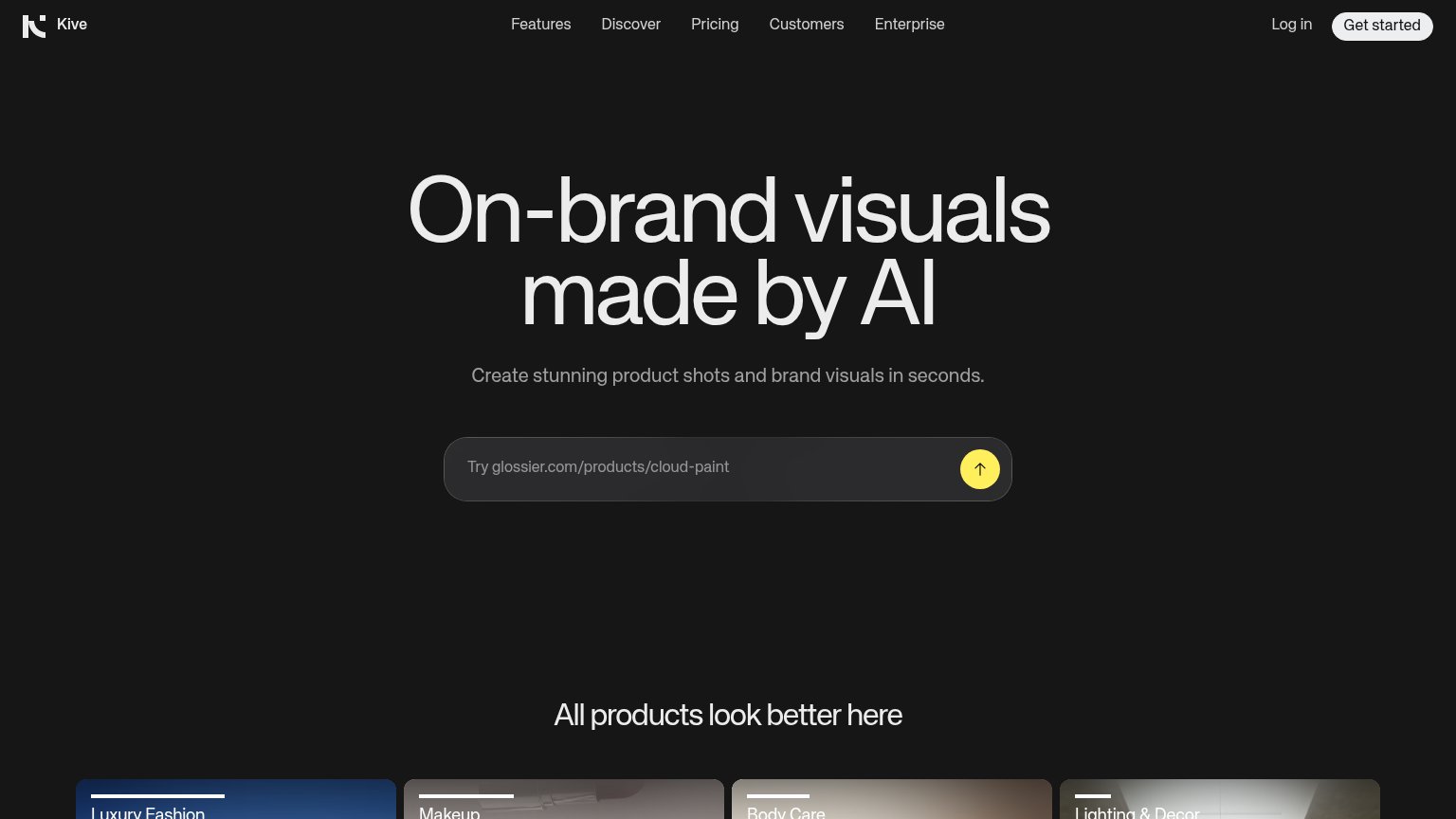
Problems
- 'Sign up' feels costly, not valuable
- nav says 'Get started', hero 'Sign up'
- three competing actions in one fold
- button small vs CLI block above it
Mobile web
62FairThe phone experience as a first-class citizen.
 1234
- Showcase cards row — The GAME UI/MOBILE APPS carousel occupies the entire first viewport, pushing the headline and CTAs two screens down.
- Truncated MOBILE APPS card — The second card is clipped mid-word at the viewport edge, signaling a desktop grid not rebuilt for phone width.
- Wrapped curl command — The CLI install command breaks across three lines mid-URL, an unreadable desktop element crowding the path to the CTAs.
- SIGN UP button — The primary action is desktop-proportioned and sits far below the fold instead of a full-width thumb target.
Information hierarchy
64FairDoes the design help or inhibit what the page is trying to say?
What works
What to improve
Value props
72FairTitle, subtitle, hero — do they sell the product's true value?
Rive’s headline
THE INTERACTIVE EXPERIENCE ENGINE
Build interactive UI, motion, and game experiences in the Editor, or let an agent generate them with the CLI. What you build runs natively on mobile, desktop, web, consoles, TVs, and vehicles.
Working
Could improve
Trust
72FairProof that the product is real, competent, and safe to try.
How Rive compares
Trust read