Past reportsShow past reportsHide past reports
- Sep 22, 202665LiveTrust −8 · Information hierarchy +6Viewing
- May 17, 202665First tracked report — strongest Value props 72, weakest Trust 48View →

Your landing page’s weakest score is Trust.
How Datafruit ranks
category scores
Proof that the product is real, competent, and safe to try.

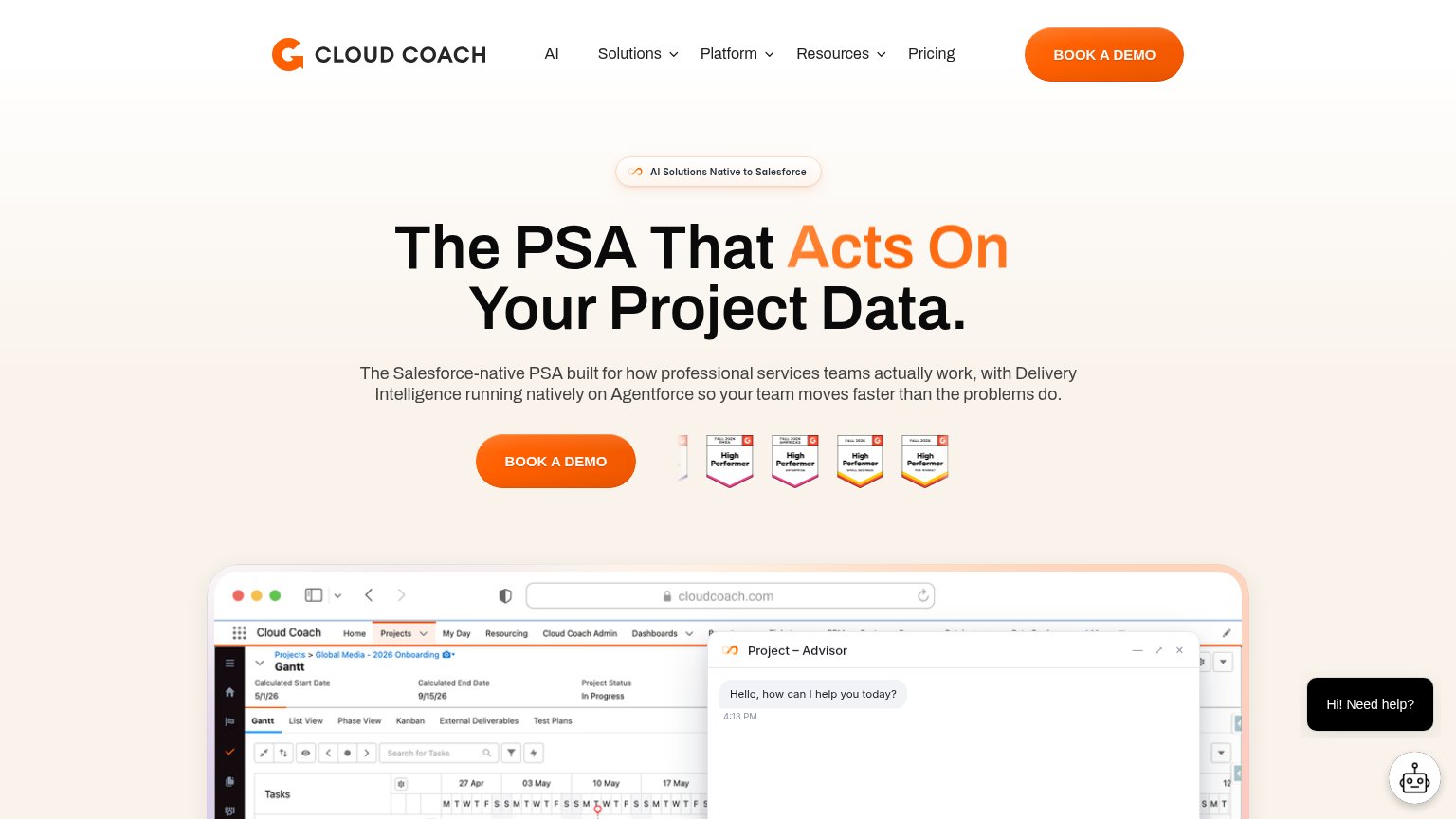
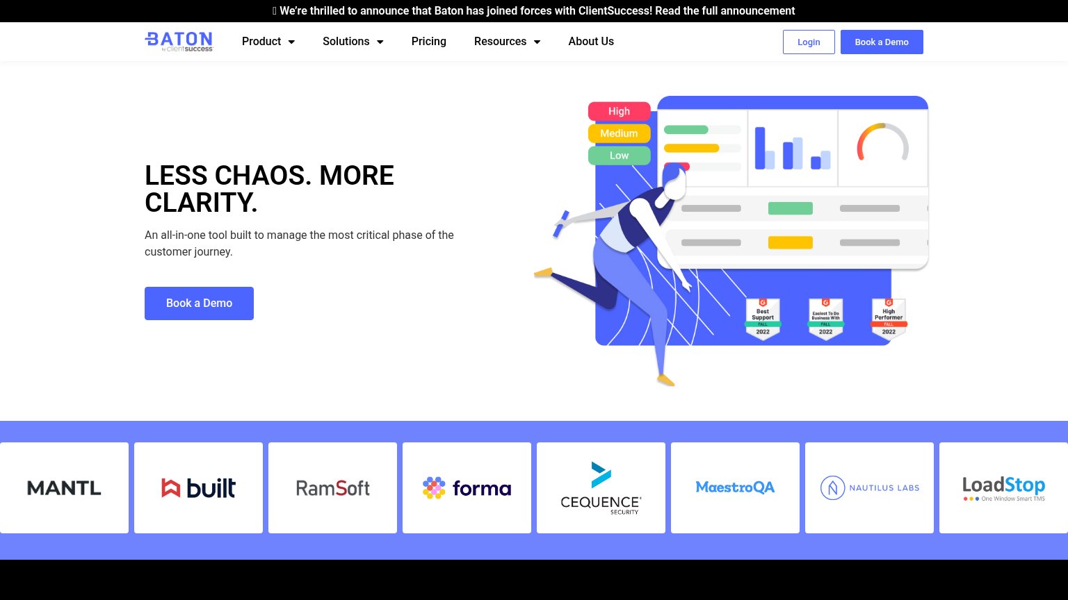

| Trust read | |
|---|---|
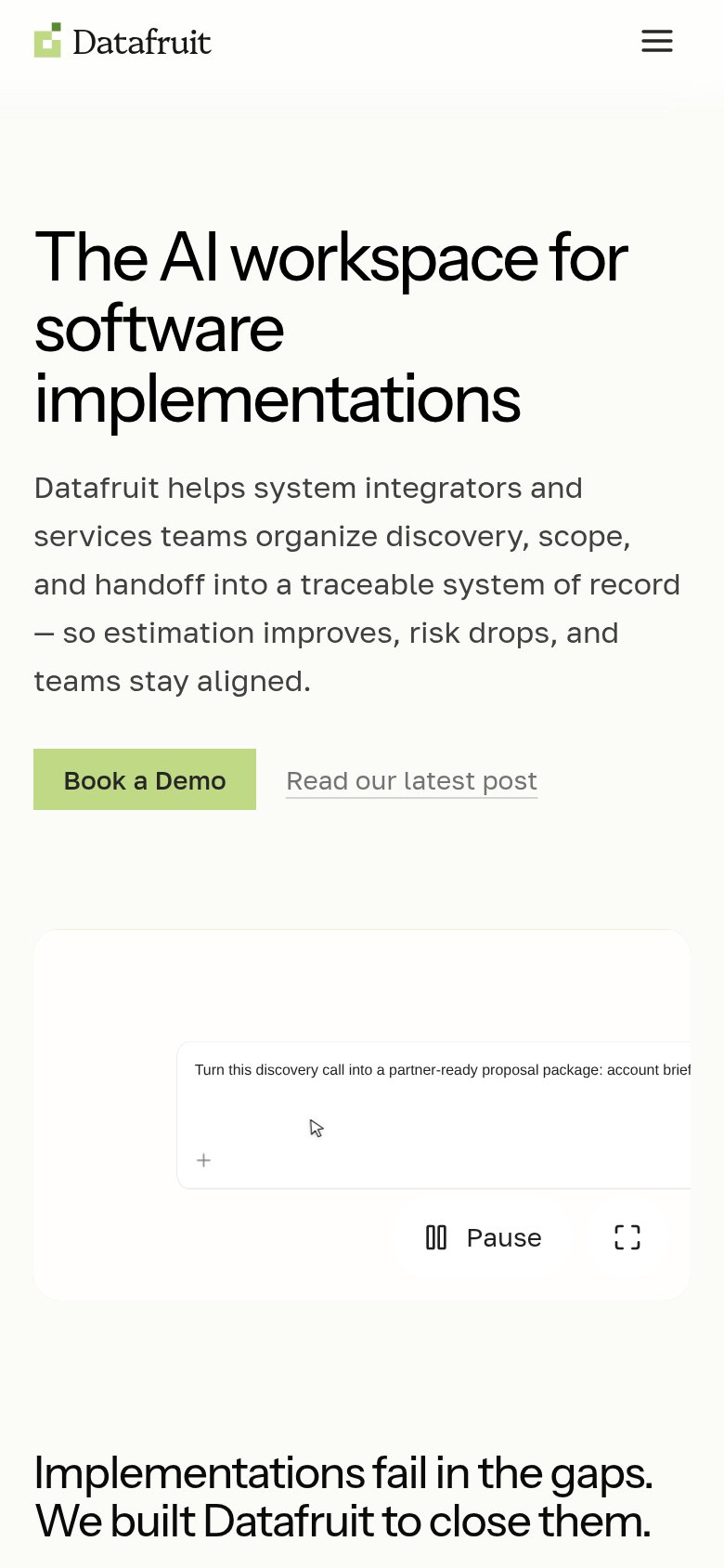
| Datafruit | Embedded product demo with the typed prompt "Turn this discovery call into a partner-ready proposal package" |
| RUNS ON SALESFORCE | |
| No visible trust signal identified. | |
| No visible trust signal identified. | |
| Customer logo strip: MANTL, Built, RamSoft, Forma, Cequence Security, MaestroQA, Nautilus Labs, LoadStop | |
| G2 Fall 2026 badge row ("High Performer", "Fastest Implementation", "Best Support") next to the BOOK A DEMO CTA |
Copy, size, verb, cost-feel — does the primary CTA earn the click?
Problems
Title, subtitle, hero — do they sell the product's true value?
The AI workspace for software implementations
Datafruit helps system integrators and services teams organize discovery, scope, and handoff into a traceable system of record — so estimation improves, risk drops, and teams stay aligned.
Working
Could improve
The phone experience as a first-class citizen.
 123
Does the design help or inhibit what the page is trying to say?
123You need a lazyweb account to add your product, do a growth audit, create backlog and more
Sign me in to my Lazyweb report hub. Fetch https://www.lazyweb.com/hub/agent/sign-in.md and follow its instructions exactly. If you can't fetch URLs, tell me and I'll paste the instructions instead.
Lazyweb MCP
Step 1 of 2 · your login
Where should we send your reports? This email becomes your login on lazyweb.com — everything your agent makes lands in your workspace.
That doesn't look like an email — check it and try again.
No password, no spam — one workspace link now, then your agent command.
Step 2 of 2 · your agent
Paste this into your agent. Claude Code, Codex, Cursor, or another MCP-capable agent opens the link and sets itself up. Data access is plan-dependent.
Generating your agent command...
Free account
We’ll add Datafruit as your product and bring this score into your workspace. You can change it later in Settings.