
Your landing page’s weakest score is Trust.
How RASPIRE ranks
72Growth scoreupdated
category scores
category scoresShowHide
Score over time
Trust
58FairProof that the product is real, competent, and safe to try.


| Trust read | |
|---|---|
| RASPIRE | "BACKED BY Y COMBINATOR" badge above the hero headline |
| Appdome dashboard mockup on the monitor ("Hello Tom, Meet Your New AI Agent Team") | |
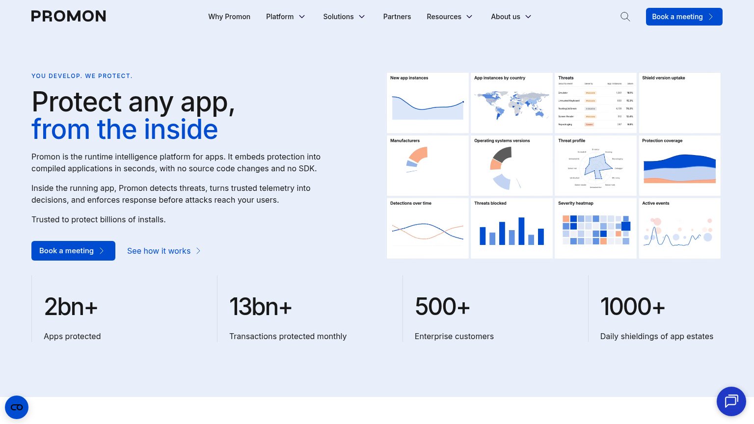
| "2bn+ Apps protected / 13bn+ Transactions protected monthly / 500+ Enterprise customers" stats band | |
| Banner: "Guardsquare Acquires Extended Threat Defense (XTD) Technology & Assets From Verimatrix" | |
| Customer logo strip under "Securing the best of the best" (TELUS, IMAX, Megacable, Etisalat, A1, RTL Lëtzebuerg) | |
| "New: 2026 Global Mobile Threat Report" original research offer in the hero |
CTA
64FairCopy, size, verb, cost-feel — does the primary CTA earn the click?

Problems
- demo ask feels costly, sales-gated
- no low-commitment product entry
- weak contrast vs secondary CTA
Value props
78FairTitle, subtitle, hero — do they sell the product's true value?
RASPIRE’s headline undersells
Security that works every time your app does.
No-code runtime protection for Android and iOS apps. AI-configured defenses protect every release from tampering, reverse engineering, and runtime abuse without touching source code.
Working
- Subhead names threats and platforms precisely
- 'Without touching source code' is a sharp hook
- Dashboard hero shows the product working
Could improve
- H1 is a vague tautology, no specifics
- No numbers or proof in headline copy
- YC badge is only trust signal in fold
Mobile web
78FairThe phone experience as a first-class citizen.
 12
- Book a Demo button — Desktop-proportioned button floats at ~40% width; should stretch near-full-bleed for the thumb.
- Five-line subheadline — Gray paragraph runs five lines on the phone, pushing the CTA pair to the bottom of the fold.
Information hierarchy
82StrongDoes the design help or inhibit what the page is trying to say?
123- See how it works button — Styled at nearly the same size and weight as 'Book a Demo', splitting click intent at the decision moment.
- Five-link nav row — FEATURES through BLOG offers five exits before the visitor reaches the headline, leaking attention from the demo CTA.
- Book a Demo button — Small footprint relative to the massive headline; the sole conversion surface reads visually subordinate to the copy above it.