
Your landing page’s weakest score is Mobile web.
How Promon ranks
70Growth scoreupdated
category scores
category scoresShowHide
Mobile web
62FairThe phone experience as a first-class citizen.
 1234
- Stacked body paragraphs — Two full desktop paragraphs plus a tagline push the primary CTA out of the first viewport.
- Book a meeting button — Desktop-proportioned width floats in the column instead of a full-bleed thumb target, and it sits below the fold.
- Bottom-left circle widget — Second floating bubble mirrors the chat icon bottom-right, covering the dashboard thumbnails on both sides.
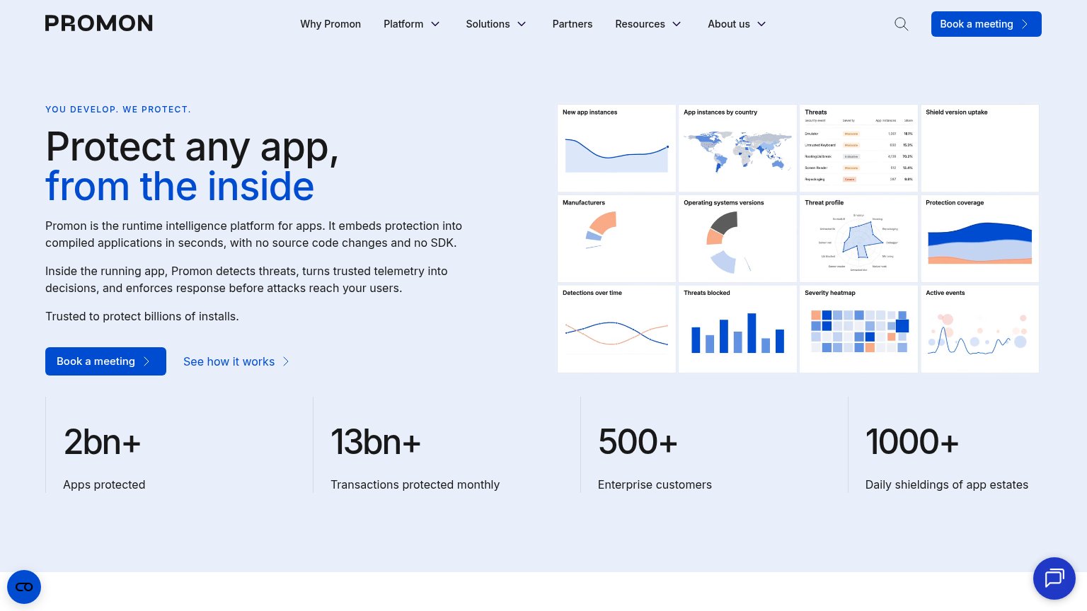
- Dashboard thumbnail grid — Twelve desktop-scale chart tiles shrink to illegible size in the phone column.
Information hierarchy
68FairDoes the design help or inhibit what the page is trying to say?
 1234
- Duplicate Book a meeting — The nav's 'Book a meeting' button matches the hero CTA's weight, splitting one action across two equal blue targets.
- Five dropdown nav items — Why Promon, Platform, Solutions, Resources, and About us each open dropdowns, offering many exit paths before the hero CTA.
- Twelve-tile dashboard grid — Twelve same-size chart thumbnails compete at equal weight; no single tile communicates the outcome, so the visual reads as noise.
- Three-paragraph hero subtext — Three stacked paragraphs before the CTA slow the scan; the second and third repeat the first's claim.
CTA
68FairCopy, size, verb, cost-feel — does the primary CTA earn the click?
How Promon compares
Recommended rewrites
Trust
68FairProof that the product is real, competent, and safe to try.
How Promon compares
Trust read
Value props
82StrongTitle, subtitle, hero — do they sell the product's true value?
Promon’s headline
Protect any app, from the inside
Promon is the runtime intelligence platform for apps. It embeds protection into compiled applications in seconds, with no source code changes and no SDK.
Working
Could improve