
Your landing page’s weakest score is Trust.
How InstaAgent ranks
- 1.
AdCreative.ai80
- 2.
Omneky76
- 3.
Smartly64
- 4.
InstaAgent59
- 5.
Pencil59
59Growth scoreupdated
category scores
category scoresShowHide
Score over time
Trust
48PoorProof that the product is real, competent, and safe to try.
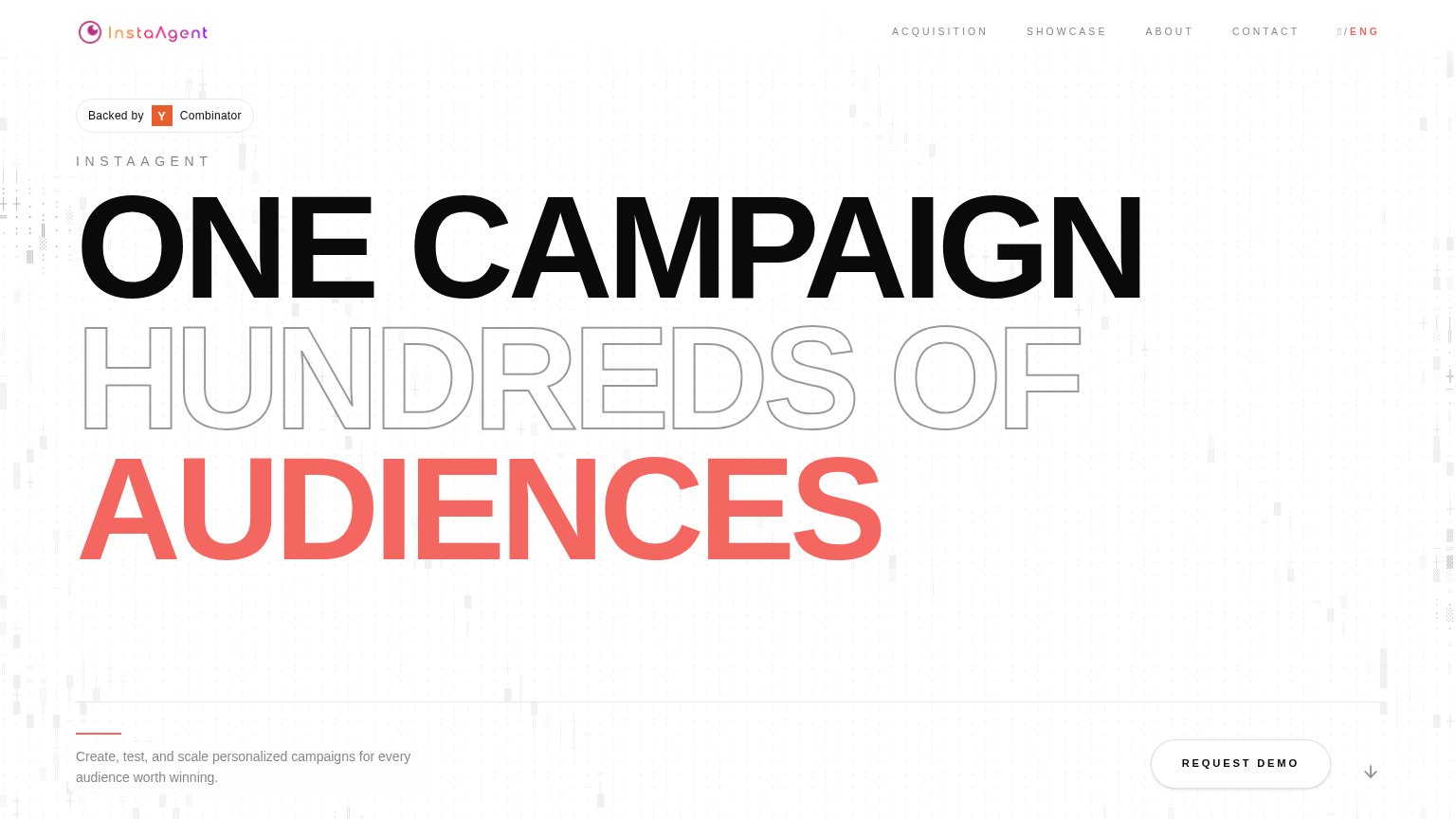
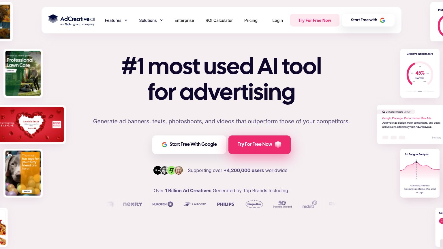
| Trust read | |
|---|---|
| InstaAgent | "Backed by Y Combinator" badge |
| "Over 1 Billion Ad Creatives Generated by Top Brands Including:" logo row with Philips, Nurofen, La Poste, Häagen-Dazs, | |
| No visible trust signal identified. | |
| No visible trust signal identified. | |
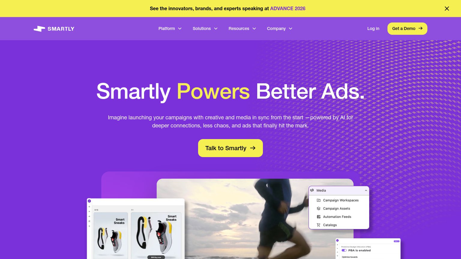
| Real product UI screenshots showing "PBA is enabled" budget-allocation panel and Campaign Workspaces media menu |
CTA
58FairCopy, size, verb, cost-feel — does the primary CTA earn the click?
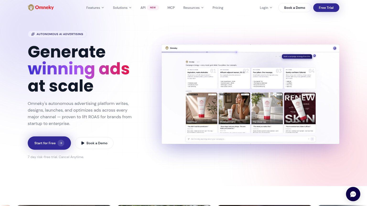
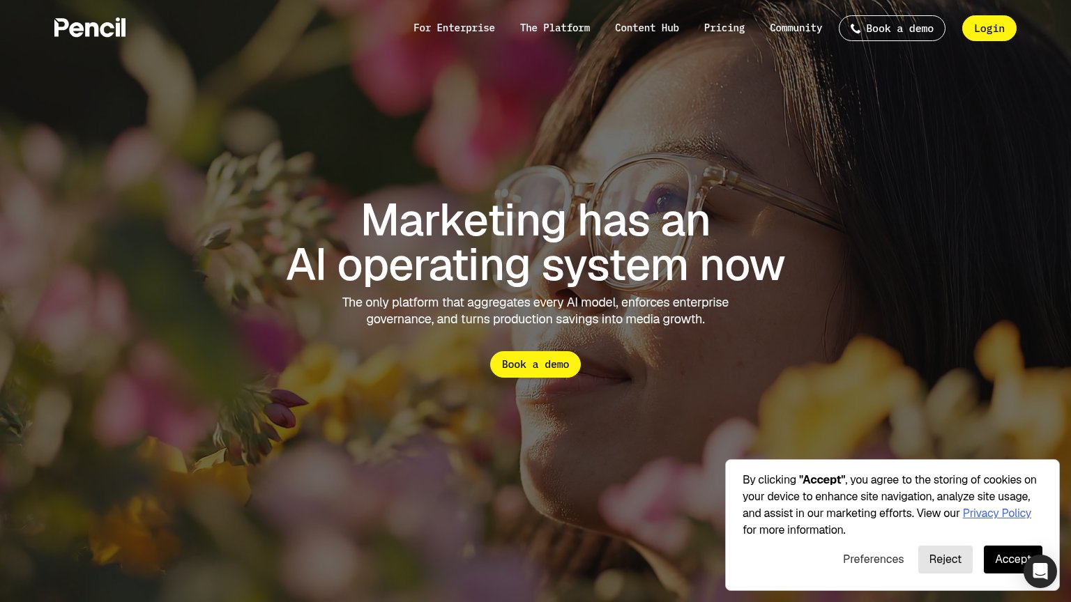
Problems
- 'Request' feels costly, sales-gated
- visually quiet vs huge headline
- no low-commitment alternative
- click delivers a form, not value
Mobile web
58FairThe phone experience as a first-class citizen.
 123
- Request Demo button — Primary CTA sits roughly two viewports below the fold, invisible on landing.
- Ticker-glyph artwork band — A tall decorative glyph block pushes the subhead and CTA far down the page.
- Faded headline lines — Outlined 'HUNDREDS OF' text has near-zero contrast and is hard to read on mobile.
Information hierarchy
64FairDoes the design help or inhibit what the page is trying to say?
1234- Request Demo button — Primary CTA is a ghost outline in the bottom-right corner — smallest visual weight on the page and last in the scan path.
- Hundreds Of line — Hollow outline styling on the middle headline line drops it to near-invisible, breaking the reading flow of the three-line promise.
- Subheadline copy — The only sentence explaining what InstaAgent does is small gray text pinned at the fold edge, easy to skip entirely.
- Top nav links — Four equal-weight nav links plus a language toggle are the most prominent interactive elements — all exits, no conversion path.
Value props
68FairTitle, subtitle, hero — do they sell the product's true value?
InstaAgent’s headline sells
ONE CAMPAIGN HUNDREDS OF AUDIENCES
Create, test, and scale personalized campaigns for every audience worth winning.
Working
- Six-word contrast nails scale promise
- Subhead names create/test/scale workflow
- YC badge adds instant credibility
Could improve
- No product visual — hero is decoration
- Zero concrete metrics or proof points
- "Audience worth winning" is vague poetry