
Your landing page’s weakest score is Trust.
How Imperfect ranks
- 1.
Athletica79
- 2.
Imperfect76
- 3.
Runna75
- 4.
Humango70
- 5.
TrainAsONE68
76Growth scoreupdated
category scores
category scoresShowHide
Score over time
Trust
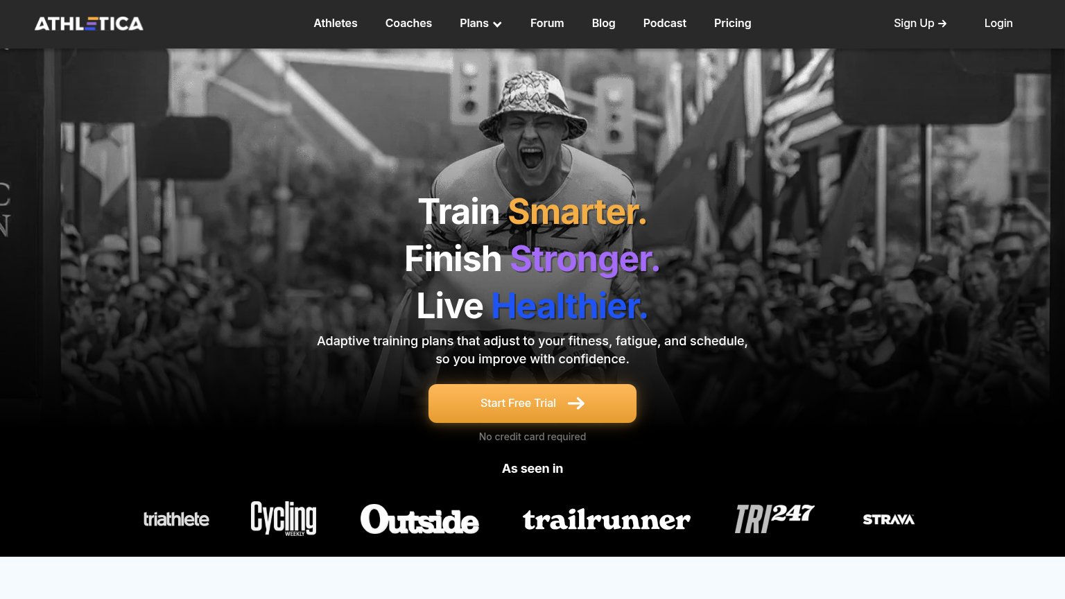
52FairProof that the product is real, competent, and safe to try.


| Trust read | |
|---|---|
| Imperfect | Detailed app UI screenshots showing the "Set your goal" race search with the "Woodside Crossover" event and distance opt |
| Detailed real app screenshots including "TCS New York City Marathon Plan" and GPS route UI | |
| "Harness intelligence from over 100 million kilometres of real-world data" | |
| App UI screenshots showing personalized plan ("Amy, it's time to start training!") with workouts and health metrics (56 | |
| "As seen in" press logo bar (Triathlete, Cycling Weekly, Outside, Trail Runner, TRI247, Strava) |
Value props
76FairTitle, subtitle, hero — do they sell the product's true value?
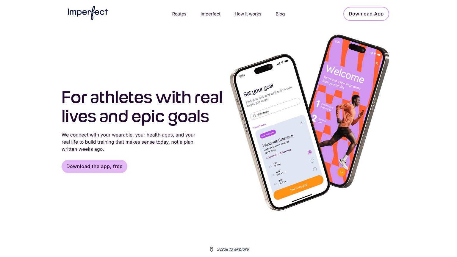
Imperfect’s headline sells
For athletes with real lives and epic goals
We connect with your wearable, your health apps, and your real life to build training that makes sense today, not a plan written weeks ago.
Working
- Subhead names real mechanism: wearable-driven plans
- "Not a plan written weeks ago" hits the pain
- Mockups demonstrate goal setup, not decoration
Could improve
- H1 names the audience, not the product's job
- Zero numbers or proof points in the fold
- No named outcome like finishing a race
Information hierarchy
82StrongDoes the design help or inhibit what the page is trying to say?
 123
- Header Download App pill — Duplicates the hero CTA at near-equal visual weight, splitting the scan between two download buttons.
- Four-link nav row — Routes, Imperfect, How it works, and Blog offer four exit paths before the visitor reaches the hero CTA.
- Hero CTA button — Pale lilac fill on white gives it soft contrast; it reads quieter than the headline it should follow.
CTA
82StrongCopy, size, verb, cost-feel — does the primary CTA earn the click?
Problems
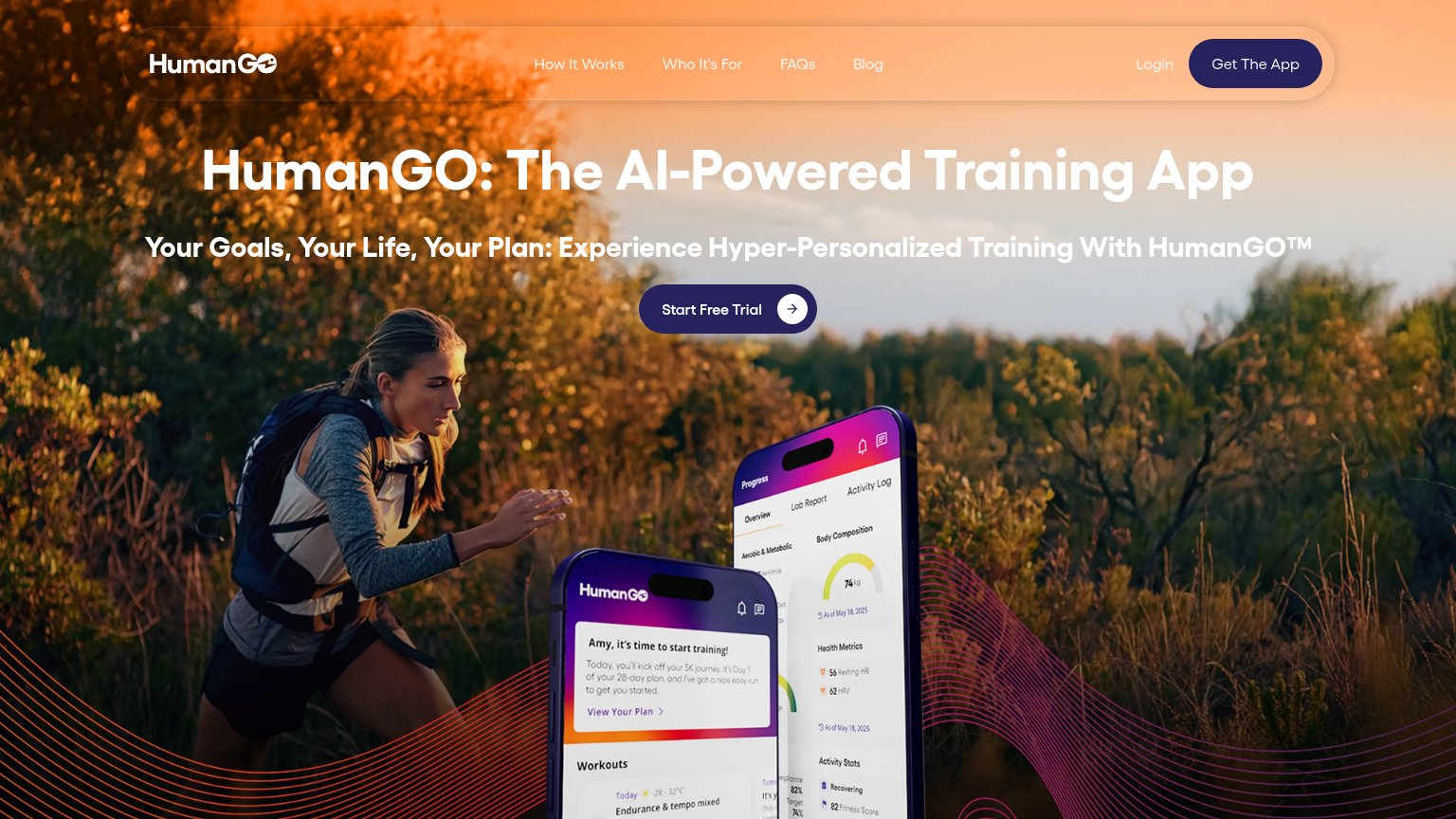
- 4 words — one past ideal
- nav says 'Download App', not same label
- nav variant drops 'free'
Mobile web
86StrongThe phone experience as a first-class citizen.
No specific callouts
Imperfect's mobile fold is close to textbook: one headline ("For athletes with real lives and epic goals"), one supporting paragraph, and the primary CTA "Download the app, free" all visible and tappable in the first viewport with no pop-ups, cookie banners, or chat bubbles in the way. The nav collapses to a clean logo-plus-hamburger row that stays out of the hero, and the headline scales down to two comfortable lines instead of a cramped desktop wrap. The one gap is CTA sizing: "Download the app, free" is rendered as a centered pill at roughly half the column width rather than the near-full-bleed, thumb-friendly button mobile allows — stretching it edge-to-edge is the biggest lever left for this category.