
Your landing page’s weakest score is CTA.
How Foresight ranks
- 1.
Evidenza81
- 2.
Foresight75
- 3.
Synthetic Users71
- 4.
Yabble61
75Growth scoreupdated
category scores
category scoresShowHide
Score over time
CTA
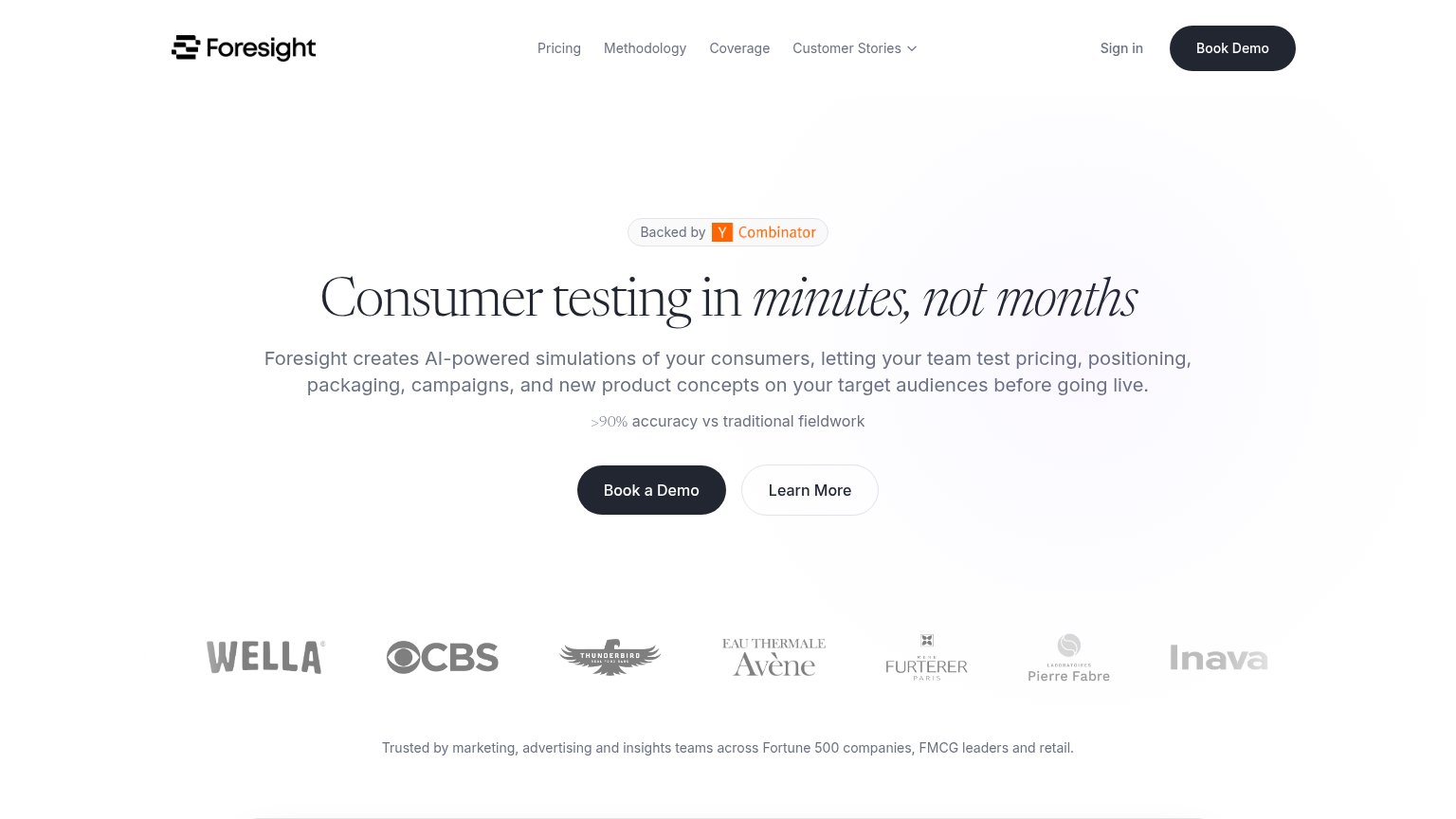
68FairCopy, size, verb, cost-feel — does the primary CTA earn the click?
Problems
- demo booking feels costly
- no product value in the click
- nav label differs: 'Book Demo'
- 'Learn More' secondary is vague
Trust
72FairProof that the product is real, competent, and safe to try.
| Trust read | |
|---|---|
| Foresight | Customer logo row (Wella, CBS, Avène, Pierre Fabre, Inava) with caption "Trusted by marketing, advertising and insights |
| "The AI feedback lined up with human feedback over 95% of the time." — Adam King, Behavioural Scientist | |
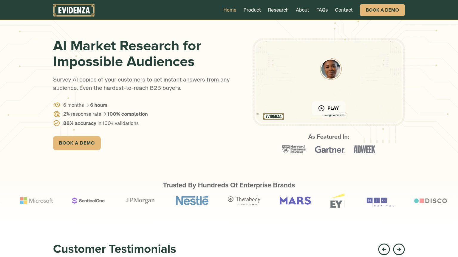
| "Trusted By Hundreds Of Enterprise Brands" logo wall with Microsoft, J.P. Morgan, Nestlé, Mars, and EY | |
| No visible trust signal identified. |
Mobile web
72FairThe phone experience as a first-class citizen.
 123
- Five-line subheadline block — Desktop-length paragraph wraps into five lines and pushes the primary CTA to the bottom of the fold.
- Book a Demo button — Half-width and paired with Learn More instead of a full-bleed thumb-friendly primary CTA.
- Clipped Thunderbird logo — Trust logo is cut off mid-word at the right edge, an unpolished mobile carousel state.
Information hierarchy
80StrongDoes the design help or inhibit what the page is trying to say?
123- Five-link navigation row — Pricing, Methodology, Coverage, Customer Stories and Sign in offer five exits at equal weight before the demo CTA.
- Learn More button — Outlined pill sits at near-equal size beside Book a Demo, splitting the single action into a choice.
- Four-line subheadline — One long sentence listing five use cases is the densest block on the page and slows the scan to the CTA.
Value props
82StrongTitle, subtitle, hero — do they sell the product's true value?
Foresight’s headline sells
Consumer testing in minutes, not months
Foresight creates AI-powered simulations of your consumers, letting your team test pricing, positioning, packaging, campaigns, and new product concepts on your target audiences before going live.
Working
- Speed contrast hits real pain
- Subhead lists concrete use cases
- >90% accuracy preempts skepticism
Could improve
- No product visual in the fold
- 'Minutes' claim never demonstrated
- Accuracy stat lacks a source