
Your landing page’s weakest score is Trust.
How E1O ranks
58Growth scoreupdated
category scores
category scoresShowHide
Score over time
Trust
44PoorProof that the product is real, competent, and safe to try.


| Trust read | |
|---|---|
| E1O | Product shot of the glasses with the "NO CAMERA." annotation reinforcing the camera-free claim |
| implicit context Ray-Ban Meta (Meta AI Glasses) may benefit from pre-existing familiarity among its target audience. | |
| No visible trust signal identified. | |
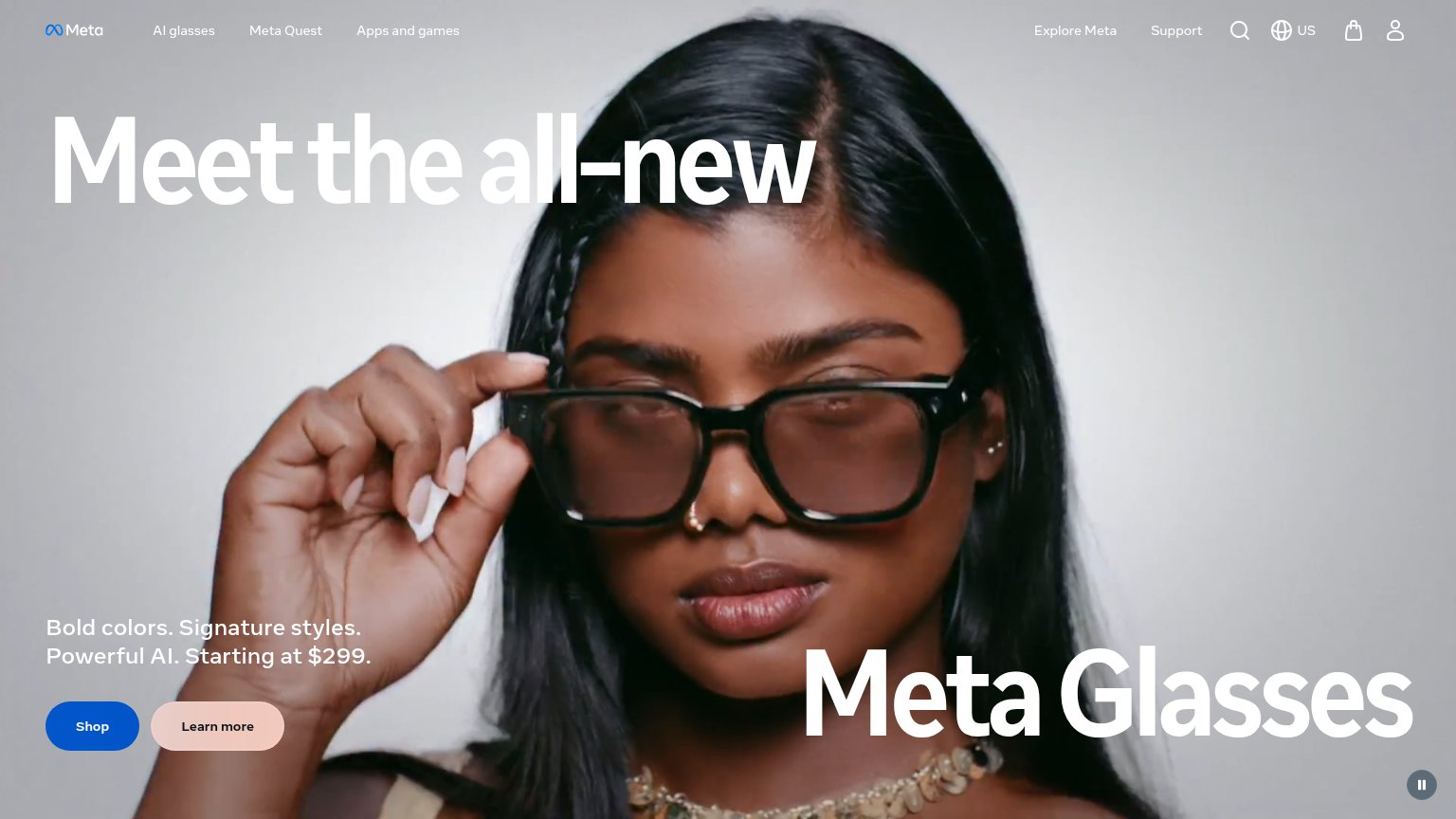
| Real product photography of the glasses hardware in the hero plus a visible multi-product lineup (Rokid AR Spatial, Roki | |
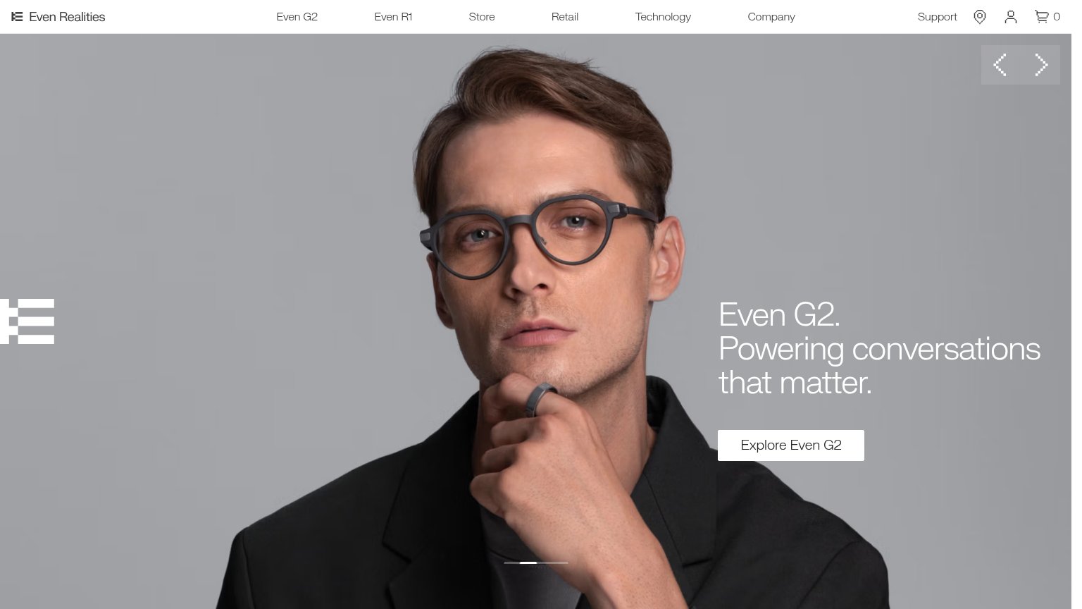
| In-lens product UI demo showing a live schedule overlay ("Lunch with Alex, 12:30 PM") inside the G2 glasses | |
| No visible trust signal identified. |
CTA
52FairCopy, size, verb, cost-feel — does the primary CTA earn the click?
Problems
- no verb — reads as a label
- nav-link size, no hero button
- waitlist feel, unclear payoff
- hero CTAs only scroll the page
Mobile web
58FairThe phone experience as a first-class citizen.
 123
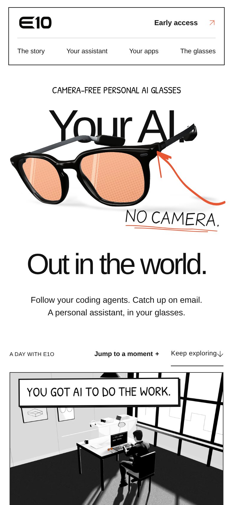
- Uncollapsed nav row — All four desktop links ("The story", "E1O's assistant", "E1O's apps", "The glasses") sit in a full-width row under the logo instead of a hamburger, creating a double-decker header that eats the top of t
- "E1O's AI." headline occluded — The glasses render covers most of the headline so the sentence reads as fragments; on mobile the copy is nearly illegible.
- Jump/explore control row — "Jump to a moment +" and "Keep exploring" are two competing text controls crammed on one line, neither sized as a thumb target.
Information hierarchy
62FairDoes the design help or inhibit what the page is trying to say?
1234- Early access link — The sole conversion path is a small text link with an arrow, styled at the same weight as nav items — invisible in a one-second scan.
- Glasses overlap headline — The product render sits on top of "E1O's AI," obscuring the headline's first line and forcing the visitor to reconstruct the message.
- Subheadline / CTA row — The value-prop copy and "See a day with E1O" sit at opposite margins in small type, splitting the fold's only actionable moment across the page.
- Jump to moment controls — "Jump to a moment" and "Keep exploring" add two more equal-weight text links competing with an already weak Early access CTA.
Value props
74FairTitle, subtitle, hero — do they sell the product's true value?
E1O’s headline sells
Your AI. Out in the world.
Follow your coding agents. Catch up on email. A personal assistant, in your glasses.
Working
- "NO CAMERA." annotation defuses privacy fear visually
- Eyebrow names the category in five words
- Subhead lists real use cases, not buzzwords
Could improve
- No numbers or proof points anywhere in fold
- Hero shows hardware, not the assistant working
- "Follow E1O's coding agents" assumes dev context