
Your landing page’s weakest score is CTA.
How Dayjob ranks
68Growth scoreupdated
category scores
category scoresShowHide
Score over time
CTA
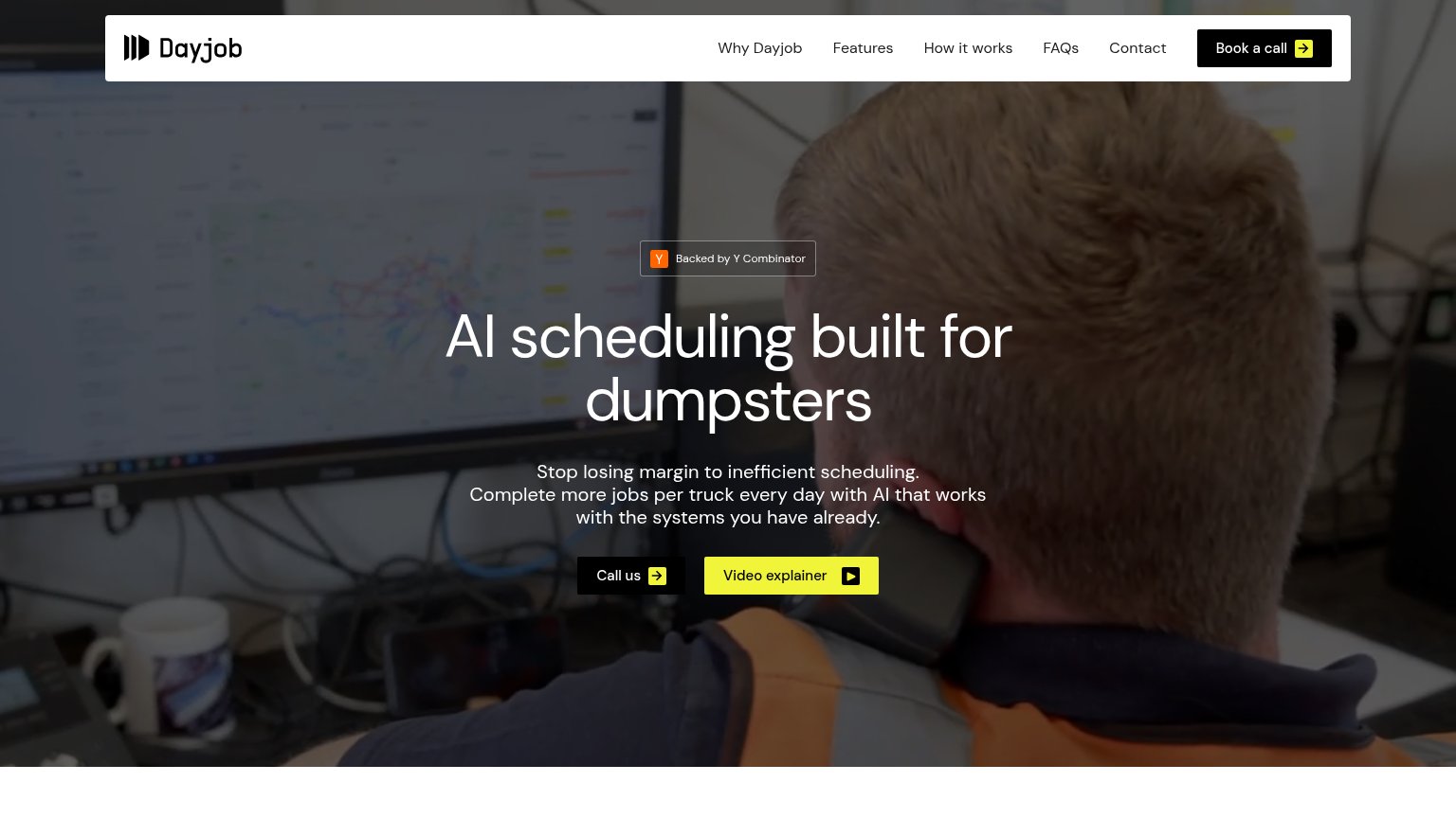
58FairCopy, size, verb, cost-feel — does the primary CTA earn the click?

Problems
- phone call feels costly
- nav says 'Book a call' — inconsistent
- secondary CTA visually dominates
- no payoff implied in label
Trust
58FairProof that the product is real, competent, and safe to try.

| Trust read | |
|---|---|
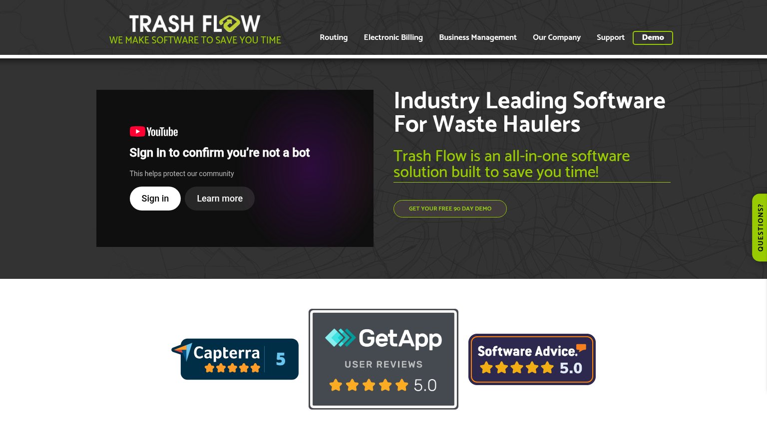
| Dayjob | "Backed by Y Combinator" badge above the hero headline |
| 4.9 ★★★★★ 84 Google Reviews badge below the mobile hero CTA | |
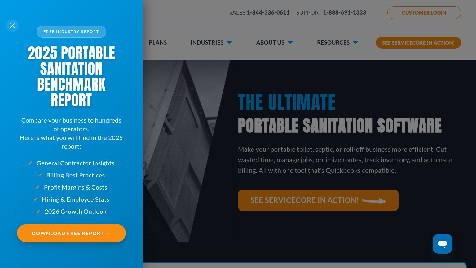
| "Compare your business to hundreds of operators" claim in the 2025 Benchmark Report overlay, alongside dedicated sales a | |
| "4.6" star rating badge with "Trusted by 10k+ users" | |
| Embedded product video player in the hero (CRO Software Solutions video) | |
| Capterra 5 / GetApp 5.0 / Software Advice 5.0 review badges |
Information hierarchy
72FairDoes the design help or inhibit what the page is trying to say?
1234- Video explainer button — Yellow fill makes this secondary action the brightest element, outranking both conversion CTAs.
- Call us button — Black-on-dark-video styling gives the conversion action the weakest contrast in the button row.
- Book a call button — Duplicates the hero's phone ask with a different label, splitting one action into two competing commands.
- Nav link row — Five links sit directly beside the CTA at equal weight, offering exits before the pitch lands.
Value props
76FairTitle, subtitle, hero — do they sell the product's true value?
Dayjob’s headline sells
AI scheduling built for dumpsters
Stop losing margin to inefficient scheduling. Complete more jobs per truck every day with AI that works with the systems you have already.
Working
- Names exact vertical in six words
- Subhead ties pain to margin
- Real ops footage, not stock decor
Could improve
- No number on jobs-per-truck gain
- Only proof is YC badge
- "Systems Dayjob have already" is vague
Mobile web
78FairThe phone experience as a first-class citizen.
 123
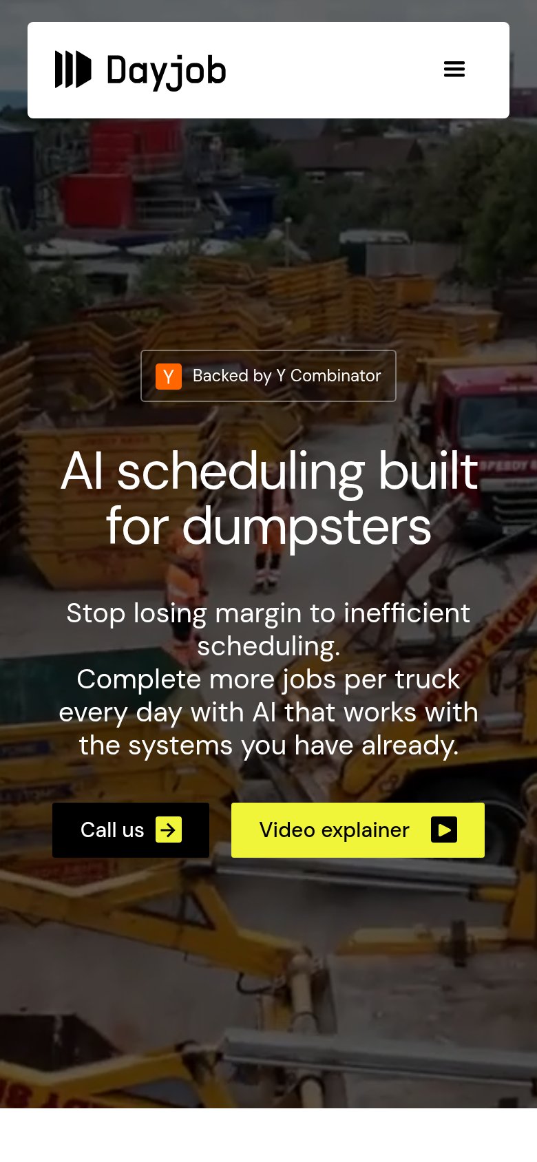
- Six-line subheadline block — Body copy wraps six lines and shoves the CTA row to the fold's bottom edge.
- Split CTA row — The dark 'Call us' button is smaller and dimmer than the yellow 'Video explainer', so the secondary action wins the tap.
- Call us button — Desktop-proportioned half-width button instead of a full-bleed thumb target.