ChertYC P26 landing page report.
← Back to YC P26

Your landing page’s weakest score is Trust.

Fix Trust

Score over time

858075706560Sendblue 68 on Sep 20 (Live)Loop Message 66 on Sep 20 (Live)Textla 79 on Jun 17 (Wayback)Textla 79 on Sep 14 (Wayback)Textla 81 on Sep 20 (Live)Salesmsg 74 on Sep 20 (Live)Chert 73 on Apr 26 (Wayback)Chert 72 on May 25 (Wayback)Chert 72 on Sep 1 (Wayback)Chert 71 on Sep 20 (Live)Apr 26May 25Sep 1Sep 20
Past reportsShow past reportsHide past reports
  1. Sep 20, 202671LiveOverall −1 · Trust +6 · Mobile web −6Viewing
  2. Sep 1, 202672Trust −10 · CTA +6View →
  3. May 25, 202672Overall −1 · Trust +6 · Mobile web −6View →
  4. Apr 26, 202673First tracked report — strongest Mobile web 86, weakest Trust 56View →

Trust

58Fair

Proof that the product is real, competent, and safe to try.

Chert
Sendblue
Salesmsg
Textla
Trust read
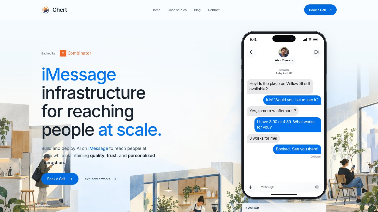
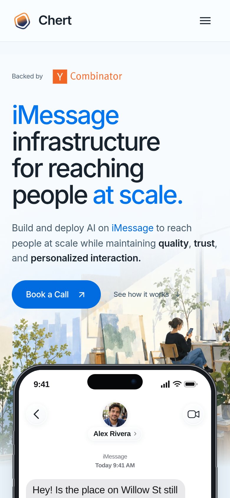
Chert"Backed by Y Combinator" badge above the hero headline
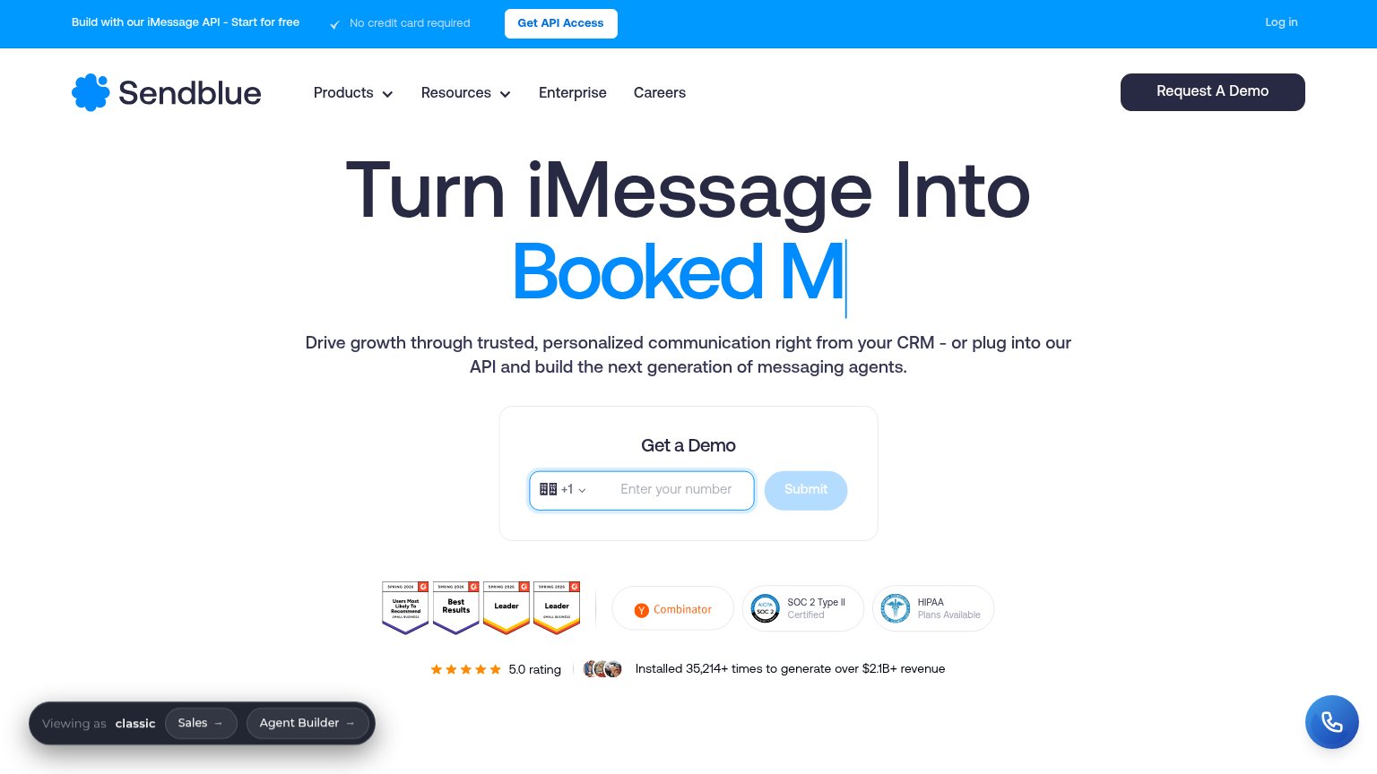
SendblueInstalled 35,214+ times to generate over $2.1B+ revenue
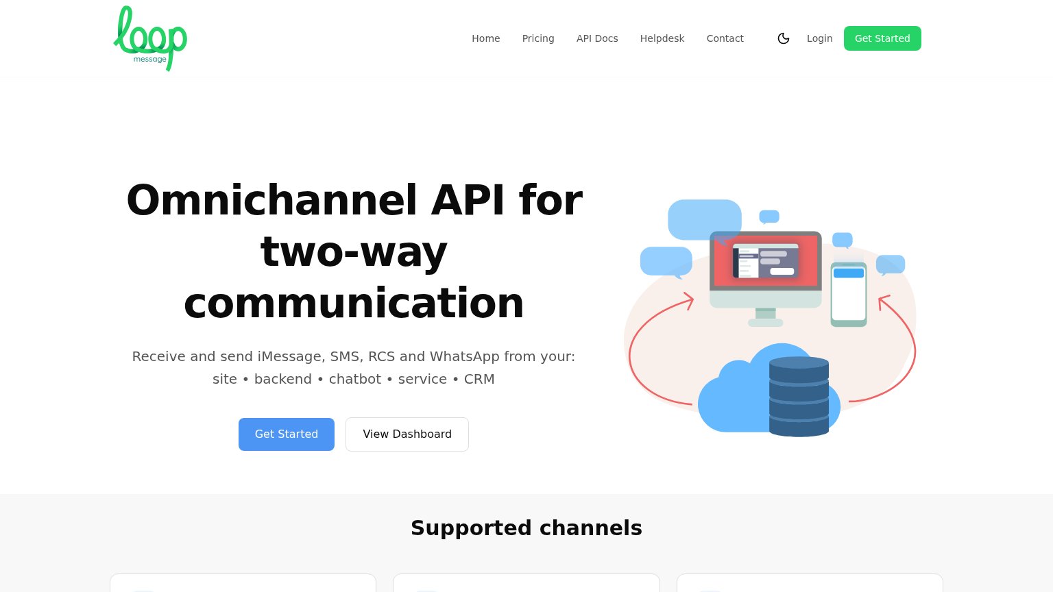
Loop MessageNo visible trust signal identified.
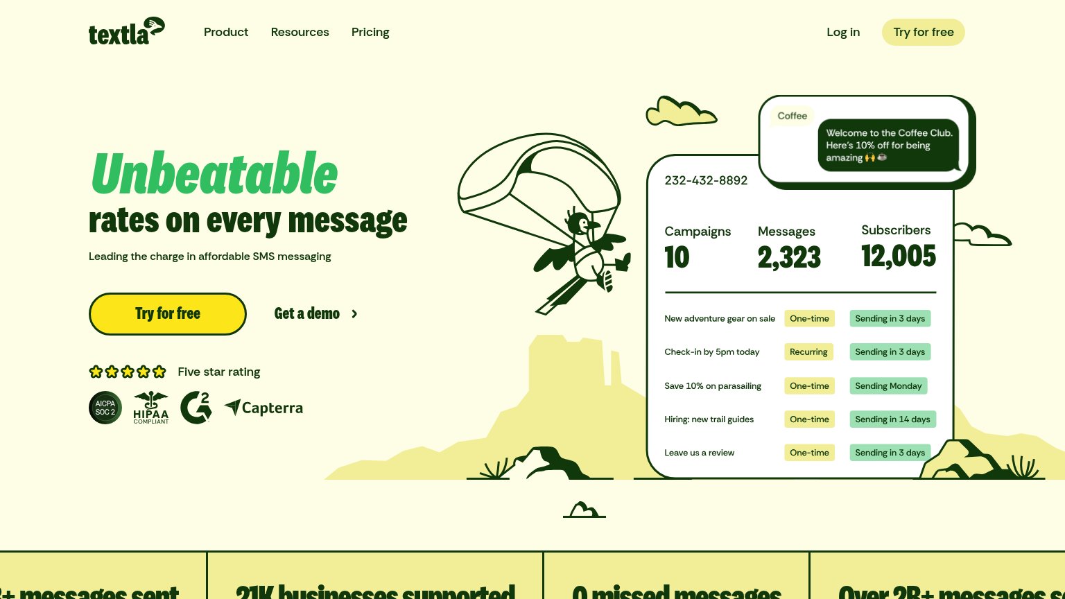
TextlaAICPA SOC 2 and HIPAA Compliant badges alongside G2 and Capterra marks under the hero CTA
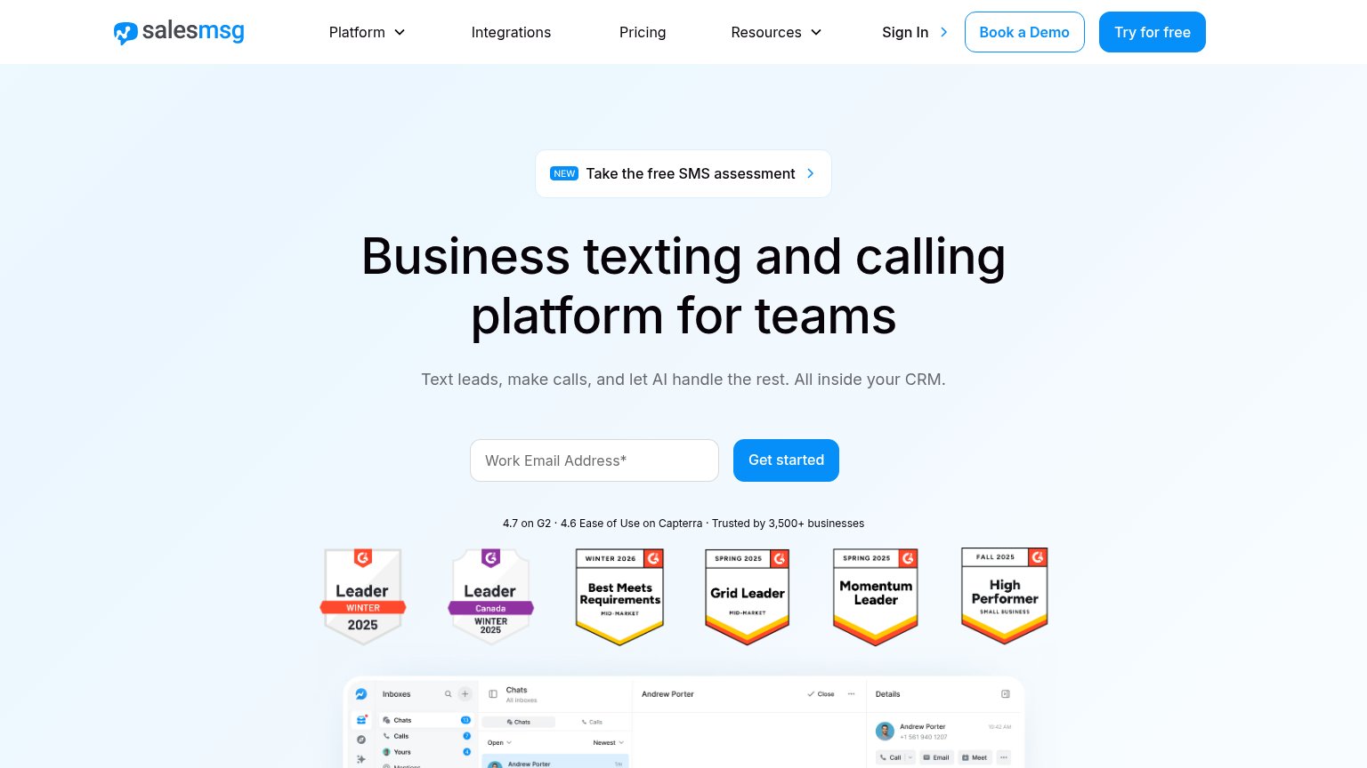
Salesmsg"4.7 on G2 · 4.6 Ease of Use on Capterra · Trusted by 3,500+ businesses" with six G2 award badges

CTA

66Fair

Copy, size, verb, cost-feel — does the primary CTA earn the click?

Chert
Textla
Loop Message
Salesmsg

Problems

  • click feels costly — sales call
  • no value promised for the click
  • no product access before meeting

Value props

72Fair

Title, subtitle, hero — do they sell the product's true value?

Chert’s headline sellsiMessage infrastructure for reaching people at scale.Build and deploy AI on iMessage to reach people at scale while maintaining quality, trust, and personalized interaction.

Working

  • Names the specific channel: iMessage
  • Hero demo shows a real booked conversation
  • YC badge adds instant credibility

Could improve

  • No numbers or proof points anywhere
  • 'quality, trust' is abstract filler
  • 'at scale' repeated in head and subhead

Mobile web

78Fair

The phone experience as a first-class citizen.

Mobile web annotations on the mobile capture12
  1. Hero headline block — Headline wraps into four tall lines and pushes 'Book a Call' to the bottom edge of the fold.
  2. Book a Call button — Roughly half-width and paired with a secondary link on the same row instead of near-full-bleed stacking.

Information hierarchy

82Strong

Does the design help or inhibit what the page is trying to say?

Information hierarchy annotations on the desktop capture123
  1. Subheadline over illustration — The line 'Build and deploy AI on iMessage…' runs over the busy background art, cutting legibility of the value prop.
  2. Four-link nav row — Home, Case studies, Blog, Contact plus a duplicate Book a Call give six exits competing with the hero CTA.
  3. See how it works — Same-row secondary link pulls scroll attention away from Book a Call at the decision moment.