Aseon LabsYC P26 landing page report.
← Back to YC P26

Your landing page’s weakest score is CTA.

Fix CTA

Score over time

706560555045RobCo 65 on Sep 20 (Live)EV Safe Charge (ZiGGY) 51 on Apr 17 (Wayback)EV Safe Charge (ZiGGY) 52 on Sep 20 (Live)Stäubli (robotic quick-connect EV charging) 49 on Sep 20 (Live)Aseon Labs 50 on May 12 (Wayback)Aseon Labs 54 on Jun 26 (Wayback)Aseon Labs 52 on Jul 11 (Wayback)Aseon Labs 53 on Sep 20 (Live)May 12Jun 26Jul 11Sep 20
Past reportsShow past reportsHide past reports
  1. Sep 20, 202653LiveOverall +1 · Trust +4 · Mobile web +4Viewing
  2. Jul 11, 202652Overall −2 · CTA −10 · Value props +4View →
  3. Jun 26, 202654Overall +4 · CTA +12 · Trust +6View →
  4. May 12, 202650First tracked report — strongest Value props 72, weakest CTA 30View →

CTA

32Poor

Copy, size, verb, cost-feel — does the primary CTA earn the click?

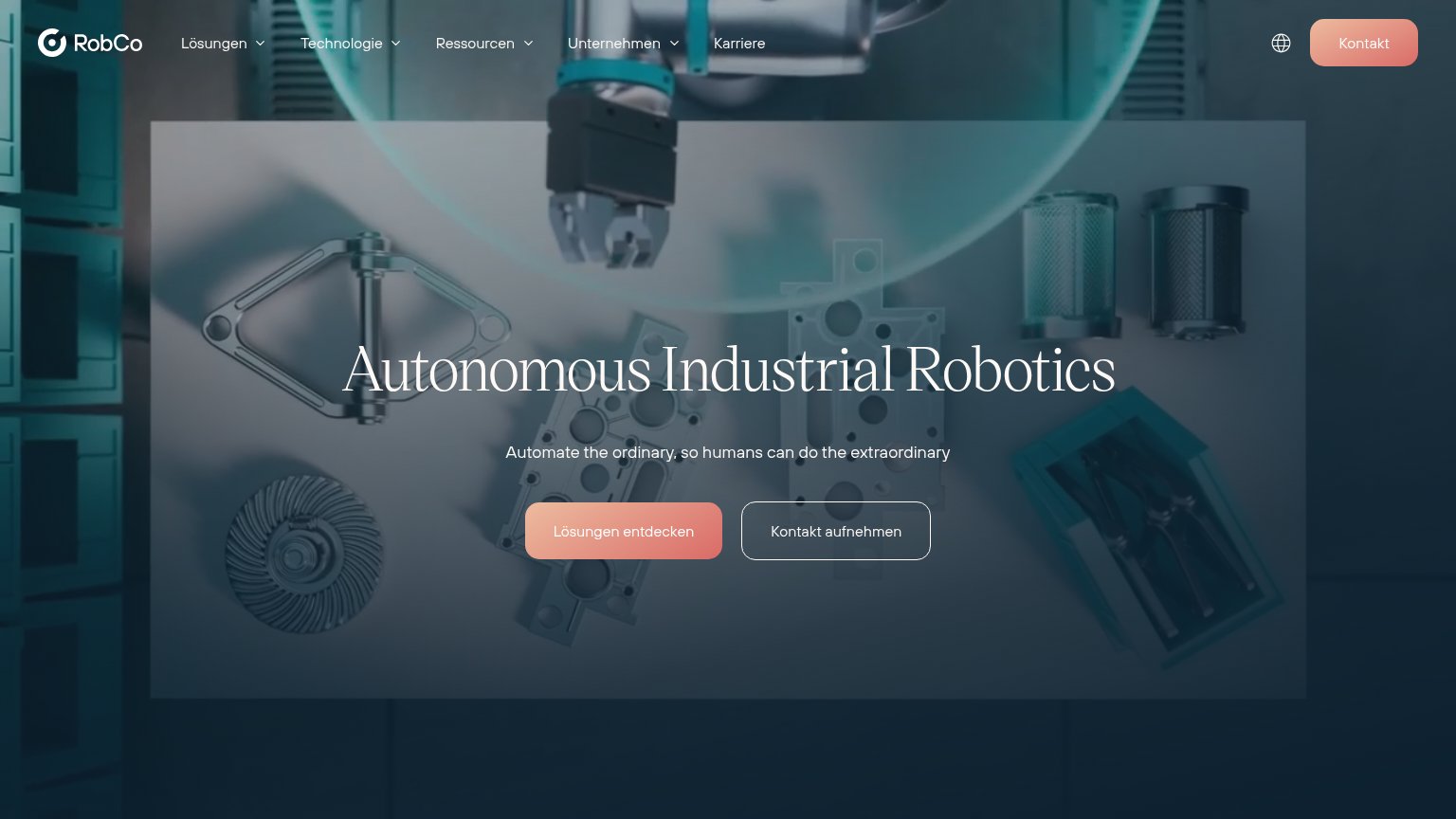
RobCo
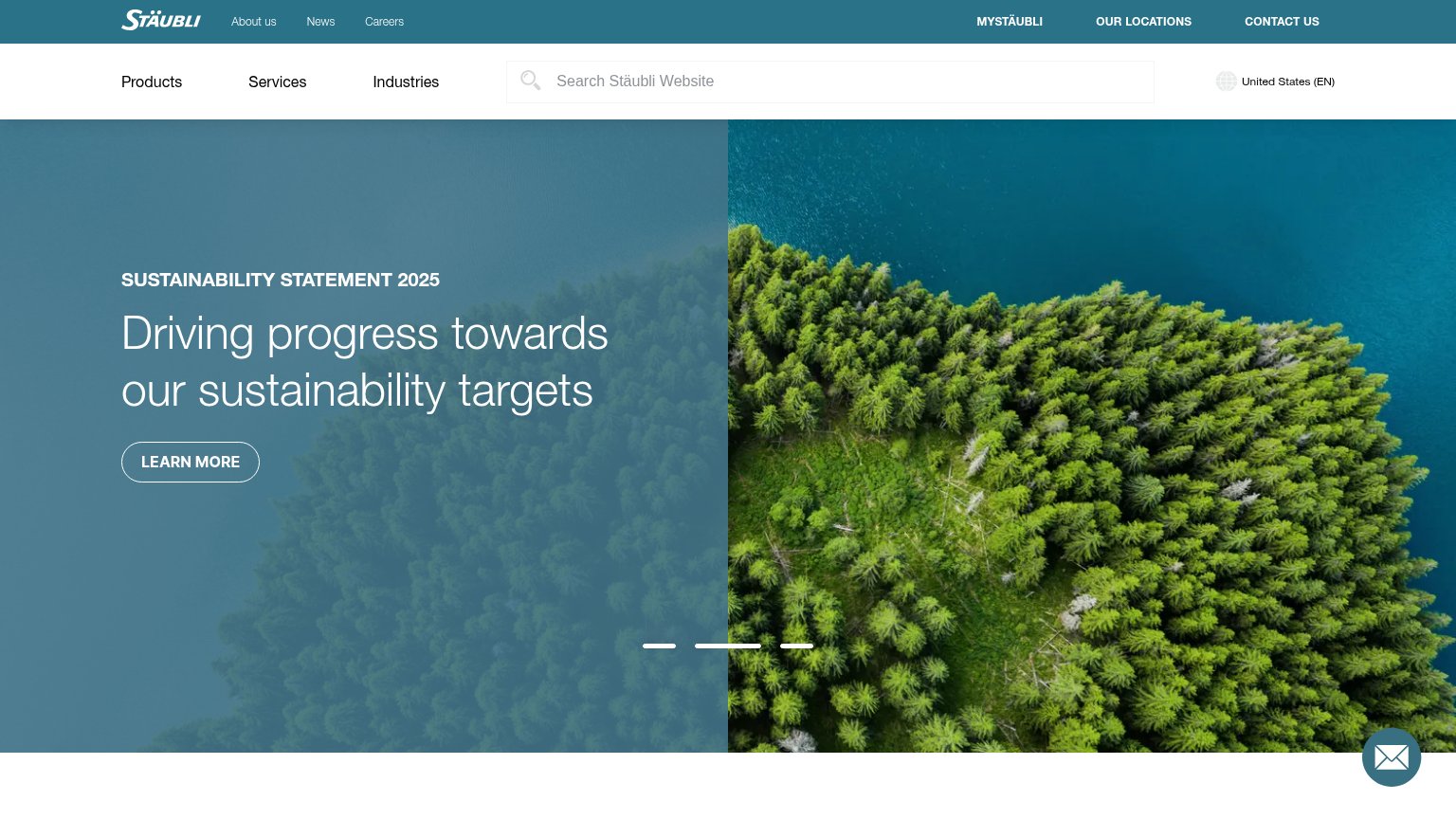
Stäubli (robotic quick-connect EV charging)
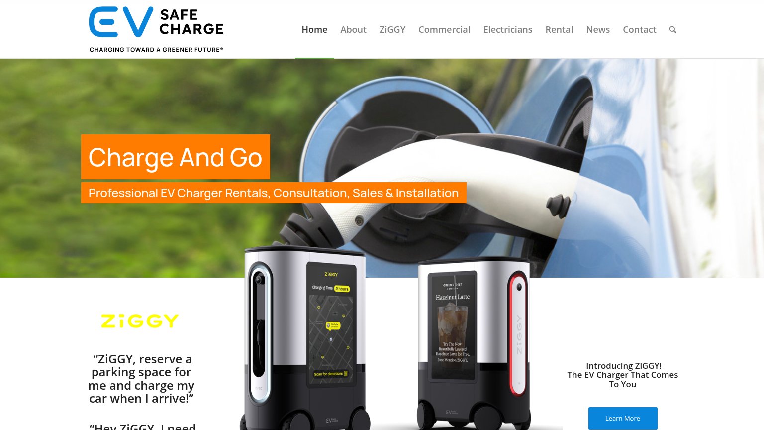
EV Safe Charge (ZiGGY)

Problems

  • no CTA anywhere in either fold
  • no nav links or contact action
  • announcement bar is only link-like element
  • nothing actionable for interested buyers

Trust

52Fair

Proof that the product is real, competent, and safe to try.

Trust read
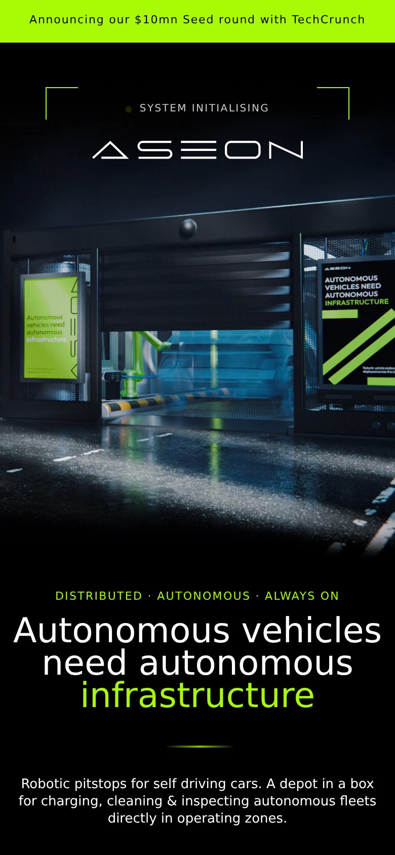
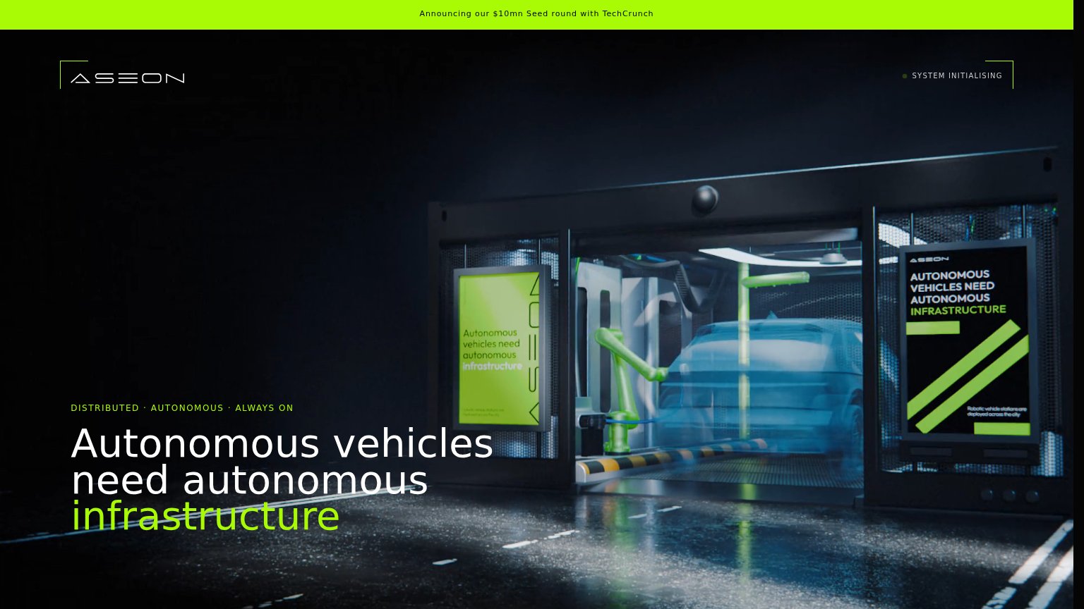
Aseon LabsBanner: "Announcing our $10mn Seed round with TechCrunch"
RobCo"Marktpioniere setzen auf RobCo" logo strip (Rosenberger, MCW Systemtechnik) on mobile
EV Safe Charge (ZiGGY)ZiGGY robot product shots showing on-device UI ("Charging Time 2 hours" map screen and "Scan for directions")
Stäubli (robotic quick-connect EV charging)implicit context Stäubli (robotic quick-connect EV charging) may benefit from pre-existing familiarity among its target audience.

Mobile web

52Fair

The phone experience as a first-class citizen.

Mobile web annotations on the mobile capture12
  1. SYSTEM INITIALISING label — Decorative status text occupies the prime header slot where a nav or CTA belongs.
  2. TechCrunch announcement bar — The only banner-like element at the top routes attention to a press note, not a conversion action.

Information hierarchy

58Fair

Does the design help or inhibit what the page is trying to say?

Information hierarchy annotations on the desktop capture12
  1. TechCrunch announcement banner — The only clickable-looking element in the fold points at press coverage, not the product action.
  2. System Initialising status — Ambiguous status text sits where nav or a CTA belongs, communicating nothing actionable.

Value props

72Fair

Title, subtitle, hero — do they sell the product's true value?

Aseon Labs’s headline undersellsAutonomous vehicles need autonomous infrastructureRobotic pitstops for self driving cars. A depot in a box for charging, cleaning & inspecting autonomous fleets directly in operating zones.

Working

  • Memorable category-defining thesis
  • Hero image shows product in action
  • Mobile subhead names product concretely

Could improve

  • Desktop fold hides the subhead
  • No numbers quantify the outcome
  • Headline alone reads as a slogan