AllowanceYC P26 landing page report.
← Back to YC P26

Your landing page’s weakest score is Trust.

How Allowance ranks

  1. 1.Allowance66
  2. 2.Skyfire66
  3. 3.Nekuda66
  4. 4.Payman56
Fix Trust

Score over time

80757065605550Payman 66 on Apr 17 (Wayback)Payman 64 on Apr 26 (Wayback)Payman 65 on May 11 (Wayback)Payman 56 on Sep 20 (Live)Skyfire 64 on Mar 22 (Wayback)Skyfire 63 on Apr 25 (Wayback)Skyfire 62 on May 7 (Wayback)Skyfire 64 on May 18 (Wayback)Skyfire 66 on Jun 15 (Wayback)Skyfire 65 on Sep 1 (Wayback)Skyfire 66 on Sep 20 (Live)Nekuda 63 on Mar 31 (Wayback)Nekuda 62 on Sep 1 (Wayback)Nekuda 66 on Sep 20 (Live)Allowance 74 on Apr 22 (Wayback)Allowance 74 on May 2 (Wayback)Allowance 66 on Sep 20 (Live)Apr 22May 2Sep 20
Past reportsShow past reportsHide past reports
  1. Sep 20, 202666LiveOverall −8 · Mobile web −16 · Information hierarchy −12Viewing
  2. May 2, 202674Trust −10 · CTA +8View →
  3. Apr 22, 202674First tracked report — strongest Value props 84, weakest Trust 62View →

Trust

58Fair

Proof that the product is real, competent, and safe to try.

Trust read
Allowance"Backed by Y Combinator" with Visa and Mastercard marks beside the CTA
PaymanNo visible trust signal identified.
SkyfireSecurity stack diagram naming Okta, Auth0, Cequence, Imperva, and Datadog
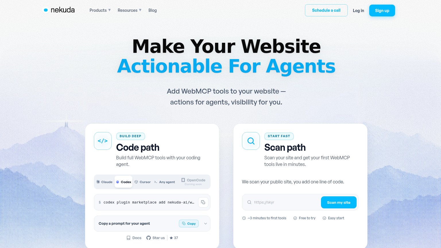
NekudaInteractive "Scan path" card with live "Scan my site" input and "~3 minutes to first tools / Free to try / Easy start" c

Information hierarchy

64Fair

Does the design help or inhibit what the page is trying to say?

Information hierarchy annotations on the desktop capture1234
  1. QR footer conversion bar — The actual conversion action (scan/text to start) sits in a low-contrast footer strip while 'Sign up' in the nav competes at equal weight — the fold has no single obvious primary CTA.
  2. Overlapping chat bubble — The 'Allowance' message bubble overlaps and obscures faded placeholder lines behind it, making the chat demo read as broken rather than staged.
  3. Nav Sign up button — Highest-contrast element on the page pulls attention to a generic account flow instead of the 'Message Allowance' entry point below.
  4. Tiny product thumbnails — The three hat cards that prove the AI-shopping outcome are thumbnail-sized and easy to miss next to the large chat bubbles.

Mobile web

66Fair

The phone experience as a first-class citizen.

Mobile web annotations on the mobile capture1234
  1. Primary CTA position — "Message Allowance" button sits far below the chat demo, well past the first viewport.
  2. Clipped chat bubble — The "Allowance" message is cut off at the top with a fade, leaving the demo conversation starting mid-sentence.
  3. Long chat demo — Three stacked chat bubbles plus a product carousel consume the entire mid-page before any action appears.
  4. Wrapped footer badges — Visa and Mastercard logos break onto separate lines, leaving the Mastercard mark orphaned at bottom-left.

CTA

71Fair

Copy, size, verb, cost-feel — does the primary CTA earn the click?

Allowance
Nekudain-product action

Problems

  • desktop CTA smaller than nav Sign up
  • competes with 'Sign up' label
  • no payoff stated in copy
  • buried below chat demo on desktop

Value props

72Fair

Title, subtitle, hero — do they sell the product's true value?

Allowance’s headline sellsGive your AI a wallet with rules.

Working

  • Names the true mechanism: AI spend with rules
  • Chat demo shows real prices and a $70 rule
  • Memorable, product-specific phrasing

Could improve

  • No subhead to name outcome or audience
  • Numbers live in the demo, not the copy
  • Emotional payoff of safe spending unstated

Competitors

inferred from product, audience, and value prop