
Your landing page’s weakest score is Trust.
How QualGent ranks
64Growth scoreupdated
category scores
category scoresShowHide
Score over time
Trust
38PoorProof that the product is real, competent, and safe to try.
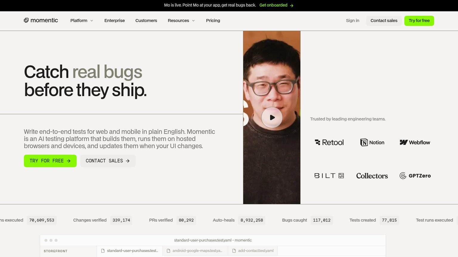
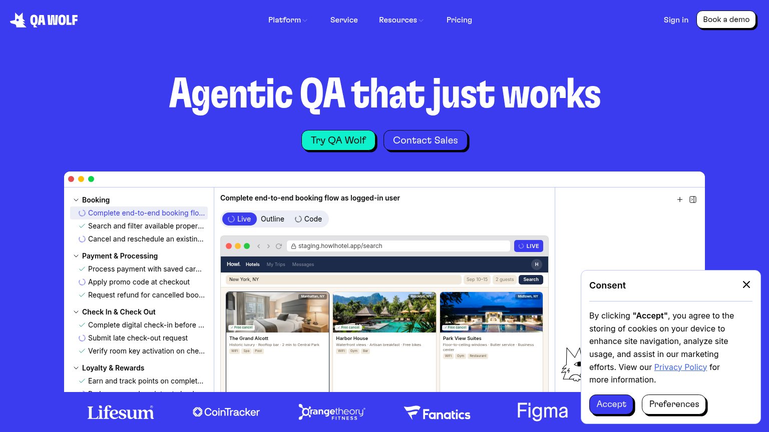
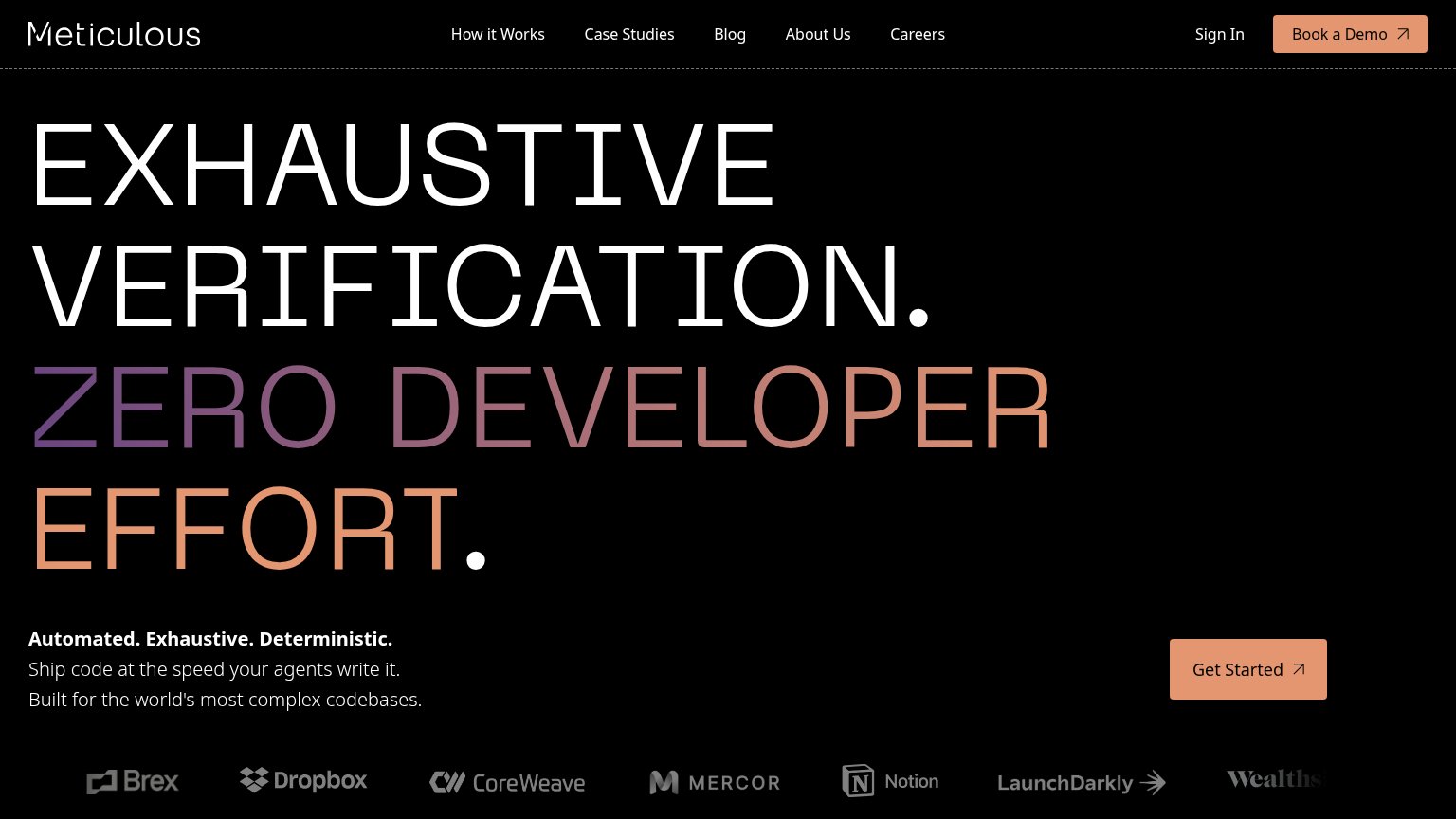
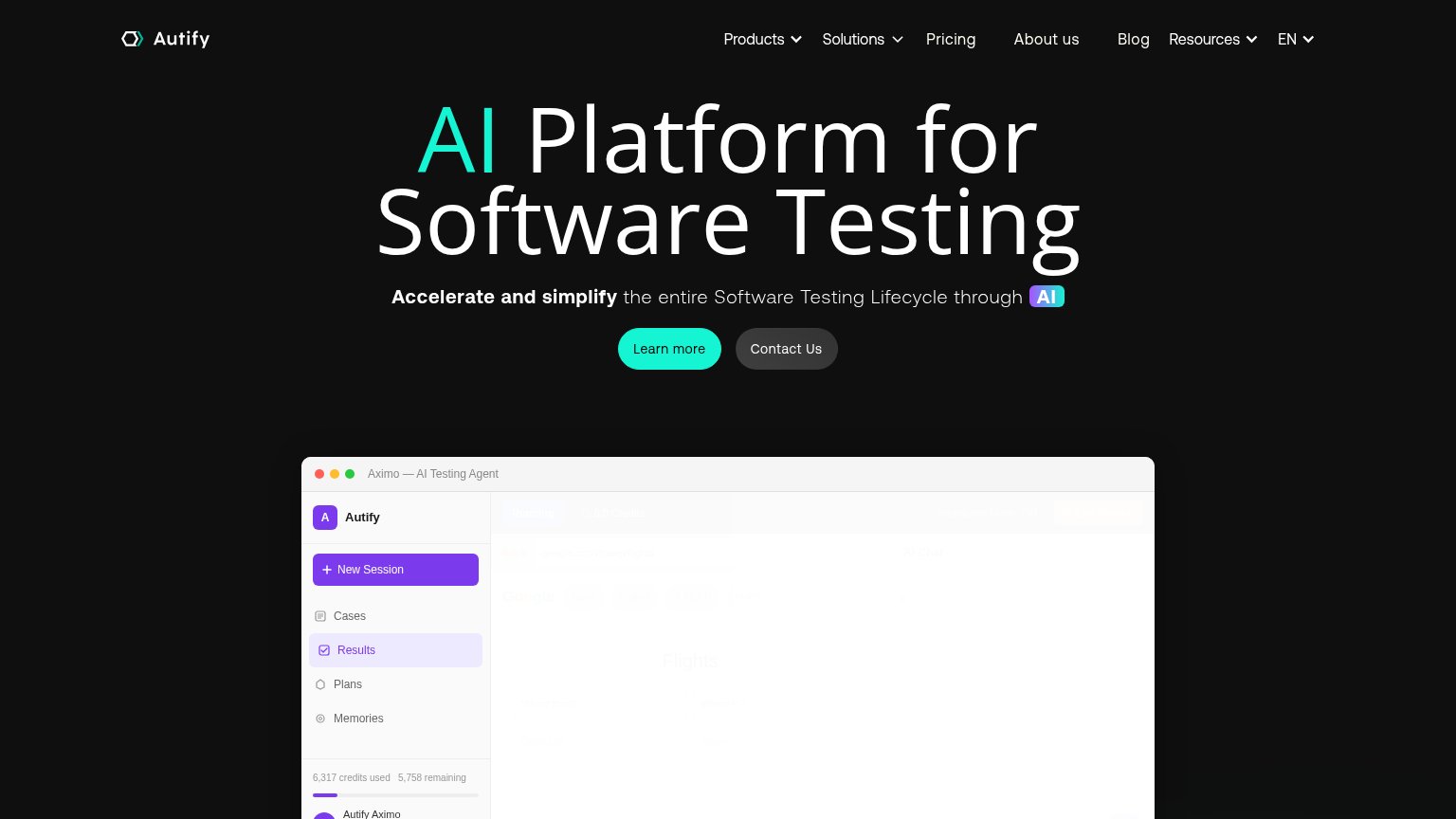
| Trust read | |
|---|---|
| QualGent | No visible trust signal identified. |
| Customer logo strip: Lifesum, CoinTracker, Orangetheory Fitness, Fanatics, Figma | |
| "Trusted by leading engineering teams." logo wall with Retool, Notion, Webflow, Bilt, Collectors, GPTZero | |
| "Trusted by organizations including…" logo wall (Brex, Dropbox, Notion, CoreWeave, LaunchDarkly, Wealthsimple) | |
| Embedded "Aximo — AI Testing Agent" product window showing real UI with sidebar and "6,317 credits used 5,758 remaining" | |
| No visible trust signal identified. |
CTA
68FairCopy, size, verb, cost-feel — does the primary CTA earn the click?
Problems
- demo booking feels costly
- no self-serve or free path
- click promises a meeting, not value
Value props
68FairTitle, subtitle, hero — do they sell the product's true value?
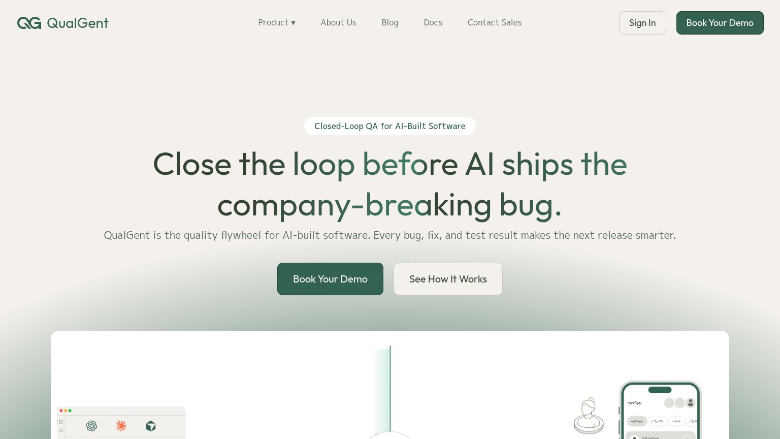
QualGent’s headline sells
Close the loop before AI ships the company-breaking bug.
QualGent is the quality flywheel for AI-built software. Every bug, fix, and test result makes the next release smarter.
Working
- Fear-based hook: company-breaking bug
- Clear category: closed-loop QA for AI code
- Subhead names a compounding mechanism
Could improve
- No numbers or proof points anywhere
- 'Quality flywheel' is abstract jargon
- Hero art decorates, doesn't demo the product
Information hierarchy
72FairDoes the design help or inhibit what the page is trying to say?
123- Duplicate demo CTAs — Header 'Book QualGent's Demo' and the hero button are styled at identical weight, splitting attention to the same action.
- Gradient headline text — The green-to-grey gradient fades 'loop befo' and 'any-brea' to low contrast mid-word, weakening headline legibility.
- Six-item nav row — Product, About Us, Blog, Docs, Contact Sales and Sign In offer six exits before the visitor reaches the demo ask.
Mobile web
76FairThe phone experience as a first-class citizen.
 123
- Four-line hero headline — Headline wraps across four tall lines, pushing the primary CTA to the bottom of the viewport.
- See How It Works — Full-width secondary button at near-equal weight competes directly with Book QualGent's Demo above it.
- Eyebrow pill — Edge-to-edge pill with long text adds a third message layer before the headline, crowding the stack.