
Your landing page’s weakest score is Trust.
How mlop ranks
70Growth scoreupdated
category scores
category scoresShowHide
Score over time
Trust
48PoorProof that the product is real, competent, and safe to try.

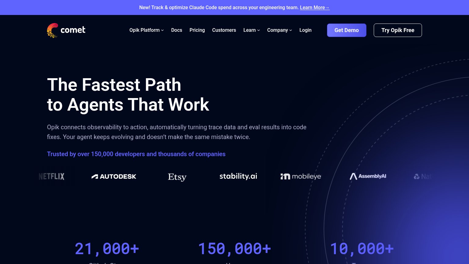
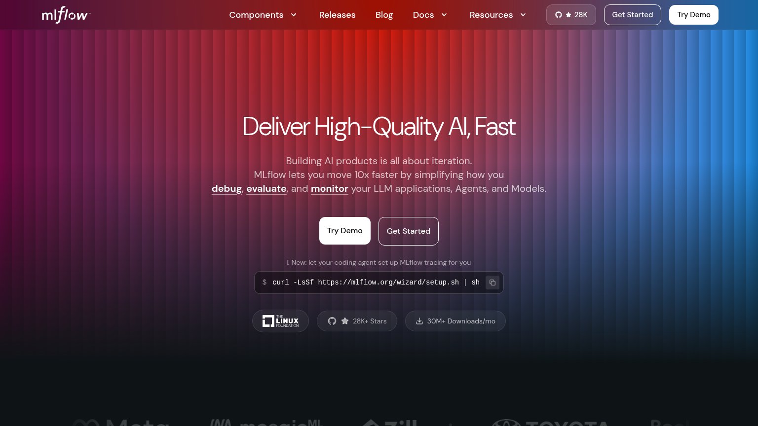

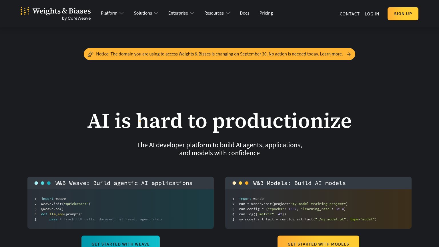
| Trust read | |
|---|---|
| mlop | "Backed by Y Combinator X25" badge above the headline |
| W&B Weave code panel showing a real SDK snippet (import weave / weave.init("quickstart") / @weave.op()) | |
| Customer logo row (Netflix, Autodesk, Etsy, Stability.ai, Mobileye, AssemblyAI) under "Trusted by over 150,000 developer | |
| "30M+ Downloads/mo" badge beside "28K+ Stars" and the Linux Foundation logo under the hero CTAs | |
| "Join 2,100+ forward-thinking organizations worldwide using ClearML" with IBM and AMD logos below it | |
| "Free and open source" label under the Get started CTAs |
Value props
58FairTitle, subtitle, hero — do they sell the product's true value?
mlop’s headline vague
The MLOps platform built for the modern teams
The open source platform for tracking, optimizing, and collaborating on machine learning experiments.
Working
- Subhead names exact jobs: track, optimize, collaborate
- Open-source positioning is clear and differentiating
- YC badge and GitHub CTAs add credibility
Could improve
- Headline is generic; "modern teams" says nothing
- No numbers, outcomes, or proof points
- Hero decorates with hexagons, never shows product
Information hierarchy
78FairDoes the design help or inhibit what the page is trying to say?
1234- Black Login button — Styled identically to "Try it free," splitting primary-CTA weight to the nav corner.
- Star on GitHub button — Near-equal footprint beside the primary CTA sends first clicks off-site to GitHub.
- Github nav pill — Duplicates the hero's GitHub exit and adds a third button-weight element above the headline.
- Faded "teams" gradient — The headline's last word fades to near-background pink, weakening legibility at a glance.
Mobile web
80StrongThe phone experience as a first-class citizen.
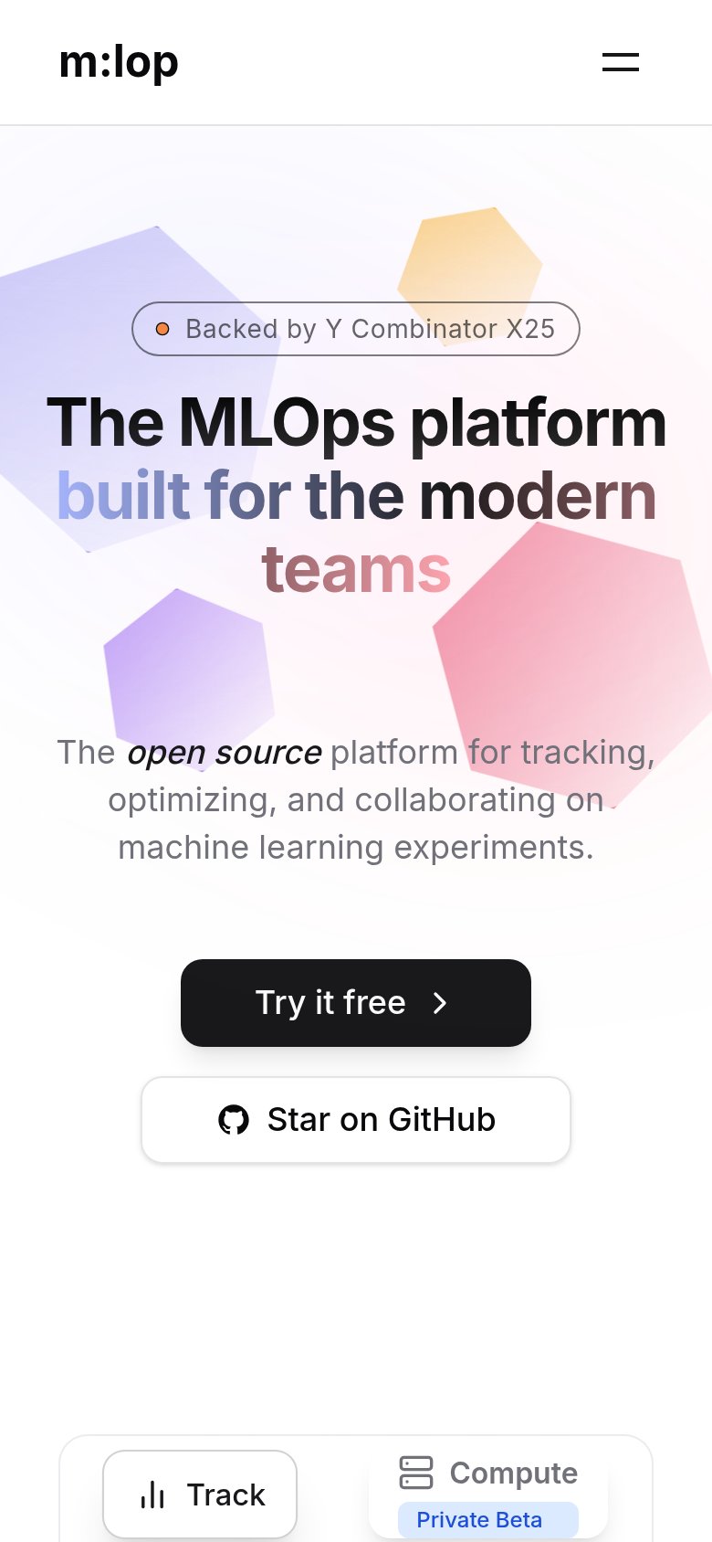 12
- Try it free button — Desktop-proportioned at half the column width; should be a near-full-bleed thumb target on mobile.
- Compute tab card — Feature tab clips mid-card at the fold edge with its 'Private Beta' pill overflowing, showing an unadapted breakpoint.
CTA
84StrongCopy, size, verb, cost-feel — does the primary CTA earn the click?
Problems
- generic "it" — no product payoff named
- no echo of headline's tracking promise