
Your landing page’s weakest score is Trust.
How Weights & Biases ranks
- 1.
MLflow74
- 2.
mlop70
- 3.
ClearML70
- 4.
Comet69
- 5.
Weights & Biases65
- 6.
DVC (Iterative)55
65Growth scoreupdated
category scores
category scoresShowHide
Trust
52FairProof that the product is real, competent, and safe to try.
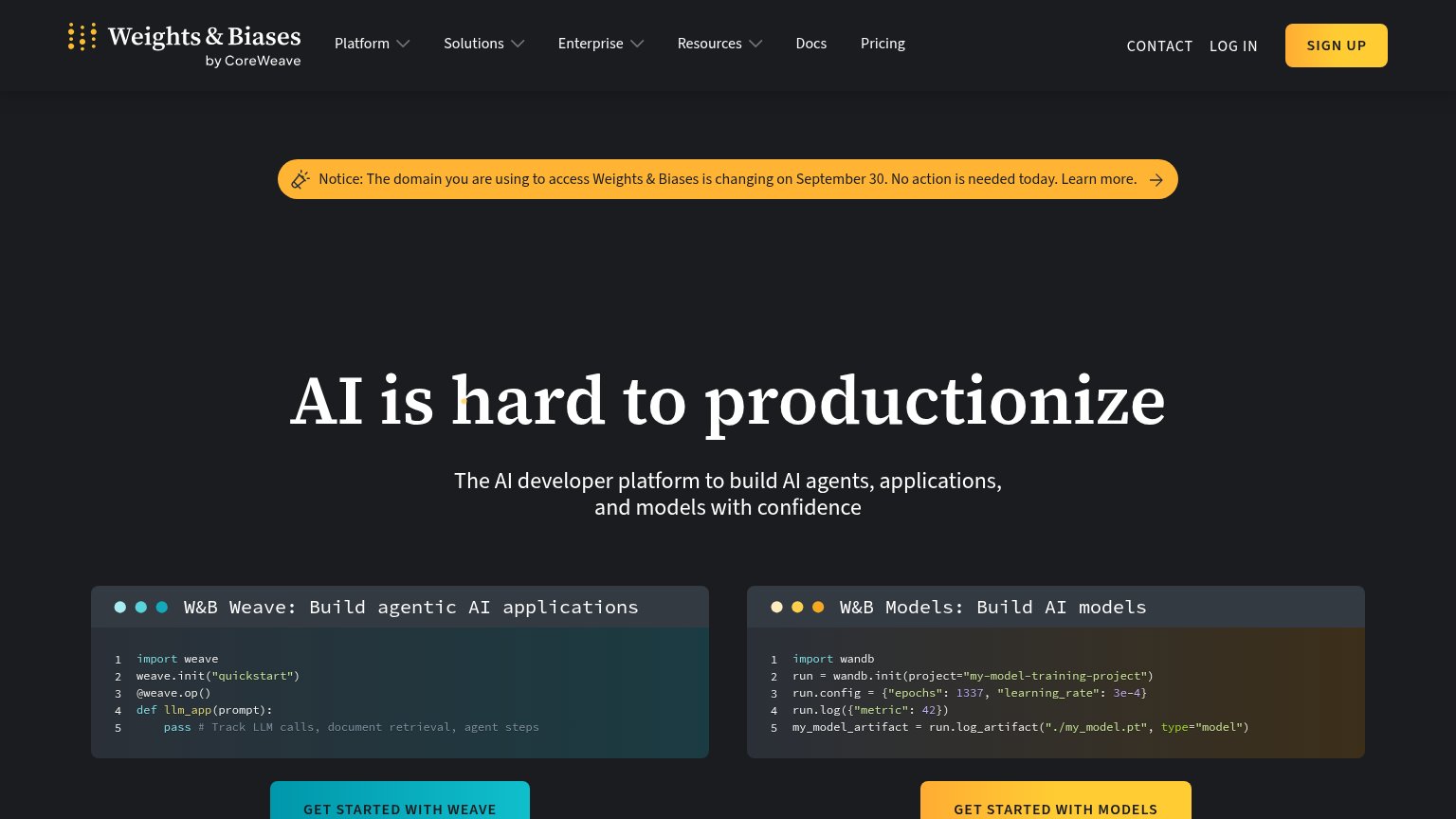
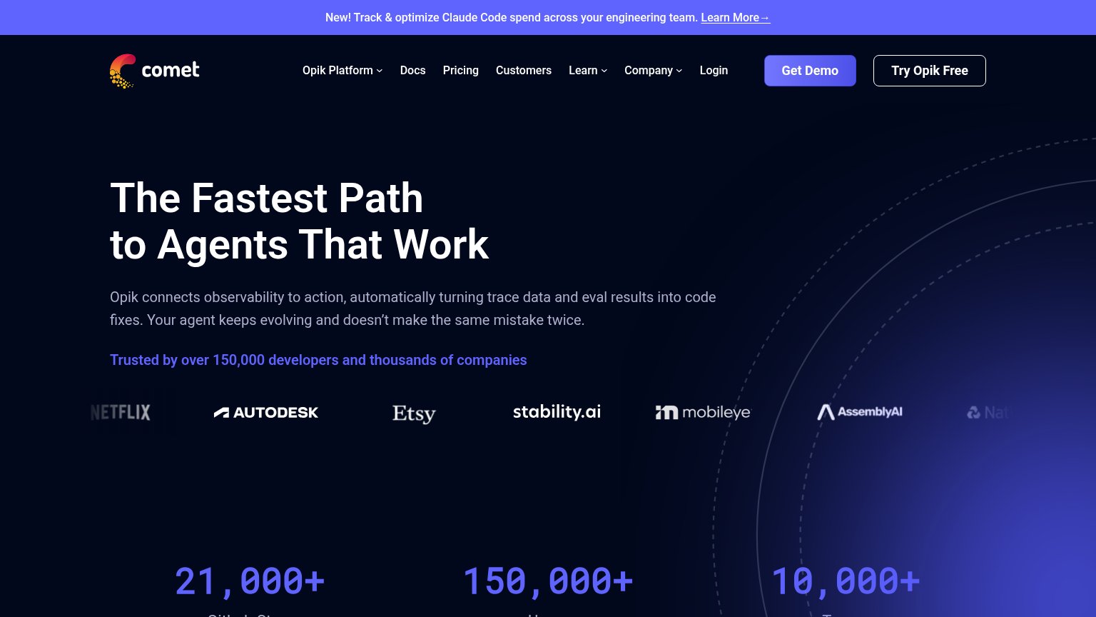
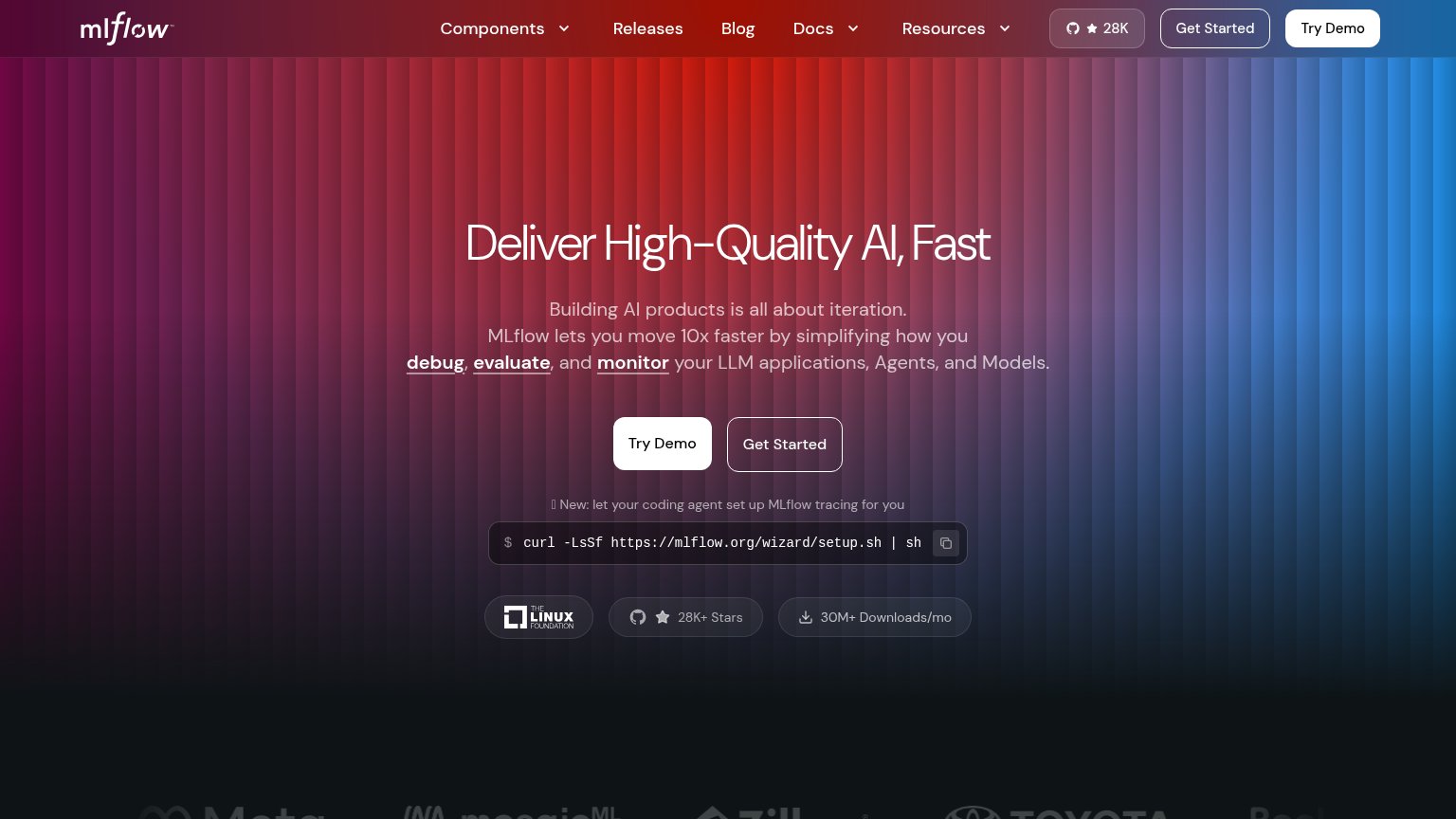
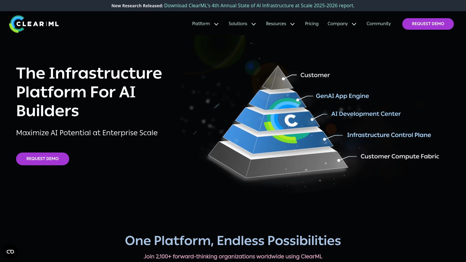
| Trust read | |
|---|---|
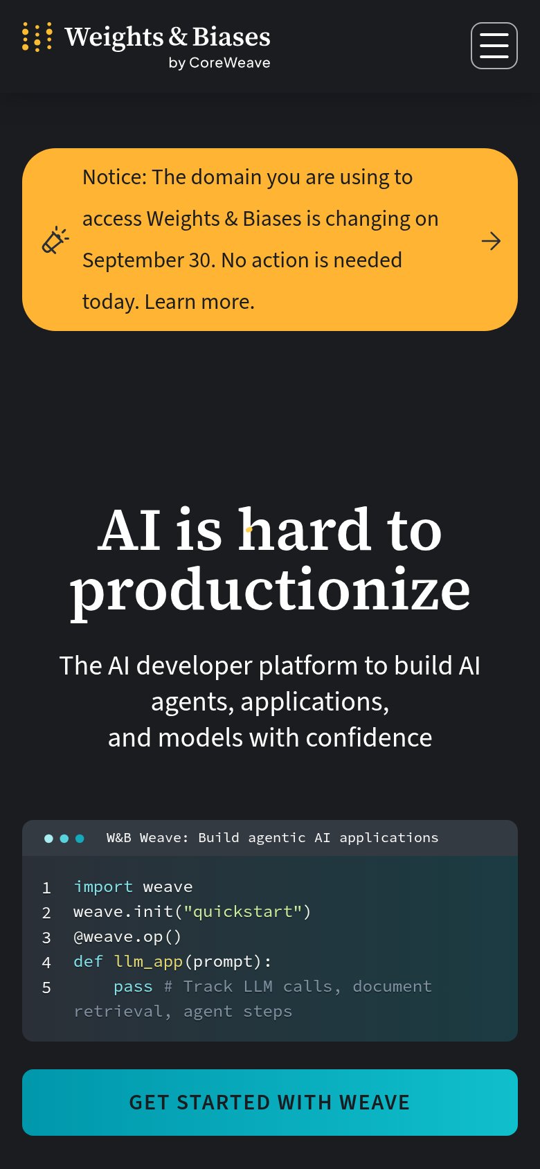
| Weights & Biases | W&B Weave code panel showing a real SDK snippet (import weave / weave.init("quickstart") / @weave.op()) |
| "Backed by Y Combinator X25" badge above the headline | |
| Customer logo row (Netflix, Autodesk, Etsy, Stability.ai, Mobileye, AssemblyAI) under "Trusted by over 150,000 developer | |
| "30M+ Downloads/mo" badge beside "28K+ Stars" and the Linux Foundation logo under the hero CTAs | |
| "Join 2,100+ forward-thinking organizations worldwide using ClearML" with IBM and AMD logos below it | |
| "Free and open source" label under the Get started CTAs |
Information hierarchy
62FairDoes the design help or inhibit what the page is trying to say?
1234- Dual product CTAs — "Get Started with Weave" and "Get Started with Models" sit at equal weight, forcing a product choice before any primary action is clear.
- Domain notice banner — The yellow migration banner is the highest-contrast element after Sign Up and pulls first attention to a non-conversion message.
- Nav dropdown row — Four dropdowns plus Docs and Pricing create eight-plus exit paths above the headline.
- Split code panels — Two same-weight code blocks compete side by side, doubling the reading load before either CTA lands.
CTA
68FairCopy, size, verb, cost-feel — does the primary CTA earn the click?
How Weights & Biases compares
Recommended rewrites
Value props
72FairTitle, subtitle, hero — do they sell the product's true value?
Weights & Biases’s headline
AI is hard to productionize
The AI developer platform to build AI agents, applications, and models with confidence
Working
Could improve
Mobile web
72FairThe phone experience as a first-class citizen.
What works
What to improve