
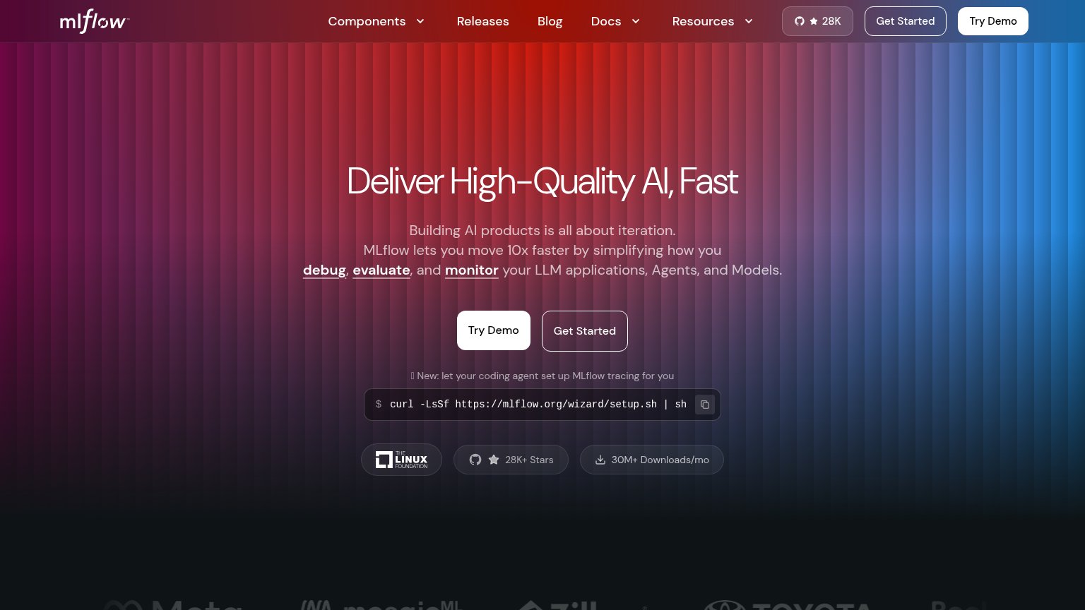
Your landing page’s weakest score is Information hierarchy.
How MLflow ranks
74Growth scoreupdated
category scores
category scoresShowHide
Information hierarchy
68FairDoes the design help or inhibit what the page is trying to say?
 1234
- Duplicate Try Demo CTAs — "Try Demo" appears both in the nav and the hero at equal filled-white weight, splitting the primary action into two competing targets.
- Duplicate Get Started buttons — "Get Started" is repeated in nav and hero at near-identical outline styling to "Try Demo", so no single action reads as primary.
- Truncated setup command — The curl command is clipped at "| sh" against the copy icon, signaling the install path over the demo and muddying which action the fold wants.
- Dense nav link row — Six nav destinations plus a GitHub star badge sit above the hero, giving attention seven exits before the headline is read.
Mobile web
68FairThe phone experience as a first-class citizen.
 1234
- Side-by-side CTA pair — "Try Demo" and "Get Started" sit small and side-by-side instead of stacked near full-width for thumbs.
- Oversized wrapped headline — Headline barely scales down and wraps into four cramped lines, pushing the CTAs deep into the fold.
- Wrapped curl command — Desktop-width shell command breaks across three lines, unreadable and competing with the CTAs.
- Seven-line subhead — Subhead runs seven lines of centered text, stacking competing messages before the action.
CTA
78FairCopy, size, verb, cost-feel — does the primary CTA earn the click?
How MLflow compares
Recommended rewrites
Value props
78FairTitle, subtitle, hero — do they sell the product's true value?
MLflow’s headline
Deliver High-Quality AI, Fast
Building AI products is all about iteration. MLflow lets you move 10x faster by simplifying how you debug, evaluate, and monitor your LLM applications, Agents, and Models.
Working
Could improve
Trust
78FairProof that the product is real, competent, and safe to try.
How MLflow compares
Trust read