KaizenYC P25 landing page report.
← Back to YC P25

Your landing page’s weakest score is Trust.

How Kaizen ranks

  1. 1.Kaizen75
  2. 2.Infinitus73
  3. 3.SmarterDx64
  4. 4.Tennr63
Fix Trust

Score over time

80757065605550Tennr 61 on Sep 3 (Wayback)Tennr 63 on Sep 20 (Live)Infinitus 61 on Apr 3 (Wayback)Infinitus 62 on Apr 14 (Wayback)Infinitus 62 on Apr 23 (Wayback)Infinitus 65 on May 7 (Wayback)Infinitus 66 on May 15 (Wayback)Infinitus 65 on Jun 13 (Wayback)Infinitus 73 on Sep 22 (Live)SmarterDx 67 on May 4 (Wayback)SmarterDx 71 on Jun 10 (Wayback)SmarterDx 60 on Aug 27 (Wayback)SmarterDx 64 on Sep 22 (Live)Kaizen 58 on Jun 13 (Wayback)Kaizen 56 on Jun 27 (Wayback)Kaizen 75 on Sep 22 (Live)Jun 13Jun 27Sep 22
Past reportsShow past reportsHide past reports
  1. Sep 22, 202675LiveOverall +19 · Information hierarchy +48 · Trust +16Viewing
  2. Jun 27, 202656Overall −2 · CTA −8 · Trust −6View →
  3. Jun 13, 202658First tracked report — strongest Mobile web 84, weakest Information hierarchy 34View →

Trust

58Fair

Proof that the product is real, competent, and safe to try.

Trust read
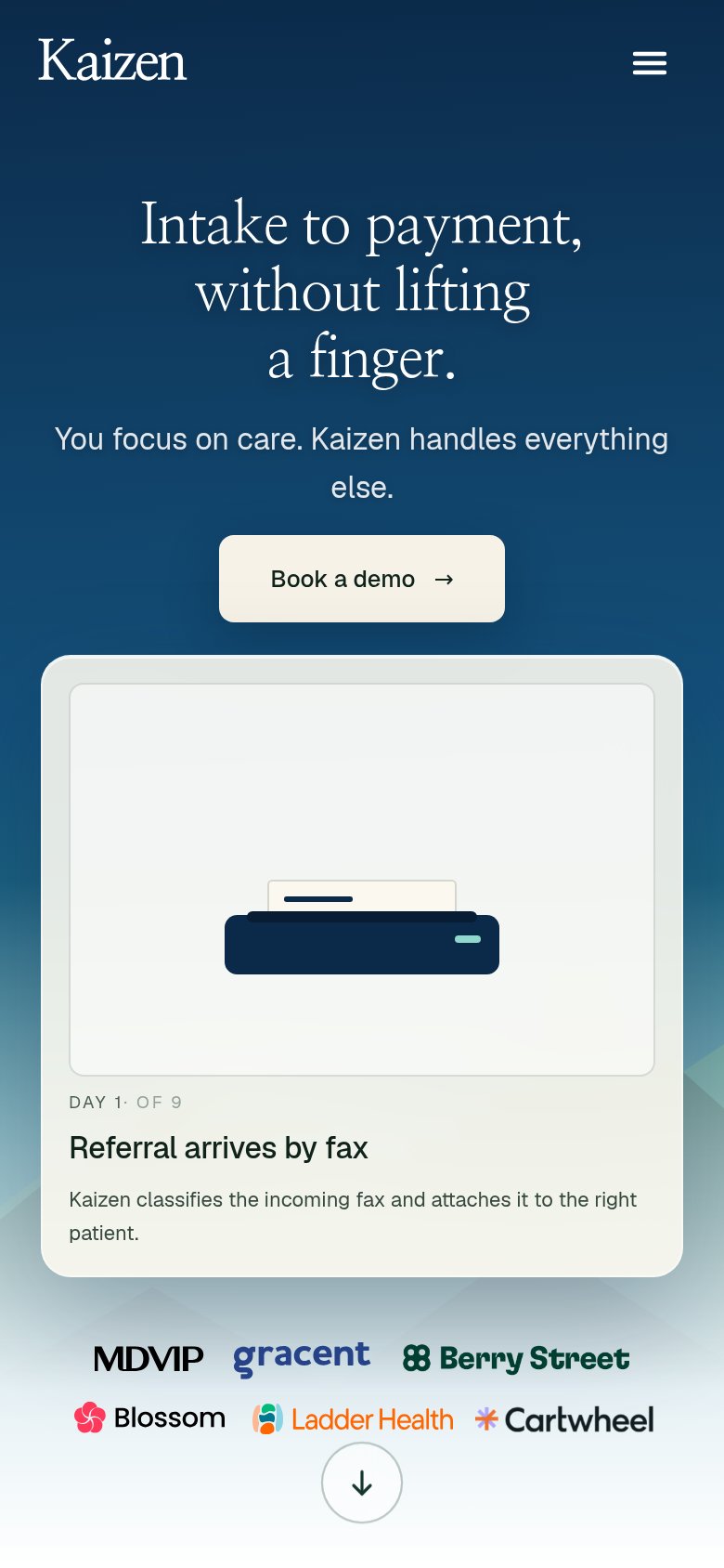
KaizenCustomer logo row on mobile: MDVIP, gracent, Berry Street, Blossom, Ladder Health, Cartwheel
TennrNo visible trust signal identified.
Infinitus">90% positive ratings from patients" metric strip beneath the hero CTA
SmarterDxNo visible trust signal identified.

CTA

72Fair

Copy, size, verb, cost-feel — does the primary CTA earn the click?

Kaizen
Infinitus

Problems

  • click feels like a sales meeting
  • no value payoff in the label
  • no lighter-weight alternative path

Value props

72Fair

Title, subtitle, hero — do they sell the product's true value?

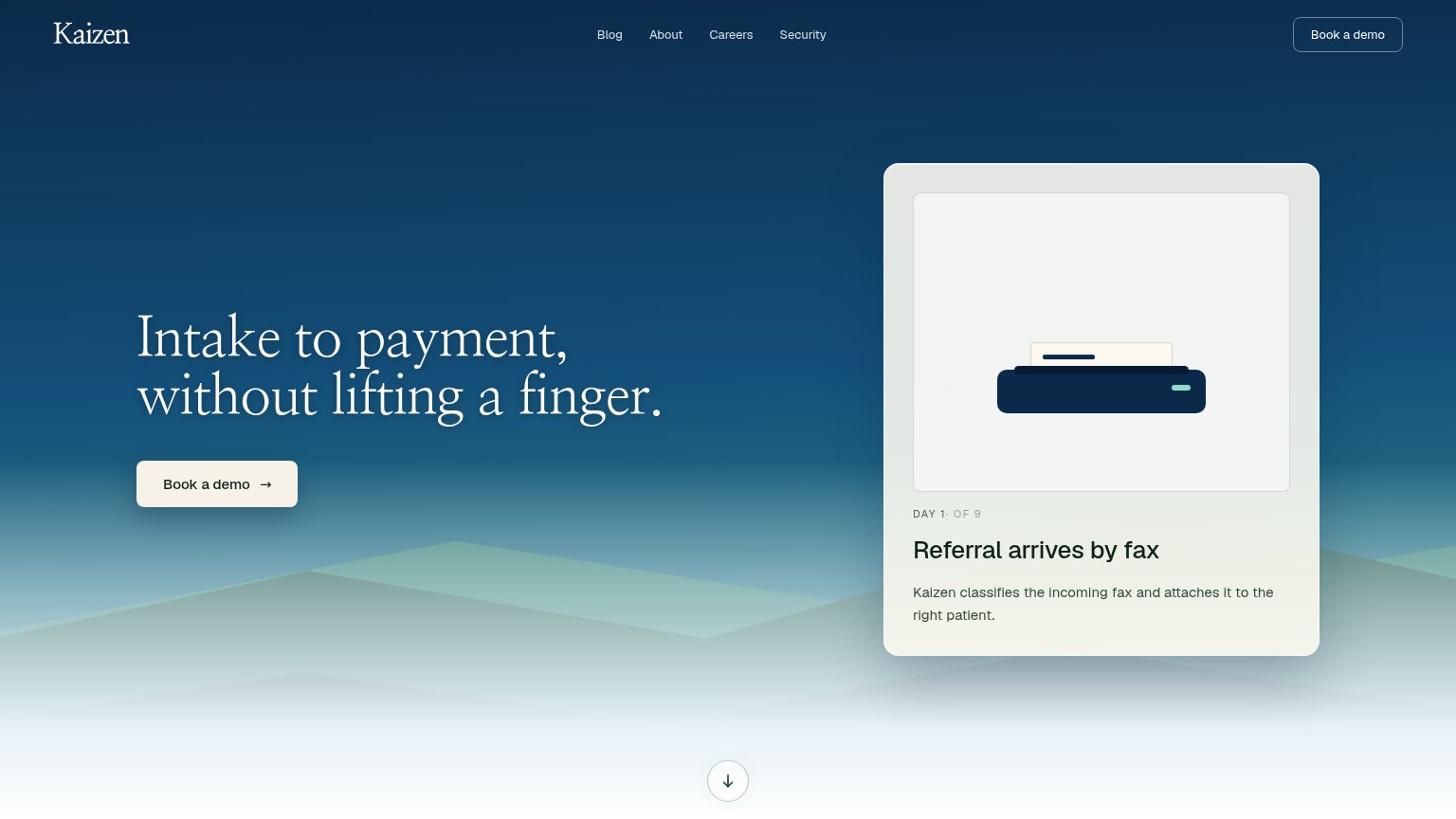
Kaizen’s headline sellsIntake to payment, without lifting a finger.You focus on care. Kaizen handles everything else.

Working

  • Outcome-first: intake to payment automated
  • Hero card shows a real workflow step
  • Emotional relief: 'without lifting a finger'

Could improve

  • No subhead on desktop fold
  • Zero numbers or specifics in copy
  • Audience (healthcare practices) unstated

Information hierarchy

86Strong

Does the design help or inhibit what the page is trying to say?

Information hierarchy annotations on the desktop capture12
  1. Duplicate header CTA — Second "Book a demo" at equal prominence splits focus from the hero button.
  2. Careers nav link — Recruiting link in the conversion fold leaks buyer attention away from the demo path.

Mobile web

86Strong

The phone experience as a first-class citizen.

Mobile web annotations on the mobile capture12
  1. Book a demo button — Desktop-proportioned pill floats centered; should stretch near full-bleed for thumb reach.
  2. DAY 1 step label — Cramped '1·' separator with no space reads like a typo in the demo card.

Competitors

inferred from product, audience, and value prop