
Your landing page’s weakest score is Value props.
How Kairos ranks
53Growth scoreupdated
category scores
category scoresShowHide
Score over time
Value props
38PoorTitle, subtitle, hero — do they sell the product's true value?
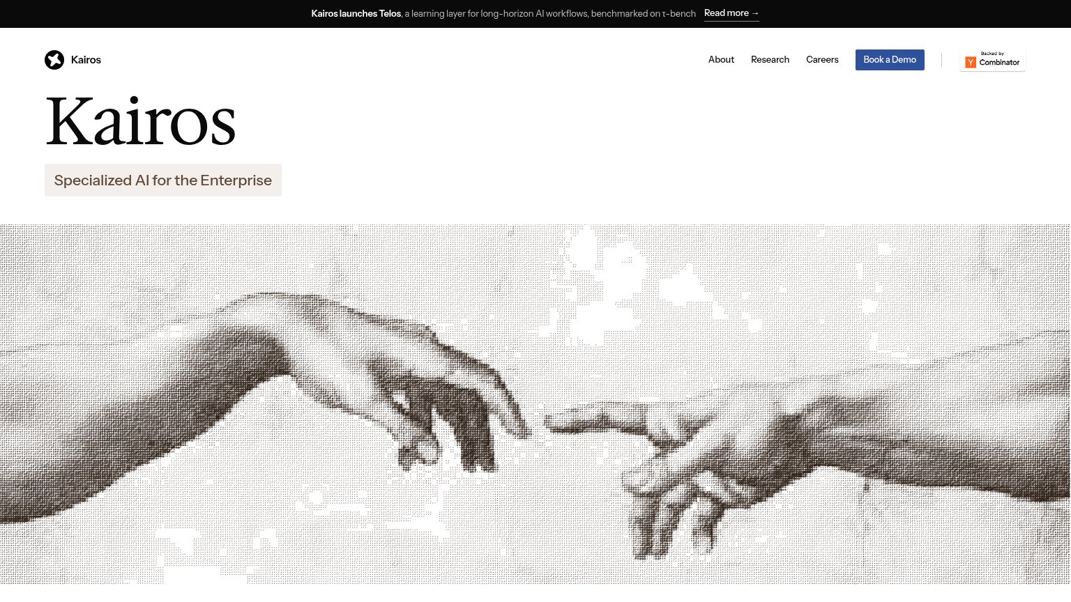
Kairos’s headline vague
Kairos
Specialized AI for the Enterprise
Working
- Banner names Telos and τ-bench proof
- Clean, confident enterprise tone
- YC badge lends early credibility
Could improve
- H1 is just the company name
- Subhead is a generic category label
- Hero art shows nothing the product does
Trust
42PoorProof that the product is real, competent, and safe to try.
| Trust read | |
|---|---|
| Kairos | "Backed by Y Combinator" badge in the header |
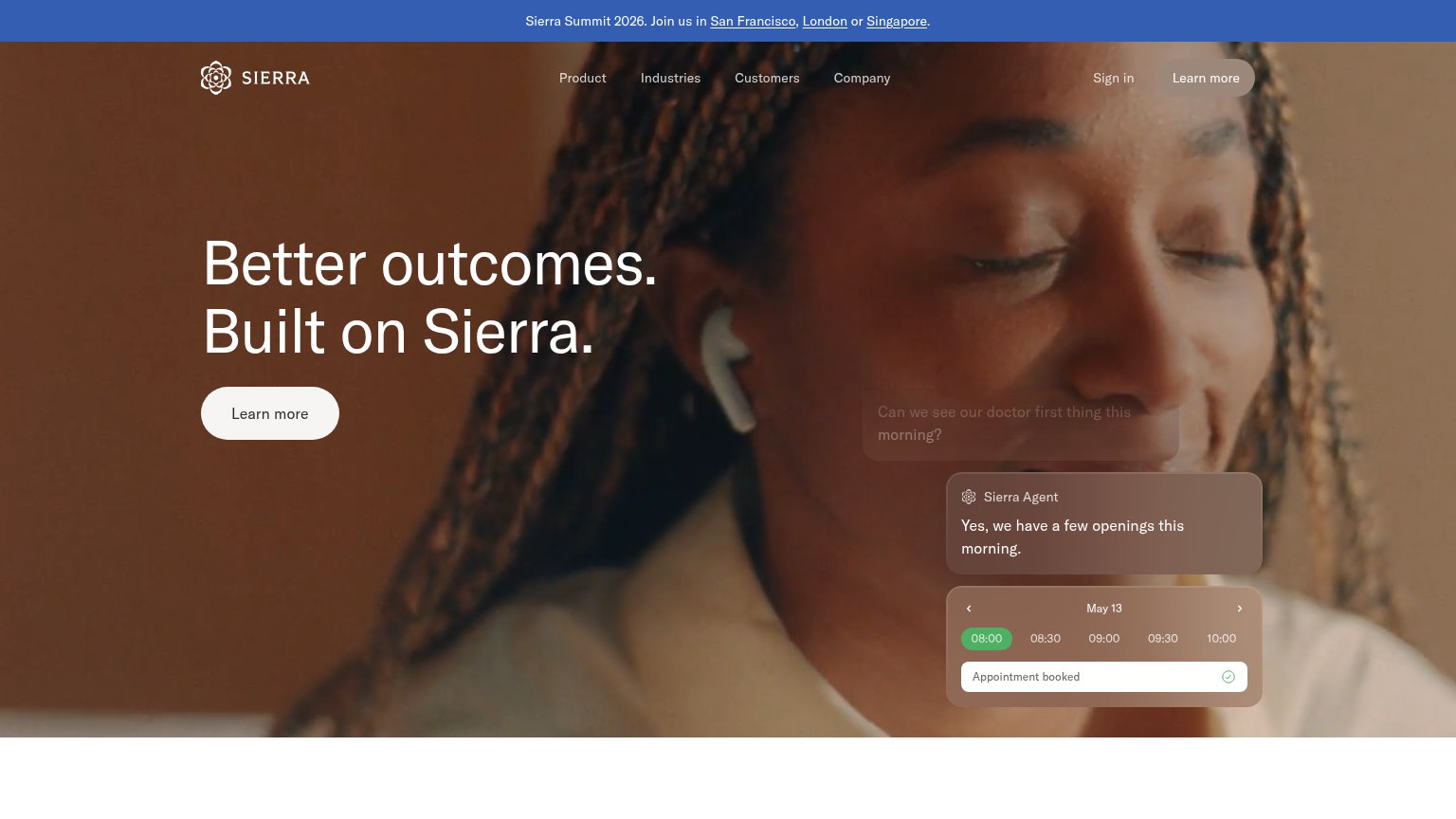
| Sierra Agent chat demo resolving "I don't recognize this $95 charge" and booking "Appointment booked" | |
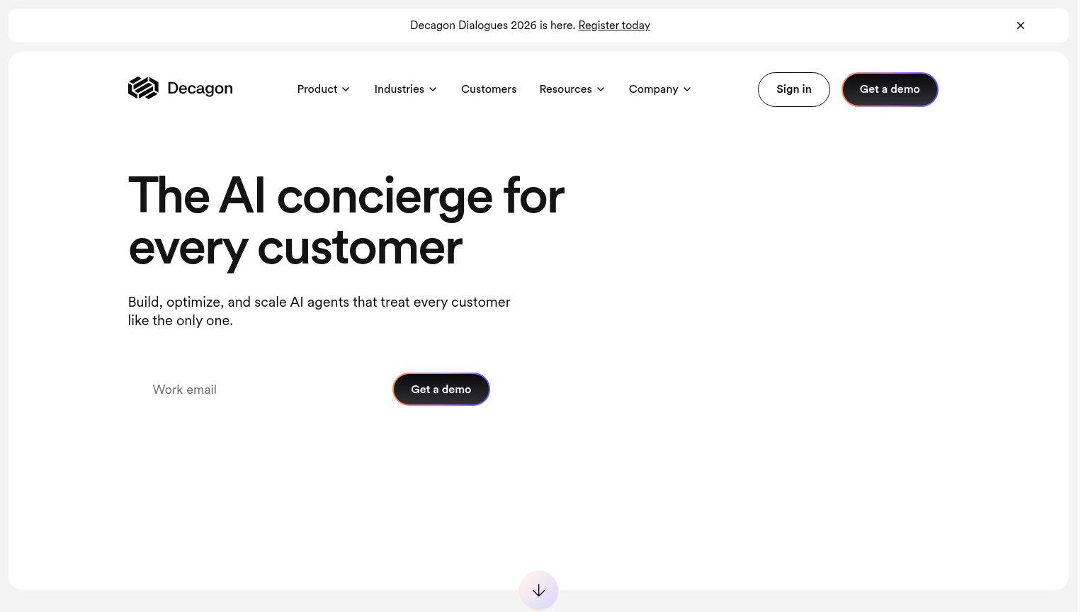
| implicit context Decagon may benefit from pre-existing familiarity among its target audience. | |
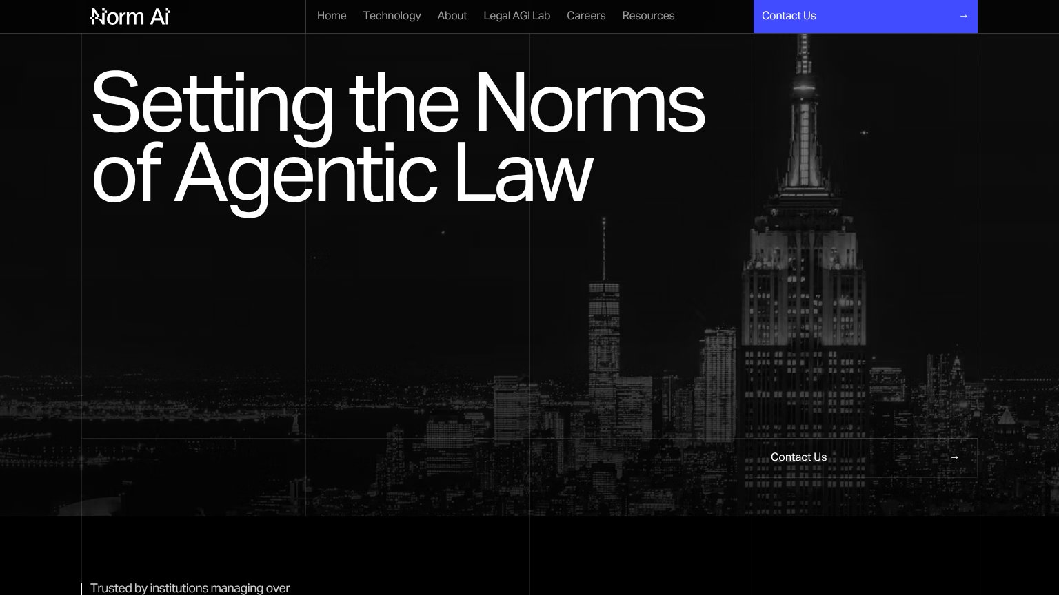
| "Trusted by institutions managing over" line at the bottom of the desktop fold | |
| No visible trust signal identified. | |
| No visible trust signal identified. |
Mobile web
58FairThe phone experience as a first-class citizen.
 12
- Header missing CTA — The desktop 'Book a Demo' button is dropped on mobile, leaving no conversion action in the fold.
- YC badge placement — The 'Backed by Combinator' badge occupies prime header space that should hold the primary CTA.
CTA
62FairCopy, size, verb, cost-feel — does the primary CTA earn the click?
Problems
- demo booking feels costly
- nav-sized, no hero CTA
- hidden behind mobile hamburger
- hero has no action at all
Information hierarchy
64FairDoes the design help or inhibit what the page is trying to say?
1234- Redundant Kairos wordmark — The hero headline repeats the logo verbatim instead of stating what Kairos does, wasting the highest-attention slot.
- Value prop pill — "Specialized AI for the Enterprise" is styled as a small muted tag, visually subordinate to the brand name it should outrank.
- Announcement banner — The Telos launch banner with "Read more →" is the first element scanned and pulls attention off the fold before the demo CTA is seen.
- Book a Demo button — The only conversion action is a small nav-corner button, outside the hero's natural left-aligned scan path.