
Your landing page’s weakest score is Trust.
How Docket ranks
65Growth scoreupdated
category scores
category scoresShowHide
Score over time
Trust
44PoorProof that the product is real, competent, and safe to try.

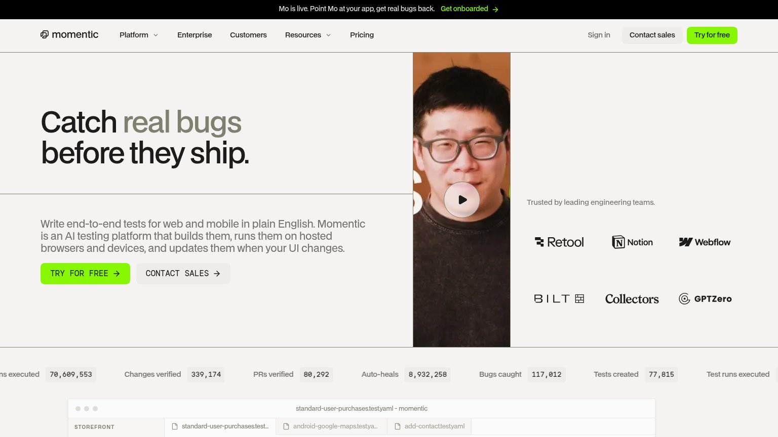

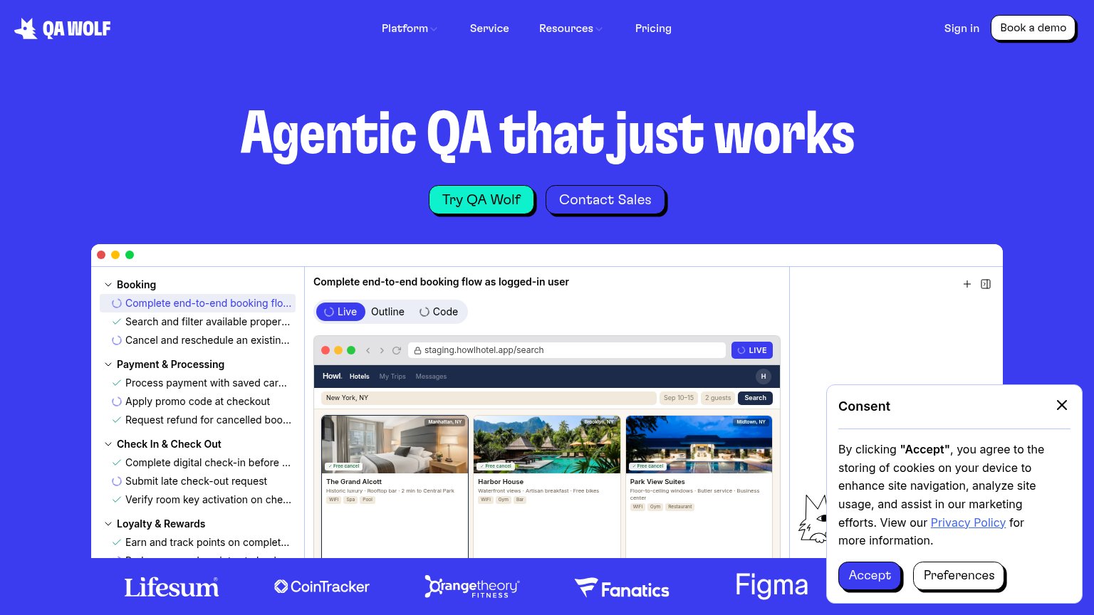
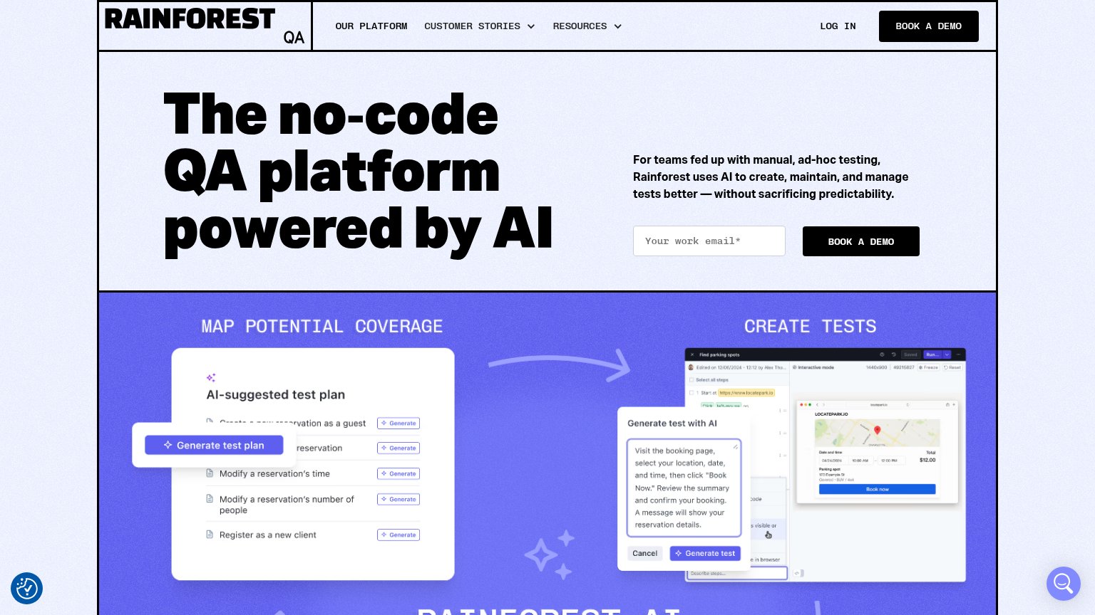
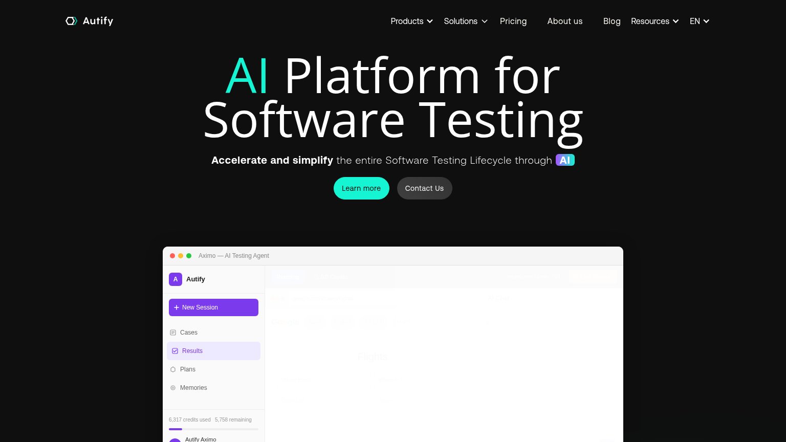
| Trust read | |
|---|---|
| Docket | "BACKED BY Y-COMBINATOR" badge above the hero headline |
| Customer logo strip: Lifesum, CoinTracker, Orangetheory Fitness, Fanatics, Figma | |
| Announcement bar: "Duolingo publishes case study on reducing manual regression tests by 70% using MobileBoost." | |
| "Trusted by leading engineering teams." logo wall with Retool, Notion, Webflow, Bilt, Collectors, GPTZero | |
| Detailed real product screenshots: "AI-suggested test plan" and "Generate test with AI" panels under "MAP POTENTIAL COVE | |
| Embedded "Aximo — AI Testing Agent" product window showing real UI with sidebar and "6,317 credits used 5,758 remaining" |
CTA
68FairCopy, size, verb, cost-feel — does the primary CTA earn the click?
Problems
- demo booking feels costly
- two CTAs both say 'Demo'
- no self-serve product path
Value props
68FairTitle, subtitle, hero — do they sell the product's true value?
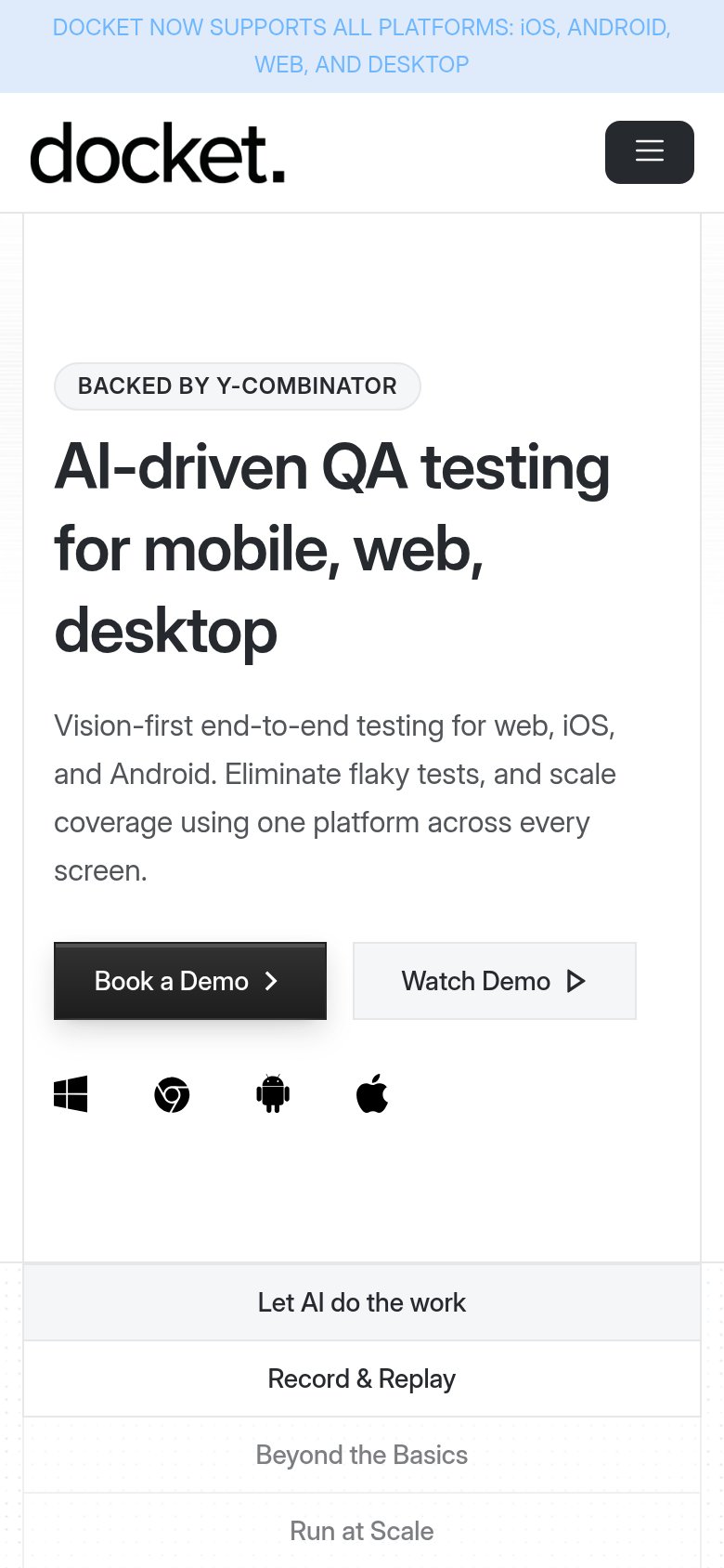
Docket’s headline sells
AI-driven QA testing for mobile, web, desktop
Vision-first end-to-end testing for web, iOS, and Android. Eliminate flaky tests, and scale coverage using one platform across every screen.
Working
- Names the real category instantly
- "Eliminate flaky tests" hits a true pain
- Cross-platform claim backed by OS icons
Could improve
- Zero numbers or proof points in fold
- No product demo visible above fold
- "Scale coverage" is generic category-speak
Information hierarchy
72FairDoes the design help or inhibit what the page is trying to say?
1234- Duplicate Book a Demo — Nav 'Book a Demo' at identical dark weight competes with the hero CTA and splits the scan path.
- Platform icons row — Unlabeled Windows/Chrome/Android/Apple icons sit below the CTAs with no caption explaining what they signal.
- Feature tab bar — Four equal-weight tabs ('Let AI do the work'…'Run at Scale') introduce a second navigation layer right at the fold edge, diluting focus.
- Announcement banner — Light-blue all-caps banner repeats the subheadline's platform claim, adding a competing message at the very top.
Mobile web
72FairThe phone experience as a first-class citizen.
 12
- Paired half-width CTAs — "Book a Demo" and "Watch Demo" split the row, leaving the primary button a small desktop-sized tap target instead of full-bleed.
- Two-line announcement banner — The all-caps platform banner wraps to two lines of low-contrast light-blue text and consumes the top of the fold before the brand appears.