
Your landing page’s weakest score is Trust.
How cubic ranks
75Growth scoreupdated
category scores
category scoresShowHide
Score over time
Trust
62FairProof that the product is real, competent, and safe to try.

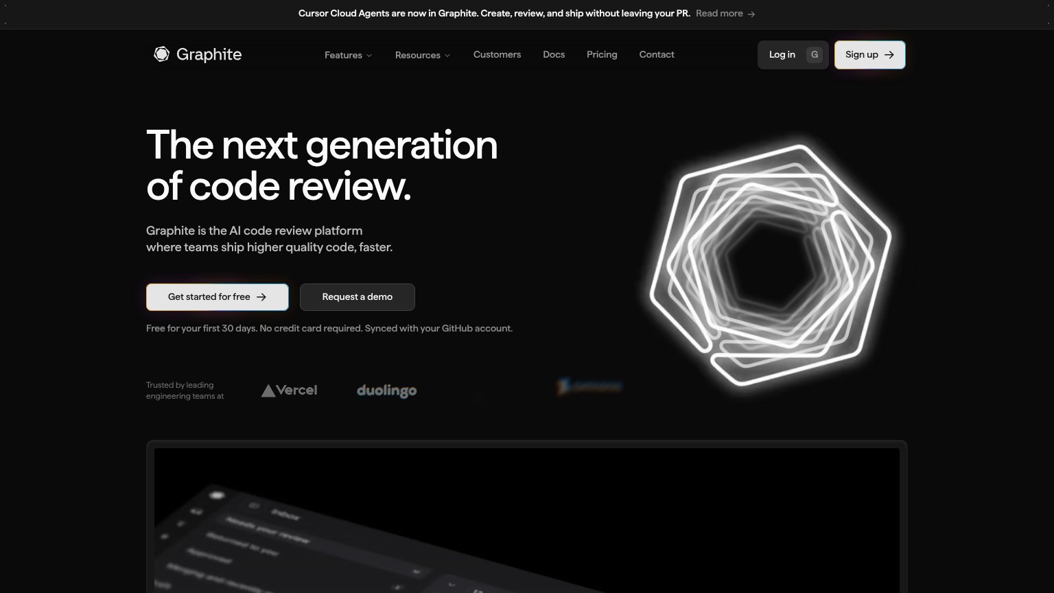
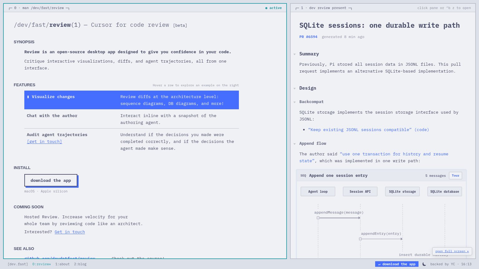
| Trust read | |
|---|---|
| cubic | "Martian Code Review Bench — #1 AI code reviewer" benchmark badge below the CTA |
| Live interactive product pane rendering PR #6594 with an "Append one session entry" sequence diagram | |
| "Trusted by leading engineering teams at" logo strip with Vercel and Duolingo | |
| Detailed "Pull requests" product UI with P0/P1/P2 priority rows and risk/reward/effort columns | |
| "OVER 22,000+ TEAMS USE GREPTILE" usage banner |
Information hierarchy
72FairDoes the design help or inhibit what the page is trying to say?
1234- Start free trial button — White-filled nav button matches the hero CTA's weight, splitting the primary action across two locations.
- Get a demo button — Sits at nearly the same size directly beside 'Try cubic for free', diluting the single-action scan path.
- Benchmark banner link — 'Read the report →' is the first clickable element on the page and pulls attention off-site before the hero.
- Blank white logo — The wordmark renders as an empty white square, leaving the brand anchor unidentifiable at the fold's center.
Mobile web
76FairThe phone experience as a first-class citizen.
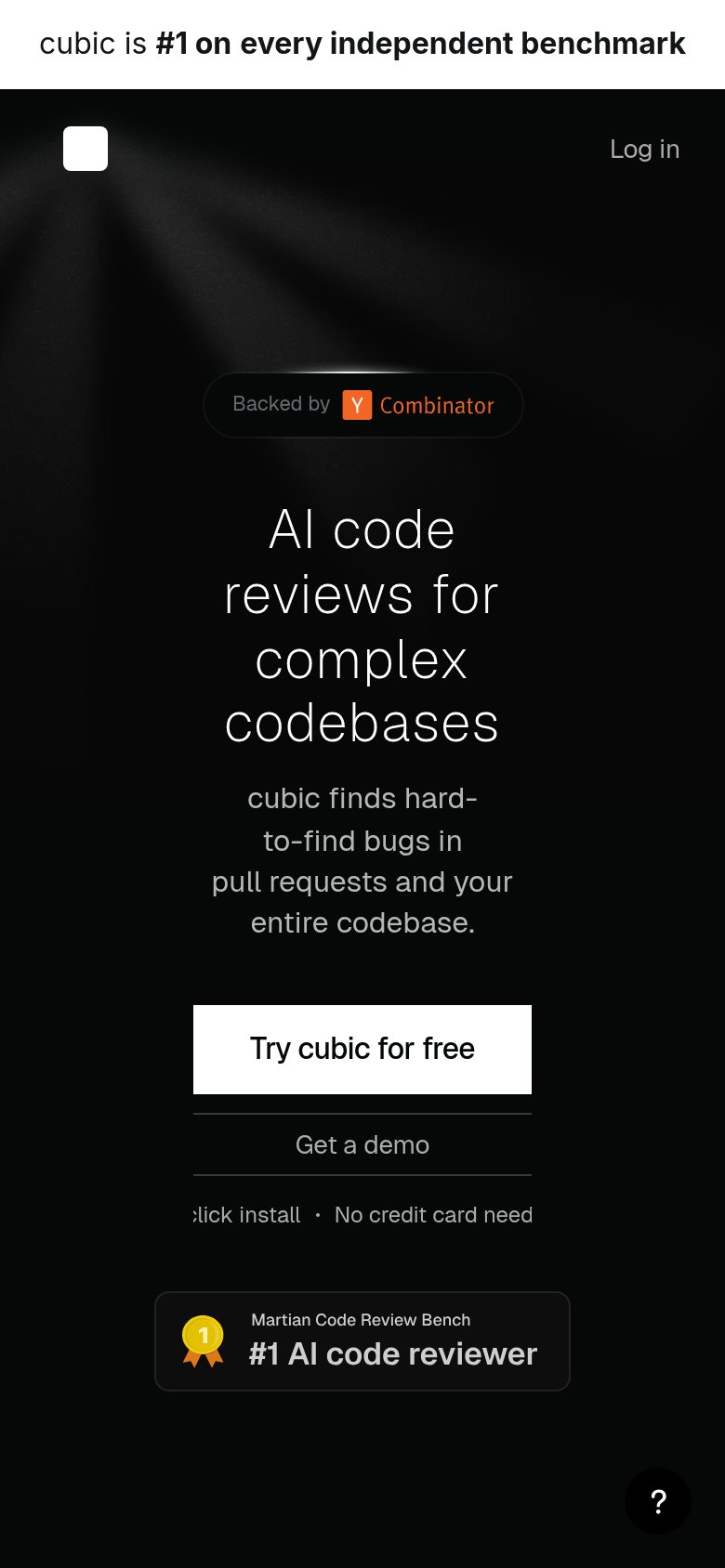 123
- Clipped reassurance text — Line is truncated to "click install · No credit card need" — text overflows the container on mobile.
- Four-line hero headline — Headline scales down too little, wrapping to four lines and pushing the CTA to the viewport edge.
- Ragged subhead wrapping — "cubic finds hard-to-find bugs" breaks into four uneven lines with awkward hyphen splits.
Value props
78FairTitle, subtitle, hero — do they sell the product's true value?
cubic’s headline sells
AI code reviews for complex codebases
cubic finds hard-to-find bugs in pull requests and your entire codebase.
Working
- Names outcome: finds hard-to-find bugs
- Differentiates on complex codebases
- #1 benchmark badge backs the claim
Could improve
- No numbers quantifying bugs or time saved
- Hero shows a black void, not the product
- Subhead repeats "codebase" from headline
CTA
86StrongCopy, size, verb, cost-feel — does the primary CTA earn the click?
Problems
- 4 words, past 3-word ideal
- nav says 'Start cubic's free trial'
- mobile microcopy clipped at edges