
Your landing page’s weakest score is Trust.
How Crimson ranks
76Growth scoreupdated
category scores
category scoresShowHide
Score over time
Trust
68FairProof that the product is real, competent, and safe to try.
| Trust read | |
|---|---|
| Crimson | "TRUSTED BY LEADING LITIGATION PRACTICES" logo strip with Duane Morris, Peters & Peters, Humphries Kerstetter, Clarion, |
| "We Raised $550M at a $15.5B Valuation" announcement banner (mobile capture) | |
| "Our customers include" logo strip with Herbert Smith Freehills Kramer, Clifford Chance, and Goodwin | |
| No visible trust signal identified. | |
| Product chat UI screenshot answering "What are the different laws that govern each contract?" across "124 Documents" wit | |
| Gartner Peer Insights 4.7/5 rating badge |
CTA
70FairCopy, size, verb, cost-feel — does the primary CTA earn the click?
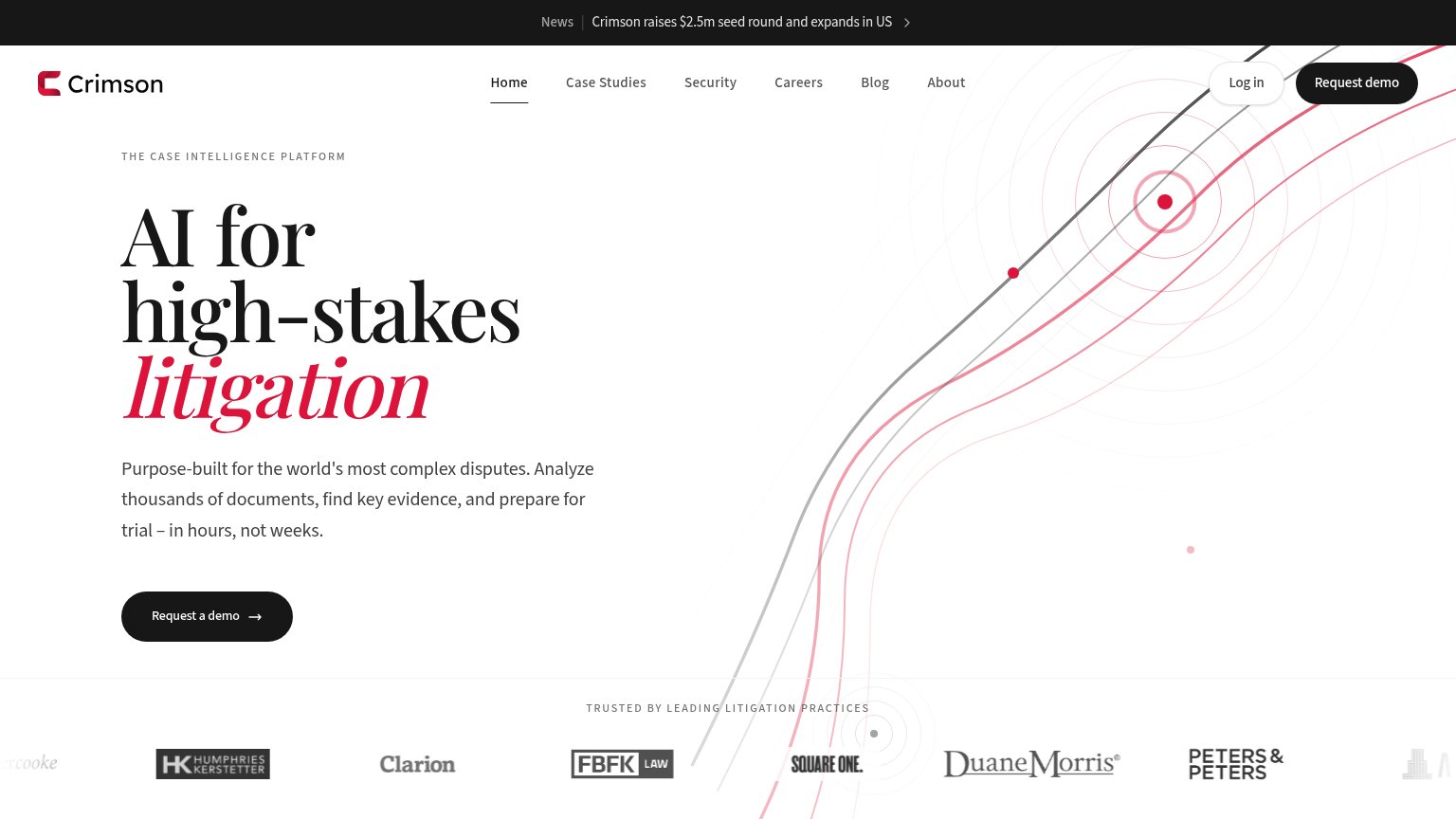
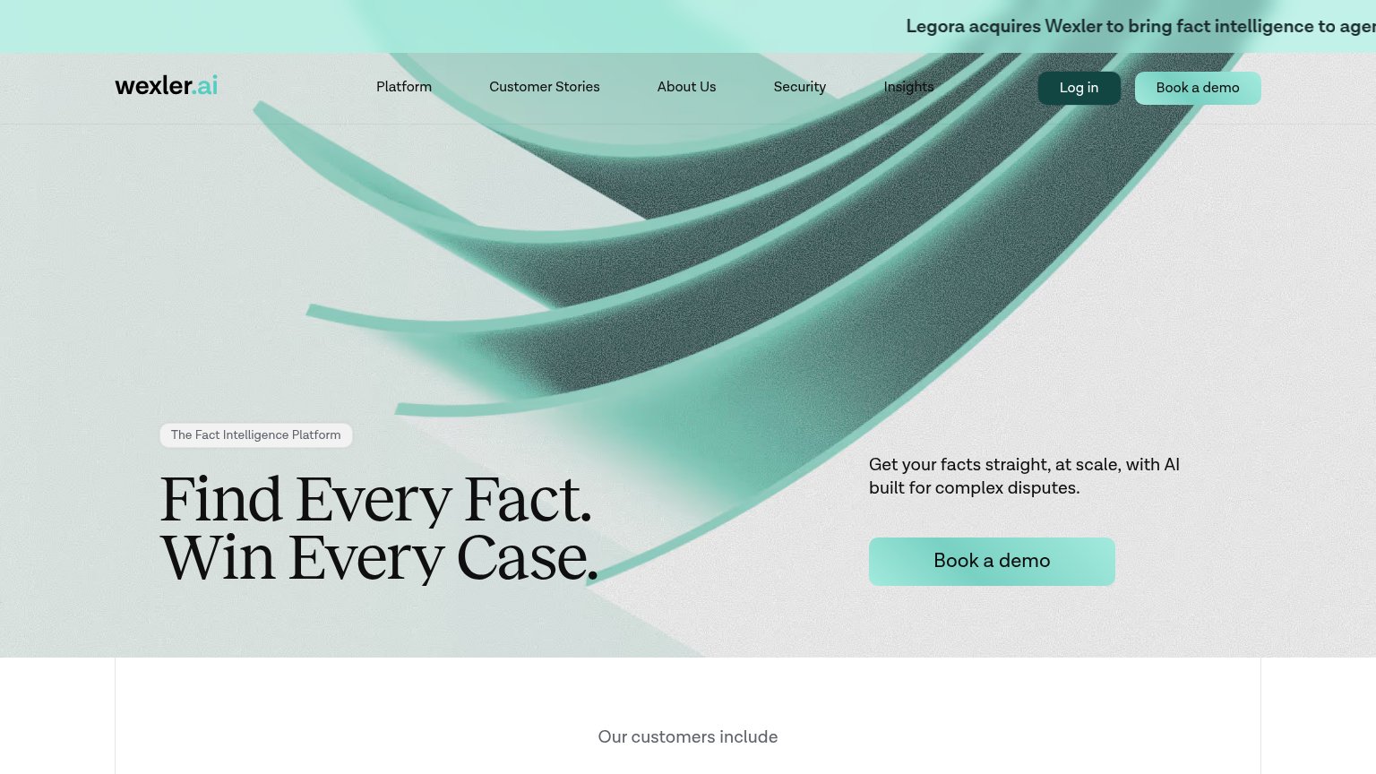
Problems
- 'Request' feels costly, sales-gated
- header says 'Request demo', hero adds 'a'
- no low-friction alternative path
Value props
78FairTitle, subtitle, hero — do they sell the product's true value?
Crimson’s headline sells
AI for high-stakes litigation
Purpose-built for the world's most complex disputes. Analyze thousands of documents, find key evidence, and prepare for trial – in hours, not weeks.
Working
- Names the exact buyer and stakes
- Hours-not-weeks quantifies the outcome
- Trusted-by logos from real law firms
Could improve
- Hero art decorates, shows no product
- No hard numbers beyond 'thousands'
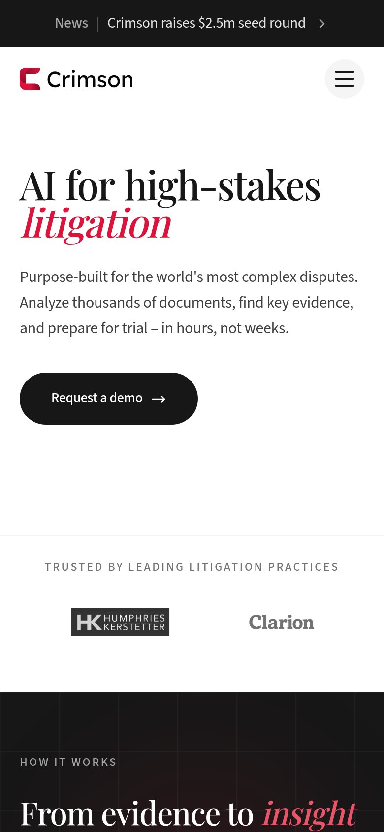
- Logo bar cut to two firms on mobile
Mobile web
80StrongThe phone experience as a first-class citizen.
 12
- Request a demo button — Desktop-proportioned pill floating at roughly half the column width instead of a full-bleed, thumb-friendly bar.
- News announcement banner — Sticky promo bar eats the top of the viewport and its text truncates ('$2.5m seed round' cut off) before the logo even renders.
Information hierarchy
82StrongDoes the design help or inhibit what the page is trying to say?
123- Seed round news banner — Sits at the very top of the scan path and routes first attention to a press story instead of the value prop.
- Six-link nav row — Careers, Blog, and About add exit paths that compete with the demo CTA at equal visual weight.
- Clipped edge logos — The trust strip cuts off logos at both ends, making the social-proof row read as broken.