Claim HealthYC P25 landing page report.
← Back to YC P25

Your landing page’s weakest score is Value props.

Fix Value props

Score over time

807060504030WellSky 56 on May 27 (Wayback)WellSky 54 on Jun 18 (Wayback)WellSky 55 on Jun 29 (Wayback)WellSky 58 on Jul 15 (Wayback)WellSky 57 on Jul 28 (Wayback)WellSky 67 on Sep 5 (Wayback)WellSky 62 on Sep 20 (Live)Careport (WellSky CarePort) 56 on Sep 22 (Live)Axxess 49 on Mar 25 (Wayback)Axxess 46 on Apr 20 (Wayback)Axxess 45 on May 2 (Wayback)Axxess 47 on May 16 (Wayback)Axxess 41 on Jun 14 (Wayback)Axxess 55 on Sep 20 (Live)Element5 60 on Apr 3 (Wayback)Element5 64 on Apr 19 (Wayback)Element5 63 on May 14 (Wayback)Element5 58 on Sep 22 (Live)Medalogix 62 on Sep 22 (Live)Claim Health 70 on Apr 2 (Wayback)Claim Health 72 on May 19 (Wayback)Claim Health 72 on Jun 13 (Wayback)Claim Health 72 on Sep 20 (Live)Apr 2May 19Jun 13Sep 20
Past reportsShow past reportsHide past reports
  1. Sep 20, 202672LiveCTA +8 · Information hierarchy −4Viewing
  2. Jun 13, 202672Information hierarchy −2 · Trust −2View →
  3. May 19, 202672Overall +2 · Information hierarchy +6 · Trust +4View →
  4. Apr 2, 202670First tracked report — strongest Information hierarchy 72, weakest CTA 68View →

Value props

68Fair

Title, subtitle, hero — do they sell the product's true value?

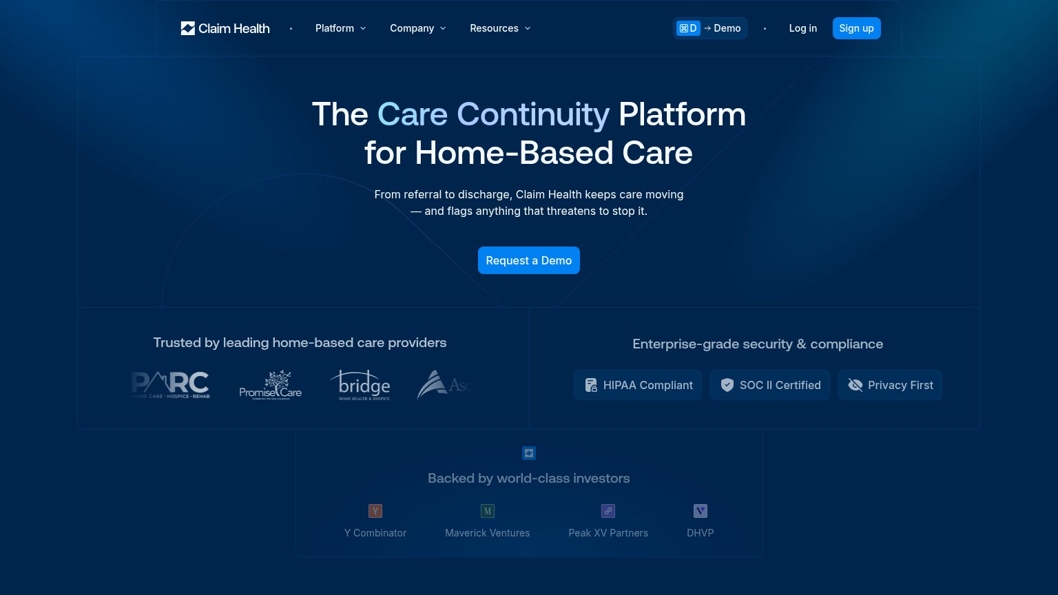
Claim Health’s headline undersellsThe Care Continuity Platform for Home-Based CareFrom referral to discharge, Claim Health keeps care moving — and flags anything that threatens to stop it.

Working

  • Subhead names workflow span: referral to discharge
  • Flags-risk line taps real anxiety in home care
  • Trust badges and provider logos back the claim

Could improve

  • Headline is category jargon, not an outcome
  • No numbers or quantified proof anywhere
  • Hero is empty gradient, shows no product

Information hierarchy

72Fair

Does the design help or inhibit what the page is trying to say?

Information hierarchy annotations on the desktop capture1234
  1. Sign up button — Styled identically to the hero's 'Request a Demo' CTA in the same blue, splitting the fold's one action into two.
  2. Investor logos strip — 'Backed by world-class investors' badges render as tiny illegible icons, adding a fourth same-weight block to the fold.
  3. PARC logo cropped — First trust logo is clipped at the container edge and the fourth logo is cut off mid-word, undermining the trust row.
  4. Demo keyboard shortcut — The '⌘D → Demo' hint duplicates the hero CTA in the nav and reads as UI clutter to first-time visitors.

Trust

72Fair

Proof that the product is real, competent, and safe to try.

Trust read
Claim Health"Trusted by leading home-based care providers" logo strip (PARC, PromiseCare, Bridge Home Health & Hospice, Ascend Healt
WellSkyTrusted by 20,000+ provider organizations. Powering care for 1 in 3 Americans.
Careport (WellSky CarePort)"CarePort powered by WellSky" logo lockup
AxxessNo visible trust signal identified.
Element5Named customer testimonial video: "Katy Ramsey, VP of Operations at AngMar Medical"
MedalogixNo visible trust signal identified.

Mobile web

72Fair

The phone experience as a first-class citizen.

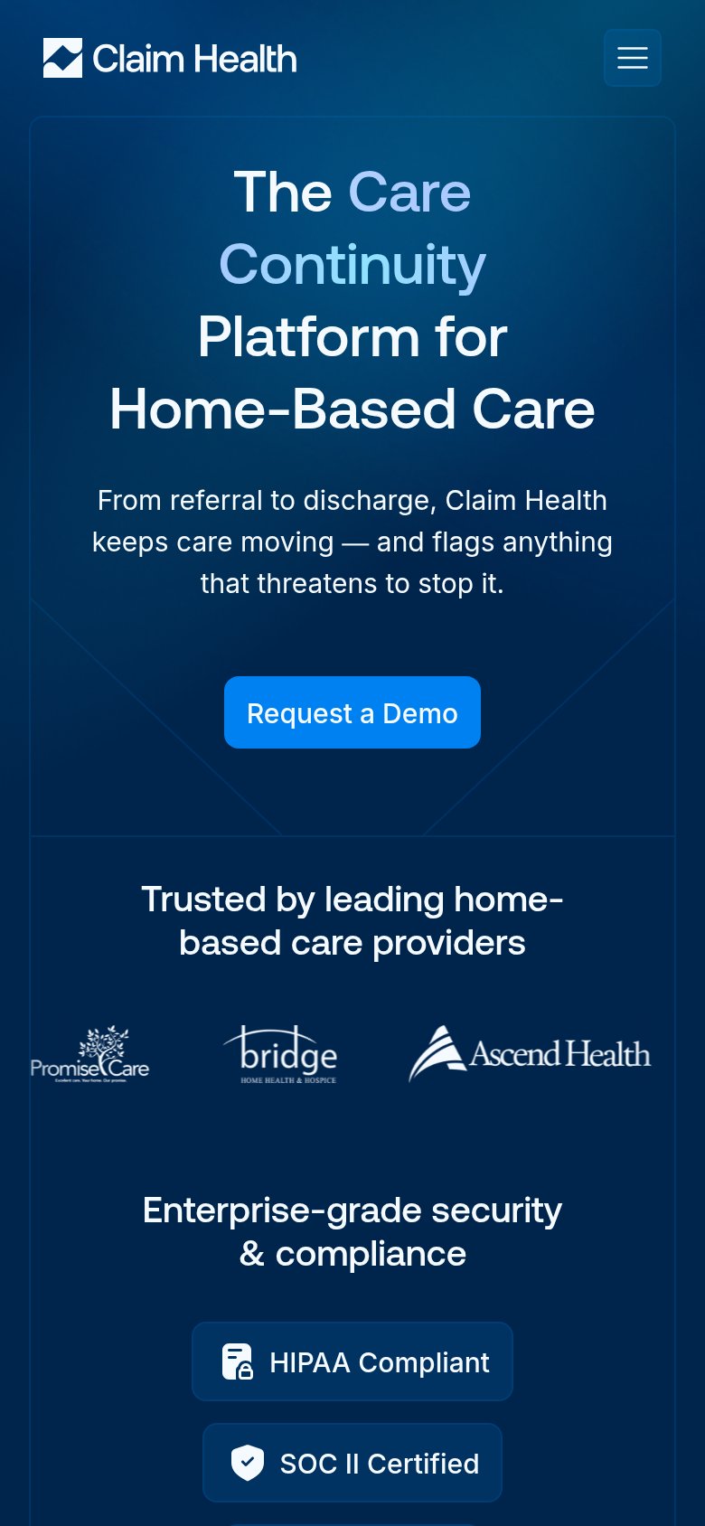
Mobile web annotations on the mobile capture123
  1. Oversized wrapping headline — Four huge lines eat a third of the viewport and push the CTA to the fold edge.
  2. Request a Demo button — Desktop-proportioned pill floating in the column instead of a full-width thumb target.
  3. PromiseCare logo clipped — First trust logo is cut off at the left edge, making the logo row look broken.

CTA

76Fair

Copy, size, verb, cost-feel — does the primary CTA earn the click?

Claim Health

Problems

  • 'Request' feels like waiting, not value
  • competes with nav 'Sign up' label
  • no demo payoff or time cost named