
Your landing page’s weakest score is Value props.
How Chiron ranks
63Growth scoreupdated
category scores
category scoresShowHide
Score over time
Value props
58FairTitle, subtitle, hero — do they sell the product's true value?
Chiron’s headline undersells
Chiron
Keep thinking.
Working
- Demo image shows product reading real math work
- 'Just enough to get unstuck' names the payoff
- 'Does less' differentiates from answer-bots
Could improve
- Headline is just the brand name
- 'Keep thinking.' explains nothing alone
- No numbers, audience, or subject named
Trust
58FairProof that the product is real, competent, and safe to try.
| Trust read | |
|---|---|
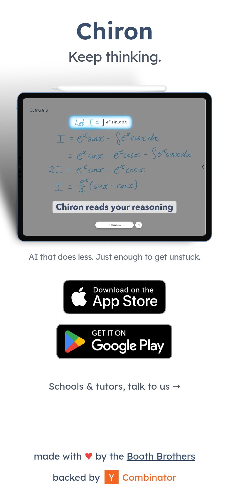
| Chiron | iPad demo showing handwritten calculus work with the "Chiron reads your reasoning" overlay |
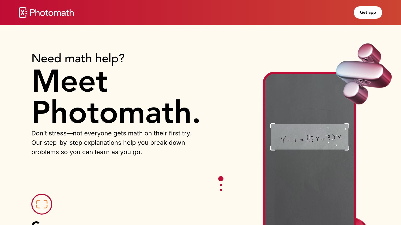
| Mobile 'Solving Steps' demo showing the scanned equation Y-1=(2Y+3)x solved step-by-step with 'Show Solving Steps' | |
| Live question input with "Drag Image or Click Here to upload" dropzone and subject tabs (Math, Calculus, Chemistry, Biol | |
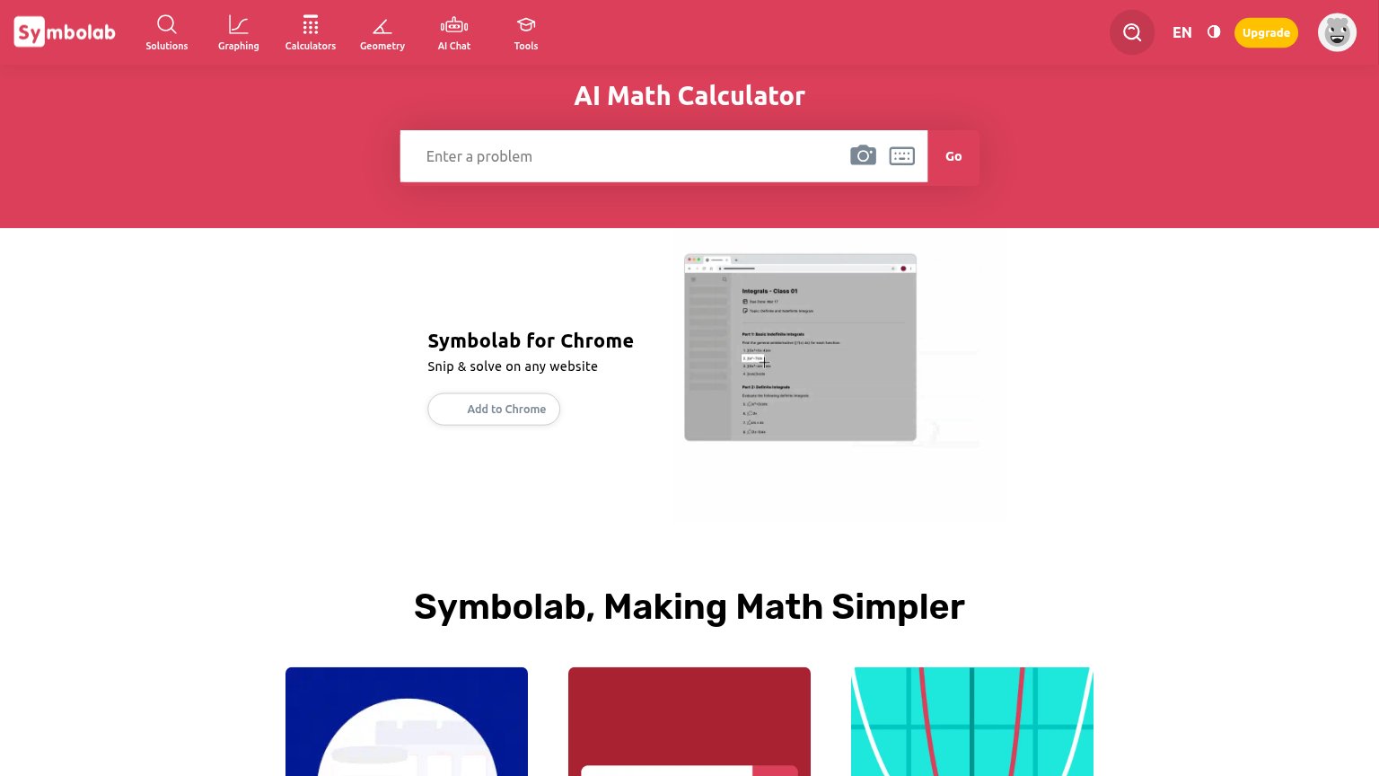
| Chrome extension screenshot under "Symbolab for Chrome — Snip & solve on any website" showing the snip-to-solve UI on a | |
| The live, interactive math solver UI — subject selector, "Enter a problem..." input with camera icon, and full math keyp | |
| Wall Street Journal quote: "Forget ChatGPT. These are the best AI-powered apps." |
CTA
62FairCopy, size, verb, cost-feel — does the primary CTA earn the click?



Problems
- stock badges, no designed CTA
- click split across two badges
- no payoff or value in copy
- small vs headline on desktop
Mobile web
62FairThe phone experience as a first-class citizen.
 123
- App Store badge — Primary CTA pushed below the first viewport by the tall demo image; nothing tappable appears on landing.
- Tall iPad demo — The demo screenshot consumes most of the fold, displacing both store badges below the first viewport.
- Reading pill text — In-screenshot UI text like "Reading…" and "Evaluate" is illegibly small at phone size.
Information hierarchy
76FairDoes the design help or inhibit what the page is trying to say?
1234- Dual store badges — Two equal-weight badges split the primary action; neither reads as THE CTA within one second.
- Keep thinking tagline — Tagline names no category or outcome, leaving the demo image to explain the entire product alone.
- Schools & tutors link — Third equal-visibility action beneath the badges adds a competing exit path in the core scan column.
- Footer credit links — Booth Brothers and Y Combinator outbound links creep into the fold and leak attention off-site.