
Your landing page’s weakest score is Trust.
How Gauth ranks
62Growth scoreupdated
category scores
category scoresShowHide
Trust
48PoorProof that the product is real, competent, and safe to try.



| Trust read | |
|---|---|
| Gauth | Live question input with "Drag Image or Click Here to upload" dropzone and subject tabs (Math, Calculus, Chemistry, Biol |
| iPad demo showing handwritten calculus work with the "Chiron reads your reasoning" overlay | |
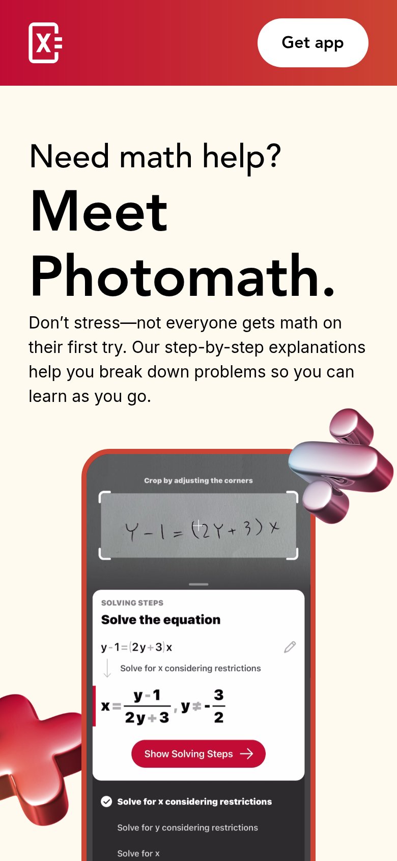
| Mobile 'Solving Steps' demo showing the scanned equation Y-1=(2Y+3)x solved step-by-step with 'Show Solving Steps' | |
| Chrome extension screenshot under "Symbolab for Chrome — Snip & solve on any website" showing the snip-to-solve UI on a | |
| The live, interactive math solver UI — subject selector, "Enter a problem..." input with camera icon, and full math keyp | |
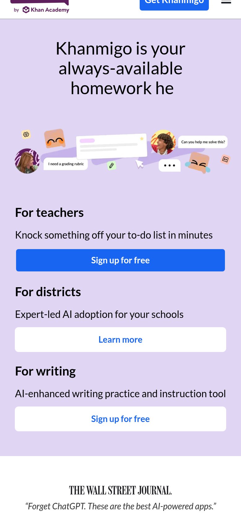
| Wall Street Journal quote: "Forget ChatGPT. These are the best AI-powered apps." |
Information hierarchy
62FairDoes the design help or inhibit what the page is trying to say?
1234- Left sidebar navigation — Eight equal-weight links (Homework, Course, Assignment Solver, Atlas, Calculator, Resources, Blog, App) siphon attention from the question input before a visitor acts.
- Upgrade and Sign in — The dark 'Sign in' pill is the most contrast-heavy button on the fold, outranking the pale question-input CTA.
- Question input arrow — The primary submit arrow is low-contrast gray-on-gray and reads as disabled rather than as the main action.
- Start Free Trial button — A third competing CTA in the sidebar's Gauth Plus card pulls toward payment before the visitor has tried the core input.
Value props
62FairTitle, subtitle, hero — do they sell the product's true value?
Gauth’s headline
Your AI Homework Helper Gauth it, Ace it!
Working
Could improve
Mobile web
62FairThe phone experience as a first-class citizen.

What works
What to improve
CTA
78FairCopy, size, verb, cost-feel — does the primary CTA earn the click?
How Gauth compares
Recommended rewrites