BluejayYC P25 landing page report.
← Back to YC P25

Your landing page’s weakest score is Mobile web.

Fix Mobile web

Score over time

100806040200Coval 62 on Apr 20 (Wayback)Coval 63 on May 16 (Wayback)Coval 68 on Sep 20 (Live)Hamming AI 67 on Apr 1 (Wayback)Hamming AI 67 on Apr 11 (Wayback)Hamming AI 66 on May 6 (Wayback)Hamming AI 77 on Jun 27 (Wayback)Hamming AI 76 on Aug 9 (Wayback)Hamming AI 72 on Sep 21 (Live)Cekura 67 on Apr 8 (Wayback)Cekura 70 on May 3 (Wayback)Cekura 68 on May 10 (Wayback)Cekura 66 on Jun 4 (Wayback)Cekura 66 on Jul 26 (Wayback)Cekura 68 on Sep 21 (Live)Vocera (Roark) 23 on Apr 17 (Wayback)Vocera (Roark) 29 on May 13 (Wayback)Vocera (Roark) 31 on Jun 12 (Wayback)Vocera (Roark) 74 on Jul 13 (Wayback)Vocera (Roark) 77 on Sep 21 (Live)Fixa 59 on May 23 (Wayback)Fixa 66 on Sep 21 (Live)Bluejay 52 on Apr 9 (Wayback)Bluejay 70 on May 17 (Wayback)Bluejay 66 on Jun 12 (Wayback)Bluejay 74 on Sep 21 (Live)Apr 9May 17Jun 12Sep 21
Past reportsShow past reportsHide past reports
  1. Sep 21, 202674LiveOverall +8 · CTA +16 · Trust +14Viewing
  2. Jun 12, 202666Overall −4 · Mobile web −18 · CTA −6View →
  3. May 17, 202670Overall +18 · Information hierarchy +40 · Value props +34View →
  4. Apr 9, 202652First tracked report — strongest Trust 66, weakest Value props 34View →

Mobile web

70Fair

The phone experience as a first-class citizen.

Mobile web annotations on the mobile capture123
  1. Stacked dual CTAs — Two equal-weight buttons compete for the tap; neither is full-width or clearly primary.
  2. Start for Free button — Translucent fill on the busy pastel render leaves the label with weak contrast and low tap affordance.
  3. Two-line announcement bar — The pink banner wraps to two lines, pushing the hero down on an already-tight viewport.

Value props

72Fair

Title, subtitle, hero — do they sell the product's true value?

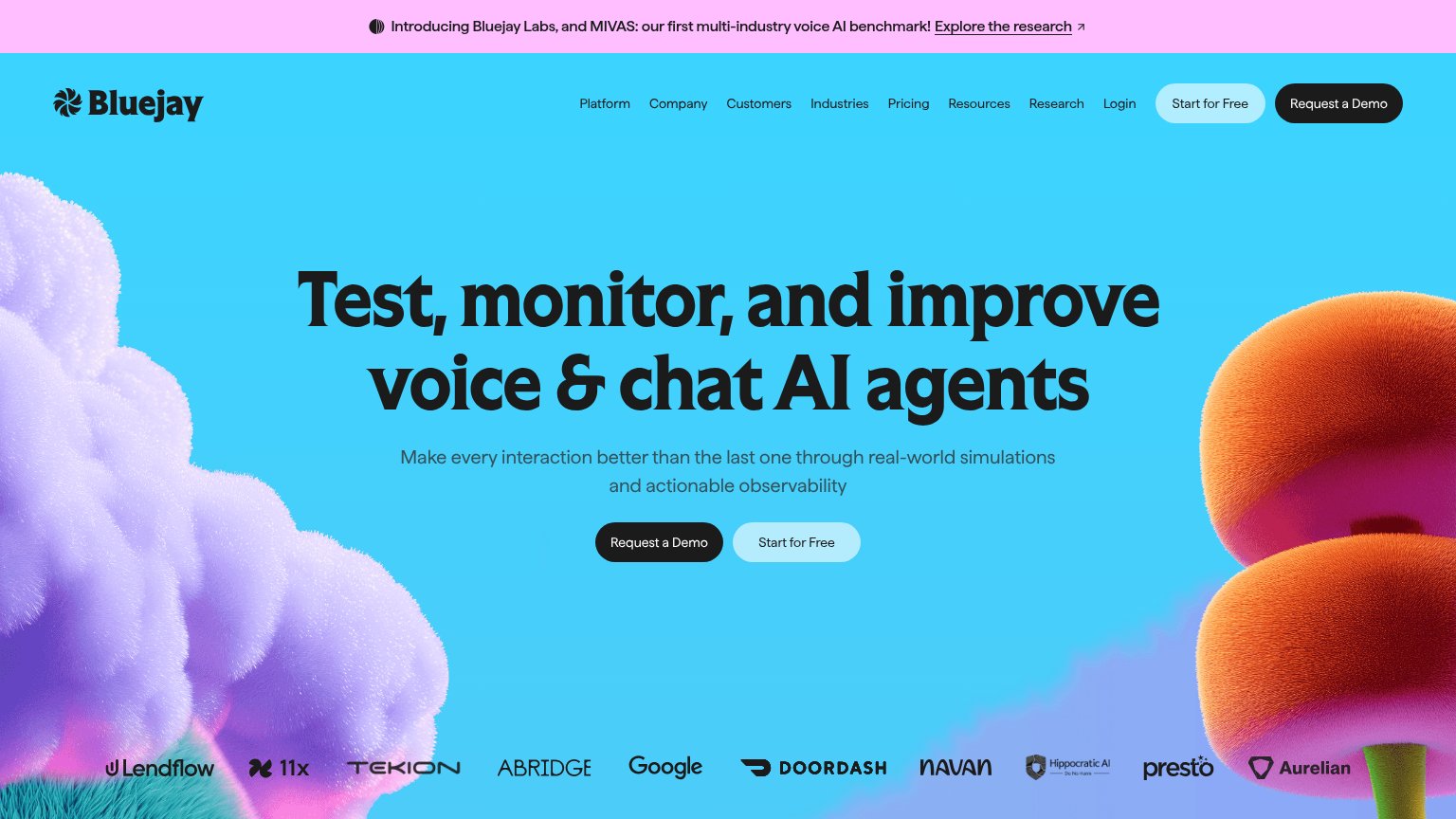
Bluejay’s headline sellsTest, monitor, and improve voice & chat AI agentsMake every interaction better than the last one through real-world simulations and actionable observability

Working

  • Names the exact job and audience
  • Subhead names the mechanism
  • Big-name logos add instant proof

Could improve

  • No numbers or concrete outcomes
  • Hero art decorates, shows nothing
  • No emotional stakes named

Trust

72Fair

Proof that the product is real, competent, and safe to try.

Trust read
BluejayCustomer logo bar featuring Google, DoorDash, Navan, Abridge, Tekion, Presto, Hippocratic AI, 11x, Lendflow, Aurelian
Coval"Coval raises $28M Series A to make voice AI deployment-ready" funding banner
Hamming AI"First test report in under 10 mins • SOC 2 Type II • HIPAA (BAA available)" strip under the CTA
Cekura"New: Voice AI Orchestration Benchmarks — Retell, Vapi, Pipecat, LiveKit & more" announcement bar
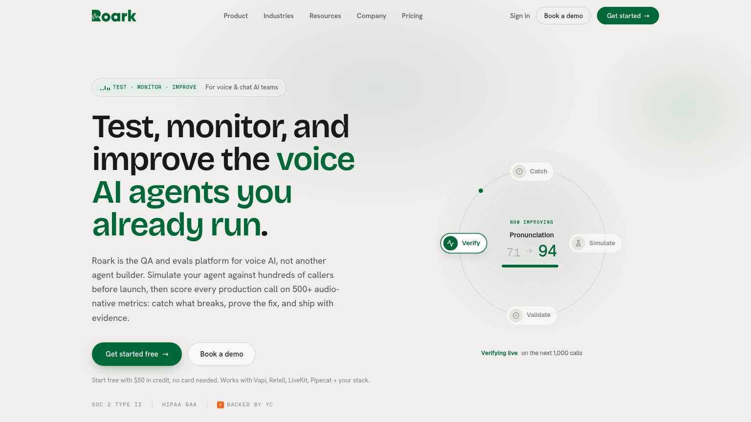
Vocera (Roark)SOC 2 TYPE II | HIPAA BAA | BACKED BY YC badge row beneath the CTA
FixaLive prompt composer with "Import from GitHub" and "Connect MCP tools" actions showing real product UI

Information hierarchy

76Fair

Does the design help or inhibit what the page is trying to say?

Information hierarchy annotations on the desktop capture123
  1. Dual hero CTAs — "Request a Demo" and "Start for Free" compete at near-equal weight, and both repeat again in the nav — no single primary action.
  2. Nine-link nav row — Platform through Login gives attention nine exits before either conversion CTA.
  3. Announcement banner link — "Explore the research" is the topmost interactive element, pulling first clicks away from the conversion path.

CTA

78Fair

Copy, size, verb, cost-feel — does the primary CTA earn the click?

Bluejay
Vocera (Roark)

Problems

  • demo ask feels costly
  • free path demoted to secondary
  • sales gate before product value

Competitors

inferred from product, audience, and value prop