
Your landing page’s weakest score is Trust.
How Attune ranks
46Growth scoreupdated
category scores
category scoresShowHide
Score over time
Trust
38PoorProof that the product is real, competent, and safe to try.
| Trust read | |
|---|---|
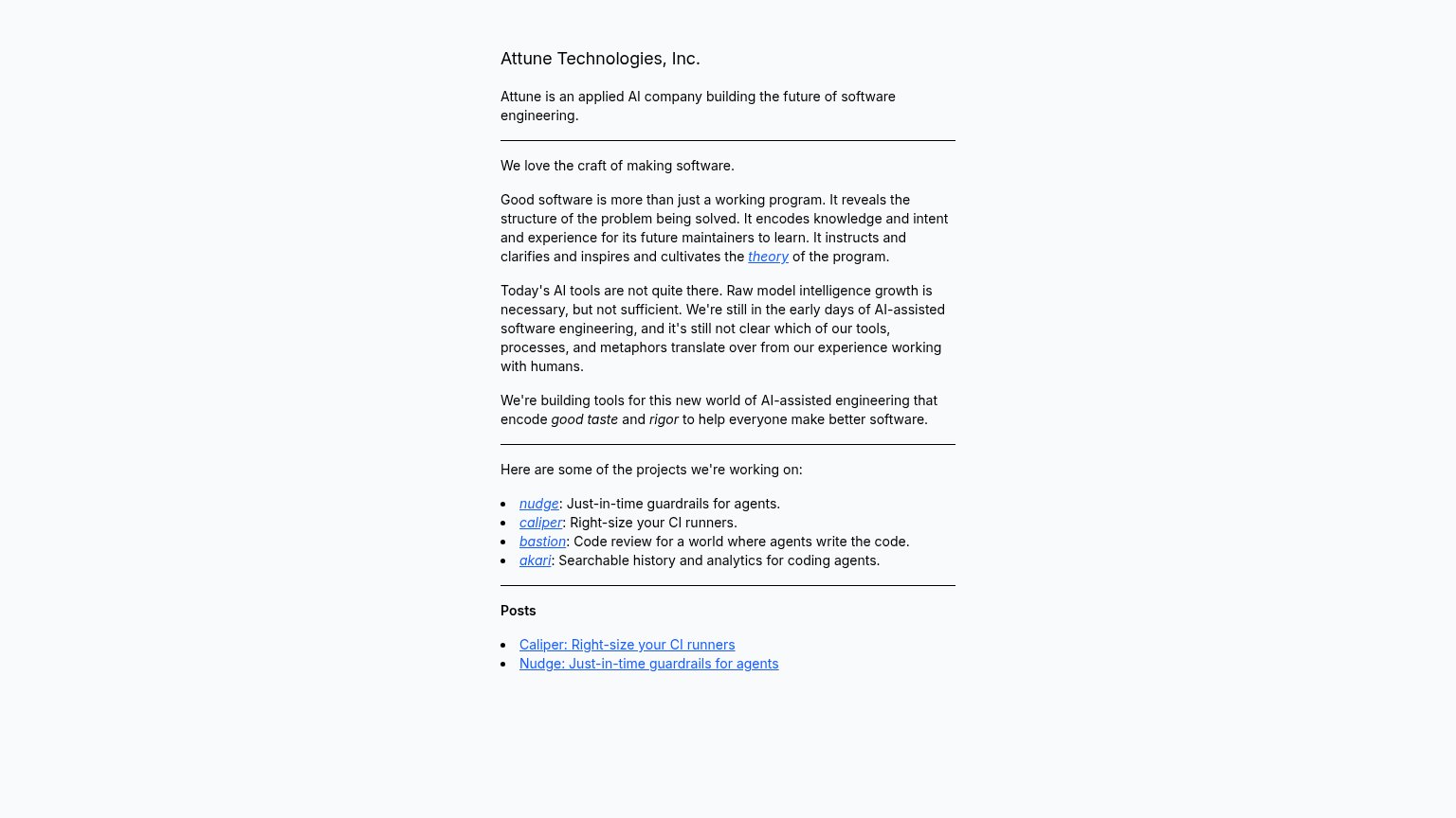
| Attune | Named project list with linked posts ("Caliper: Right-size your CI runners", "Nudge: Just-in-time guardrails for agents" |
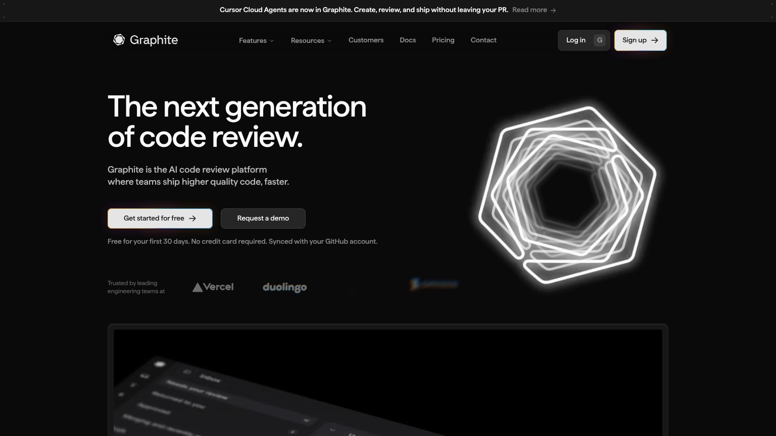
| "Trusted by leading engineering teams at" logo strip with Vercel and Duolingo | |
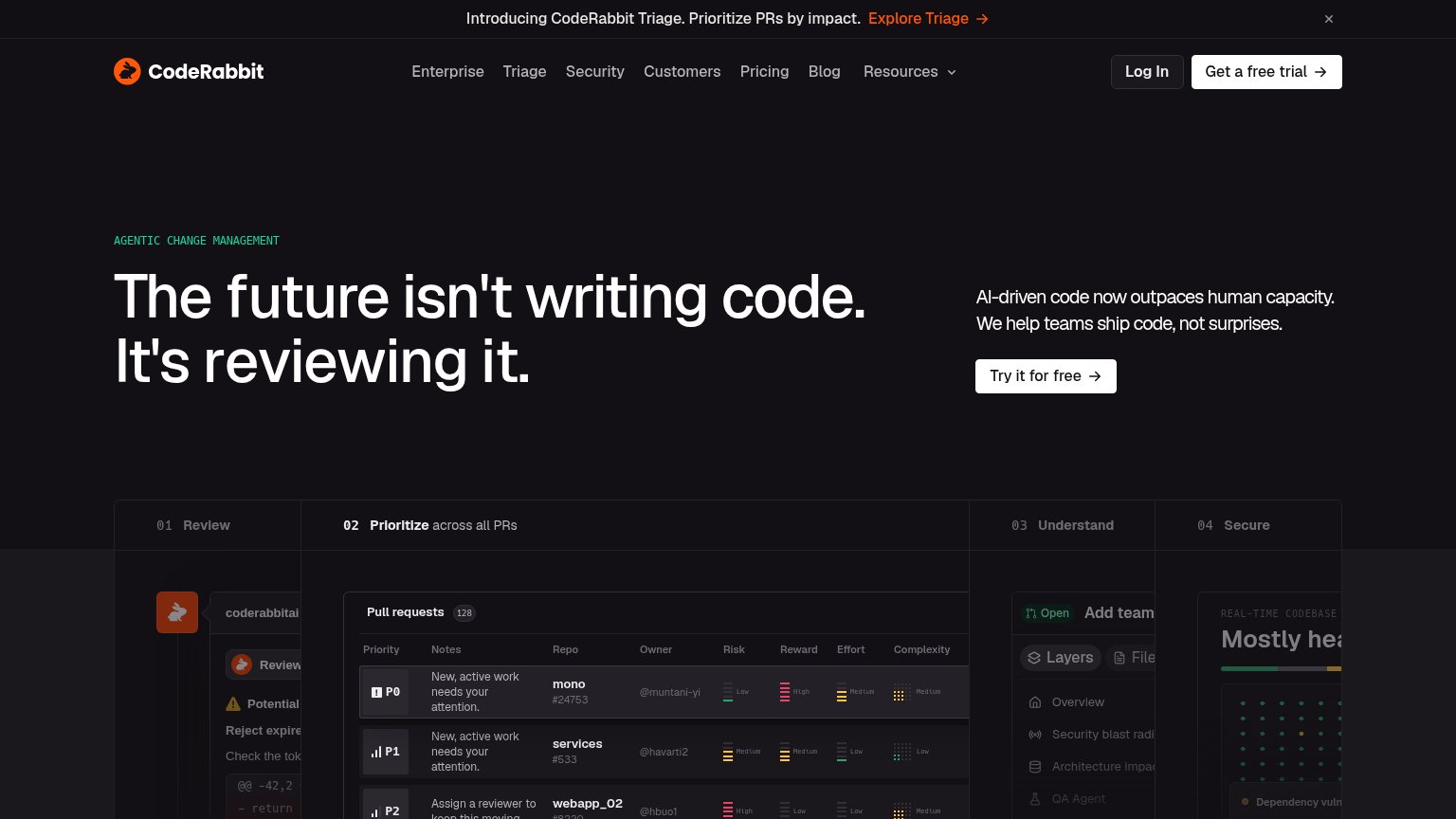
| Detailed "Pull requests" product UI with P0/P1/P2 priority rows and risk/reward/effort columns | |
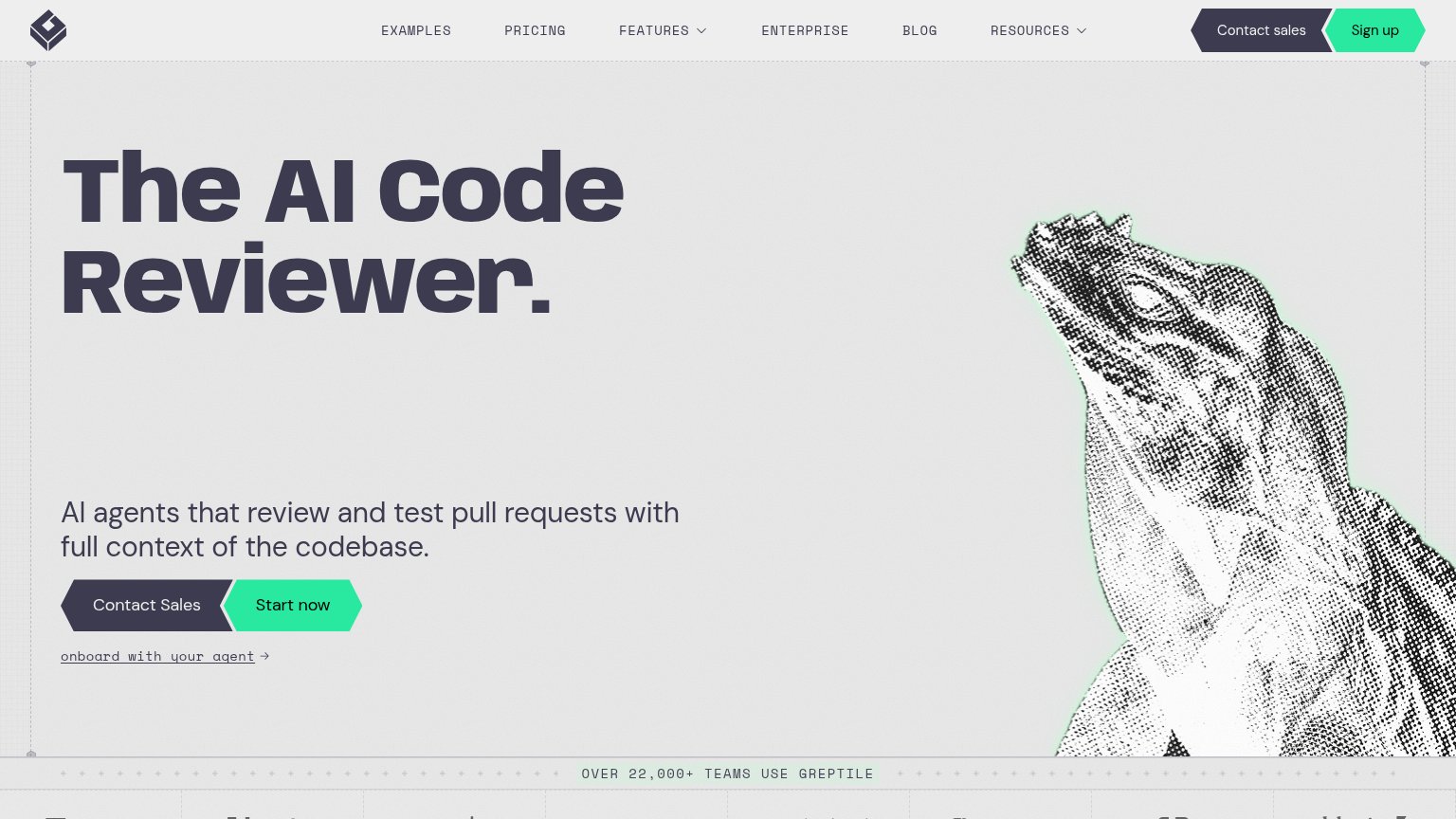
| "OVER 22,000+ TEAMS USE GREPTILE" usage banner | |
| No visible trust signal identified. |
CTA
42PoorCopy, size, verb, cost-feel — does the primary CTA earn the click?
Problems
- no button or input anywhere
- only inline text links to act on
- no signup, waitlist, or contact path
Information hierarchy
48PoorDoes the design help or inhibit what the page is trying to say?
1234- Projects link list — Four identically styled links with no weighted flagship — no clear next action for a convinced visitor.
- Manifesto paragraph block — Four dense same-weight paragraphs between headline and projects force reading before any action is offered.
- Posts section links — Two more underlined exits at equal weight, diluting attention further with no hierarchy over the projects above.
- Inline theory link — Outbound link buried mid-paragraph pulls readers away before they reach Attune's own projects.
Value props
52FairTitle, subtitle, hero — do they sell the product's true value?
Attune’s headline undersells
Attune Technologies, Inc.
Attune is an applied AI company building the future of software engineering.
Working
- Project bullets name concrete tools
- Clear POV on AI-assisted engineering
- Honest, jargon-free prose
Could improve
- H1 is a company name, not a value prop
- 'Future of software engineering' is generic
- Real products buried under essay copy
Mobile web
52FairThe phone experience as a first-class citizen.
 12
- Dense manifesto paragraphs — Three long paragraphs of desktop-style essay text fill the fold with no visual hierarchy or action.
- Inline text links — Project links like 'nudge' and 'caliper' are small underlined words, far below thumb-friendly tap-target size.