
Your landing page’s weakest score is Trust.
How Depot ranks
Trust
42PoorProof that the product is real, competent, and safe to try.
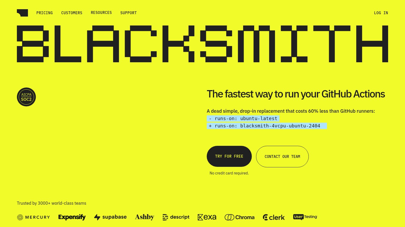
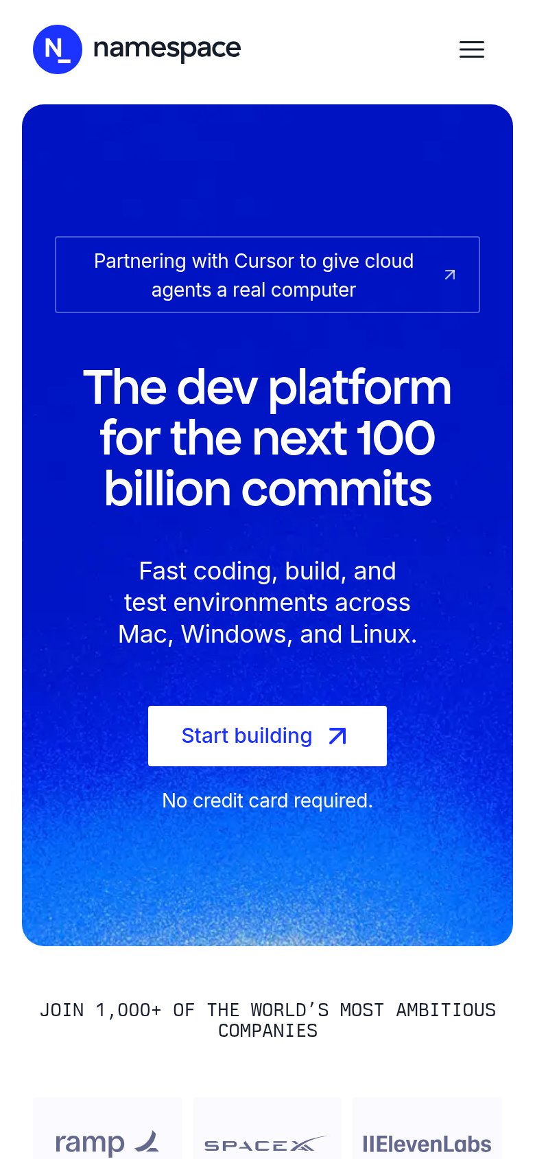
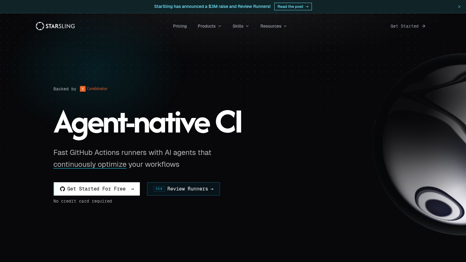
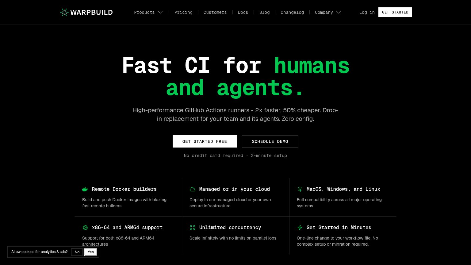
| Trust read | |
|---|---|
| Depot | No visible trust signal identified. |
| "Backed by Y Combinator" badge above the headline | |
| "Trusted by 3000+ world-class teams" logo wall (Mercury, Expensify, Supabase, Ashby, Descript, Exa, Chroma, Clerk, UserT | |
| Customer logo strip with Ramp, SpaceX, and ElevenLabs under "JOIN 1,000+ OF THE WORLD'S MOST AMBITIOUS COMPANIES" (mobil | |
| No credit card required · 2-minute setup | |
| Logo strip under "BUILDJET IS TRUSTED BY COMPANIES ALL OVER THE WORLD" showing Google, Amazon, Plex, Prisma, and Grafbas |
Mobile web
58FairThe phone experience as a first-class citizen.
 123
- START BUILDING CTA — Sits at the bottom edge of the viewport and isn't full-width, making the first tap easy to miss.
- Announcing Depot Metal banner — Sticky promo bar eats a slice of the fold and helps push the primary CTA to the viewport edge.
- Subheadline paragraph — Four cramped centered lines with an orphaned 'at AI speed.' — hard to scan on a phone.
Value props
68FairTitle, subtitle, hero — do they sell the product's true value?
Depot’s headline
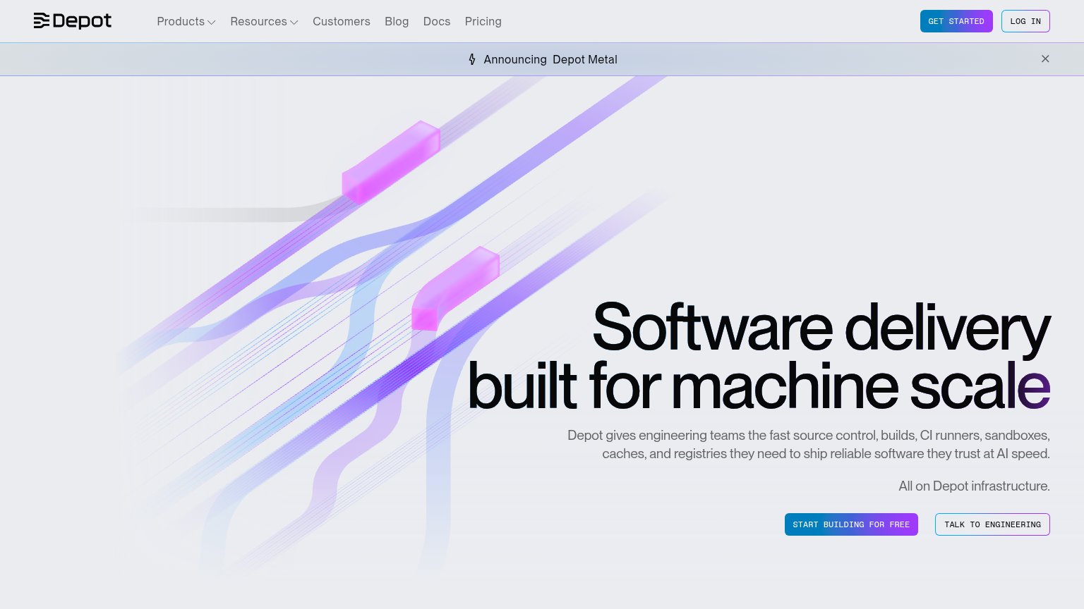
Software delivery built for machine scale
Depot gives engineering teams the fast source control, builds, CI runners, sandboxes, caches, and registries they need to ship reliable software they trust at AI speed. All on Depot infrastructure.
Working
Could improve
Information hierarchy
78FairDoes the design help or inhibit what the page is trying to say?
What works
What to improve
CTA
78FairCopy, size, verb, cost-feel — does the primary CTA earn the click?
How Depot compares
Recommended rewrites