
Your landing page’s weakest score is CTA.
How SuperRadiant ranks
58Growth scoreupdated
category scores
category scoresShowHide
Score over time
CTA
48PoorCopy, size, verb, cost-feel — does the primary CTA earn the click?



Problems
- no CTA in hero on either viewport
- hidden behind hamburger on mobile
- 'Contact' feels costly, sales-y
- small nav-sized footprint
Trust
48PoorProof that the product is real, competent, and safe to try.
| Trust read | |
|---|---|
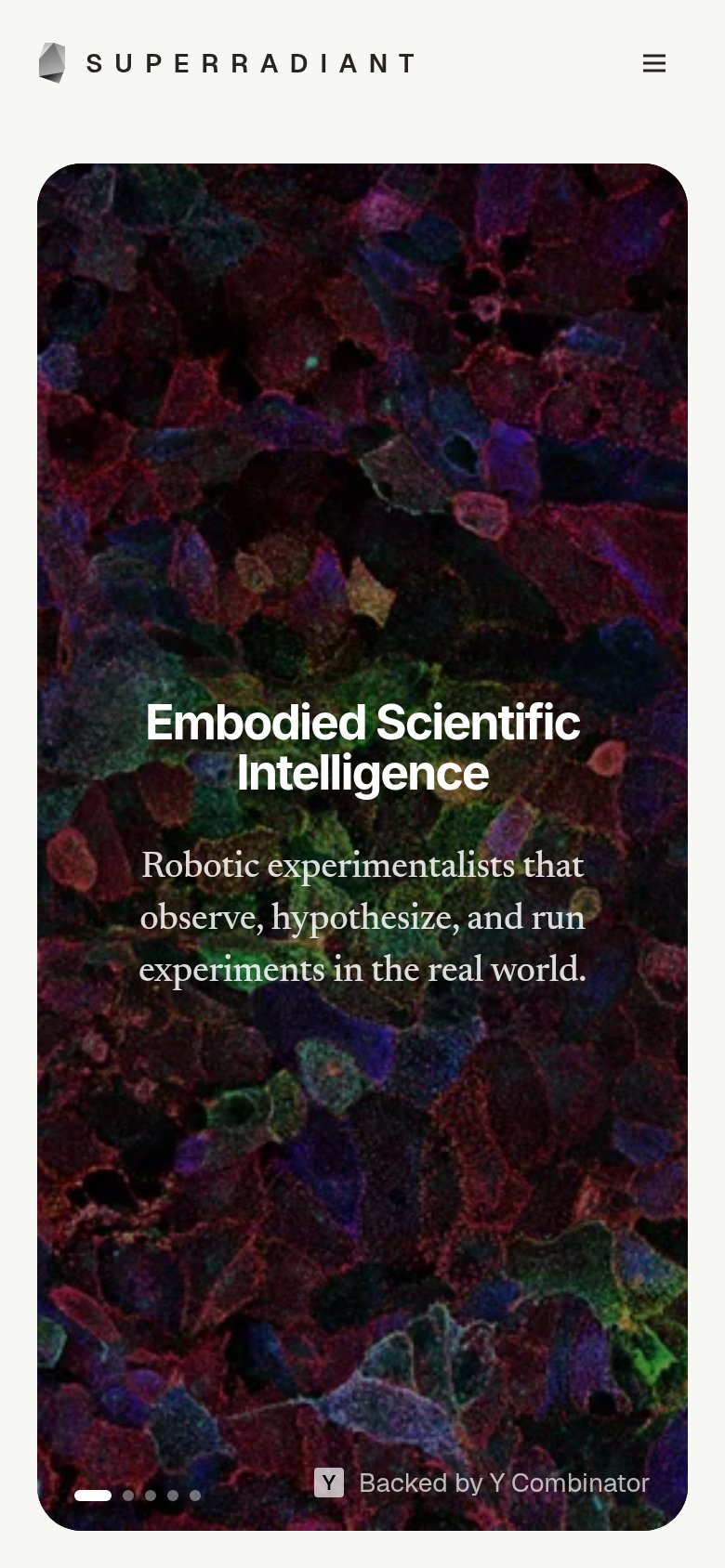
| SuperRadiant | "Backed by Y Combinator" badge in the hero |
| No visible trust signal identified. | |
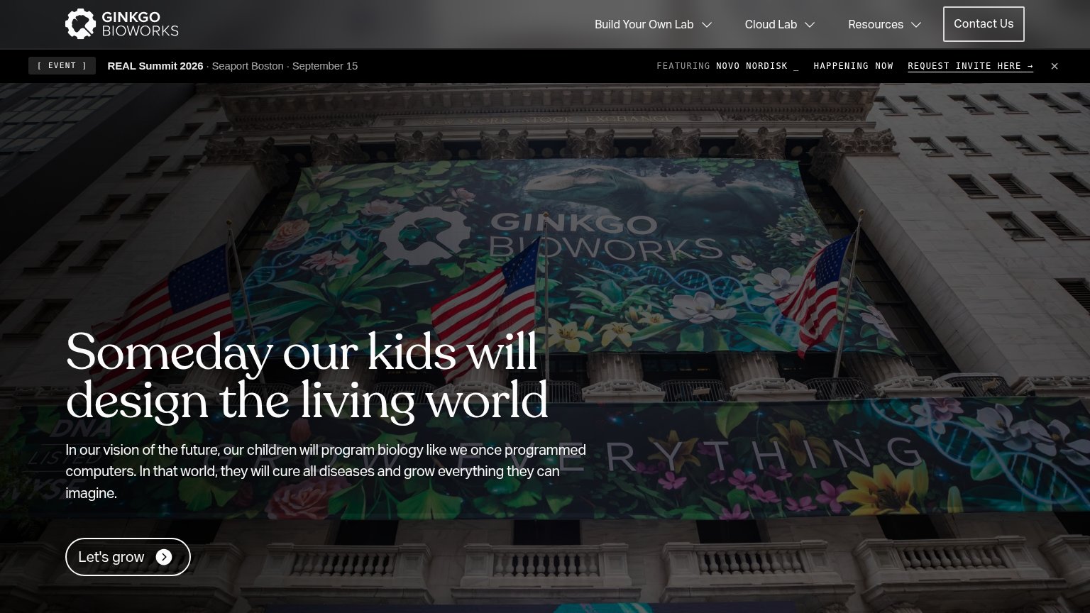
| "Trusted by" logo row: CSL, CMU, Biogen, Bristol Myers Squibb, GSK, Amgen, Argonne National Laboratory, Stanford | |
| Event banner: "REAL Summit 2026 · Seaport Boston · September 15 — FEATURING NOVO NORDISK" | |
| No visible trust signal identified. | |
| No visible trust signal identified. |
Mobile web
58FairThe phone experience as a first-class citizen.
 1
- Faded Y Combinator badge — Low-contrast gray text over the dark image reads as noise instead of a trust signal.
Value props
62FairTitle, subtitle, hero — do they sell the product's true value?
SuperRadiant’s headline vague
Embodied Scientific Intelligence
Robotic experimentalists that observe, hypothesize, and run experiments in the real world.
Working
- Subhead names concrete agent and actions
- YC badge adds credibility
- Hero image signals real lab science
Could improve
- H1 is an abstraction stack
- No numbers or outcomes anywhere
- Image decorates, doesn't show robots
Information hierarchy
72FairDoes the design help or inhibit what the page is trying to say?
123- Contact Us button — Only CTA is stranded in the top-right corner, outside the hero scan path where the headline lands.
- Carousel dots — Five-slide indicator means the hero message rotates, destabilizing the one headline the fold must land.
- Hero text block — Headline and subtitle have no action beneath them — attention peaks here with nothing to click.