
Your landing page’s weakest score is Value props.
How Lila Sciences ranks
39Growth scoreupdated
category scores
category scoresShowHide
Value props
22PoorTitle, subtitle, hero — do they sell the product's true value?
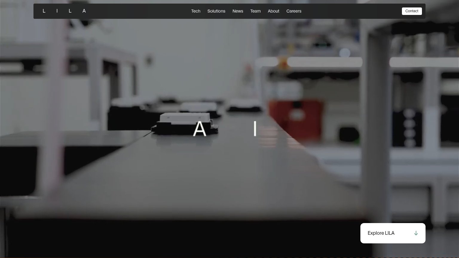
Lila Sciences’s headline vague
L I L A
Working
- Cinematic lab footage sets a serious tone
- Clean, uncluttered fold
- 'Explore LILA' invites scrolling
Could improve
- No headline stating what the product does
- No subhead, proof points, or numbers
- Hero video decorates, demonstrates nothing
Information hierarchy
38PoorDoes the design help or inhibit what the page is trying to say?
 12
- Explore LILA button — The only fold CTA is a low-key 'Explore' scroll prompt tucked bottom-right, outside the natural scan path, with no conversion intent.
- Nav link row — Seven equal-weight exits (Tech, Solutions, News, Team, About, Careers, Contact) compete before any value proposition is stated.
Trust
42PoorProof that the product is real, competent, and safe to try.
How Lila Sciences compares
Trust read
Mobile web
44PoorThe phone experience as a first-class citizen.

What works
What to improve
CTA
48PoorCopy, size, verb, cost-feel — does the primary CTA earn the click?
How Lila Sciences compares
Recommended rewrites