
Your landing page’s weakest score is Trust.
How Streamline Systems ranks
- 1.
Xona Space Systems67
- 2.
Streamline Systems65
- 3.
TrustPoint55
- 4.
Satelles (Iridium STL)52
- 5.
Locata52
- 6.
NextNav50
65Growth scoreupdated
category scores
category scoresShowHide
Score over time
Trust
32PoorProof that the product is real, competent, and safe to try.
| Trust read | |
|---|---|
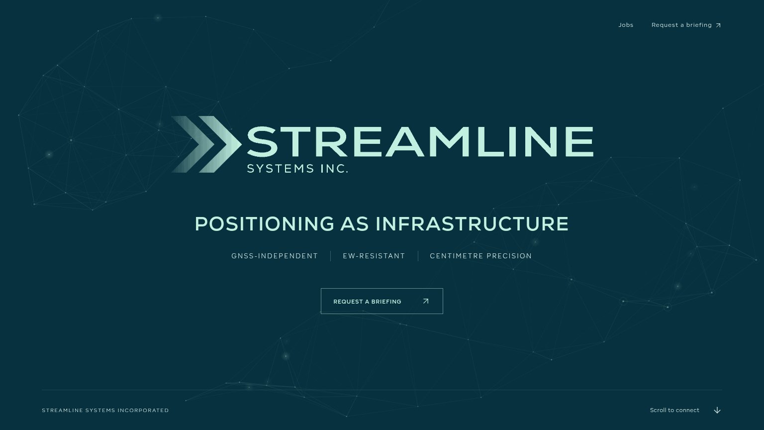
| Streamline Systems | "GNSS-INDEPENDENT | EW-RESISTANT | CENTIMETRE PRECISION" capability strip |
| No visible trust signal identified. | |
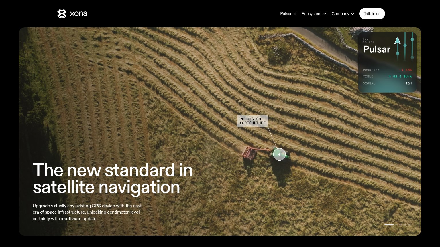
| Pulsar telemetry card showing "DOWNTIME ↓ 36% / YIELD ↑ 55.2 BU/A / SIGNAL HIGH" | |
| implicit context Satelles (Iridium STL) may benefit from pre-existing familiarity among its target audience. | |
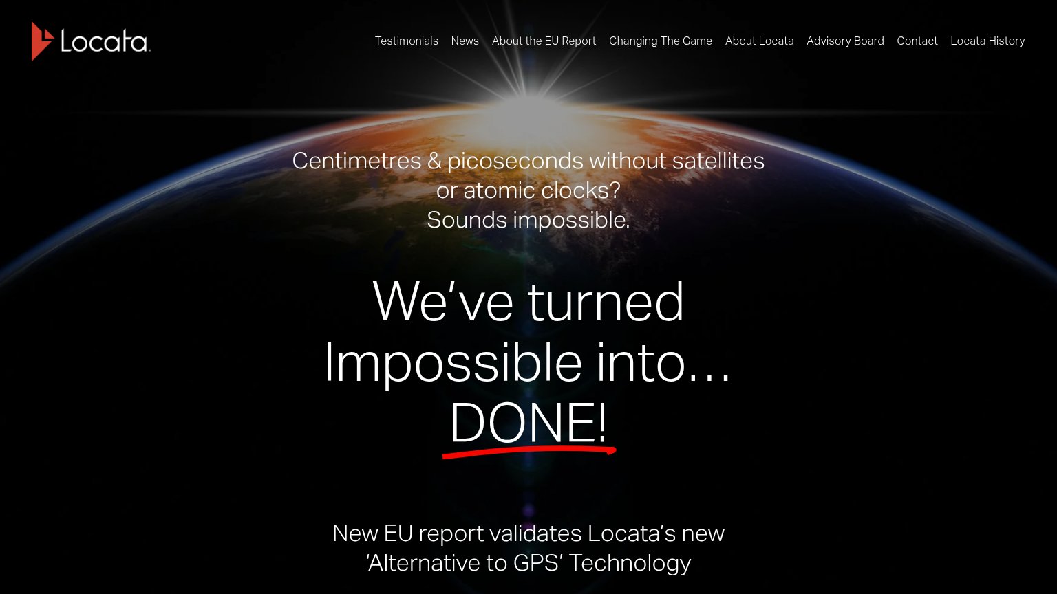
| No visible trust signal identified. | |
| New EU report validates Locata's new 'Alternative to GPS' Technology |
Value props
62FairTitle, subtitle, hero — do they sell the product's true value?
Streamline Systems’s headline undersells
POSITIONING AS INFRASTRUCTURE
GNSS-INDEPENDENT | EW-RESISTANT | CENTIMETRE PRECISION
Working
- Subhead names real differentiators
- "Centimetre precision" is concrete
- Tone fits defense-grade buyers
Could improve
- H1 is abstract category-speak
- No proof points or numbers
- Hero art decorates, shows nothing
CTA
66FairCopy, size, verb, cost-feel — does the primary CTA earn the click?
Problems
- 'Request' feels costly, sales-gated
- ghost outline lacks visual weight
- no value promised for the click
Mobile web
78FairThe phone experience as a first-class citizen.
 12
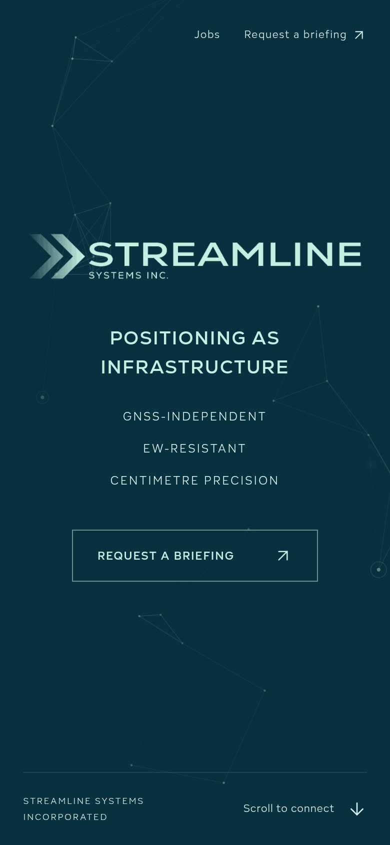
- Request a briefing button — Ghost outline stops short of full-bleed and reads low-contrast against the dark background.
- Header link row — Desktop-style nav row survives on mobile and duplicates the hero's "Request a briefing" CTA.
Information hierarchy
86StrongDoes the design help or inhibit what the page is trying to say?
123- Request a Briefing button — Ghost outline on dark teal gives the primary CTA the same visual weight as body text — it fails the one-second find test.
- Nav briefing text link — Duplicates the primary CTA at header weight, splitting the action across two targets instead of funneling to one.
- Streamline wordmark — The logo is the largest element on the page, outranking the headline that actually carries the value proposition.