
Your landing page’s weakest score is Trust.
How Papaya ranks
68Growth scoreupdated
category scores
category scoresShowHide
Score over time
Trust
42PoorProof that the product is real, competent, and safe to try.

| Trust read | |
|---|---|
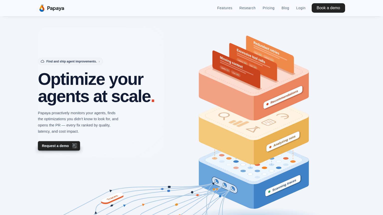
| Papaya | Isometric pipeline diagram labeled "Scanning traces," "Analyzing runs," and "Recommendations" showing detected issues li |
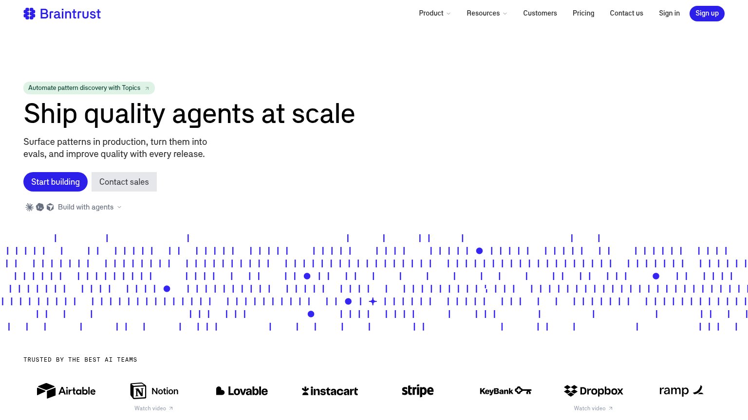
| "TRUSTED BY THE BEST AI TEAMS" logo wall (Airtable, Notion, Stripe, Instacart, Dropbox, Ramp) | |
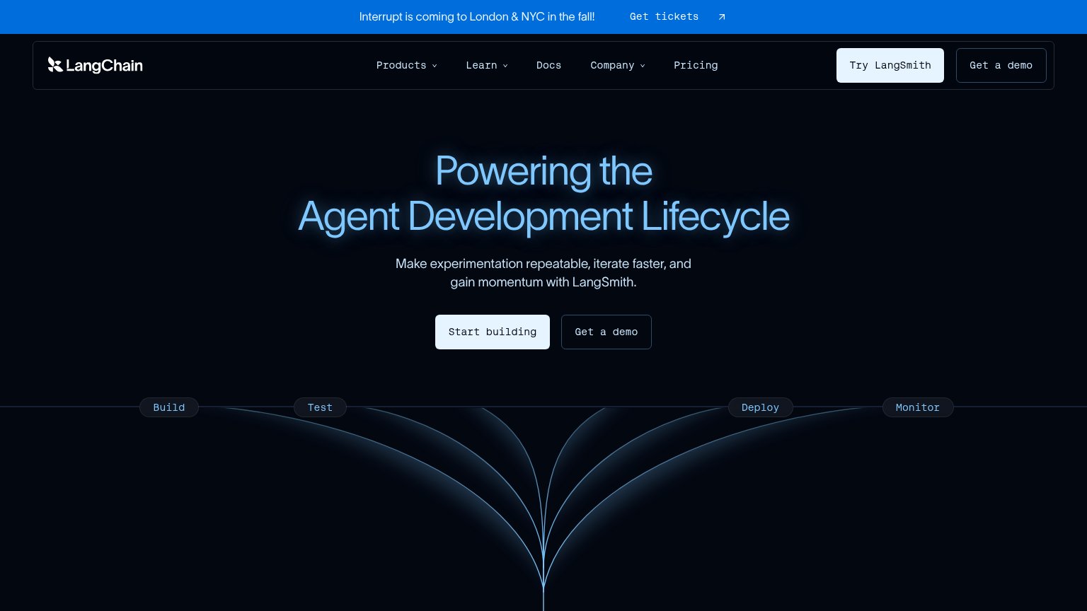
| 'Interrupt is coming to London & NYC in the fall!' conference banner | |
| Customer logo wall under "Powering the world's leading AI teams" (Uber, Spotify, Instacart, DoorDash, Booking.com) | |
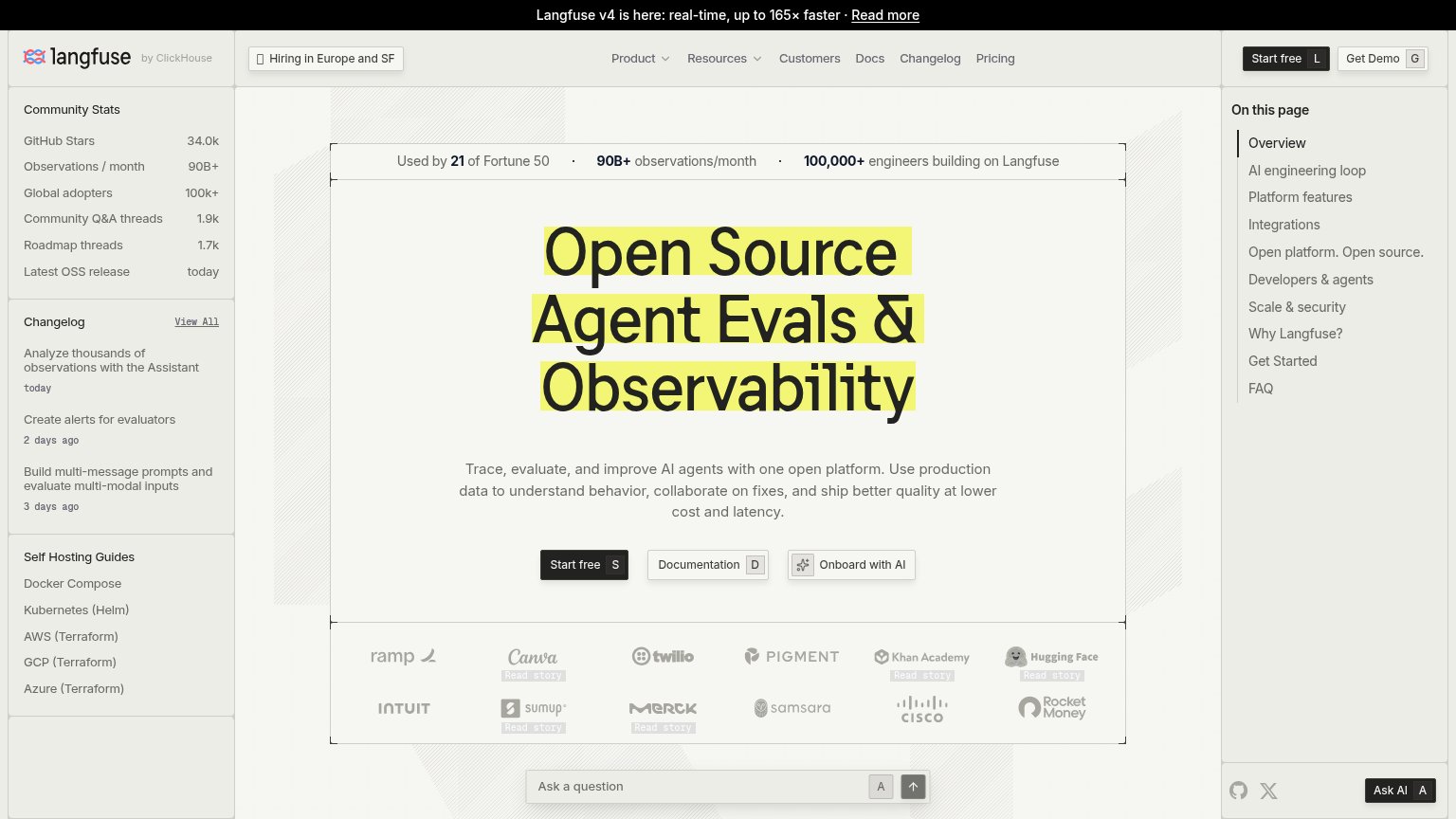
| Used by 21 of Fortune 50 · 90B+ observations/month · 100,000+ engineers building on Langfuse | |
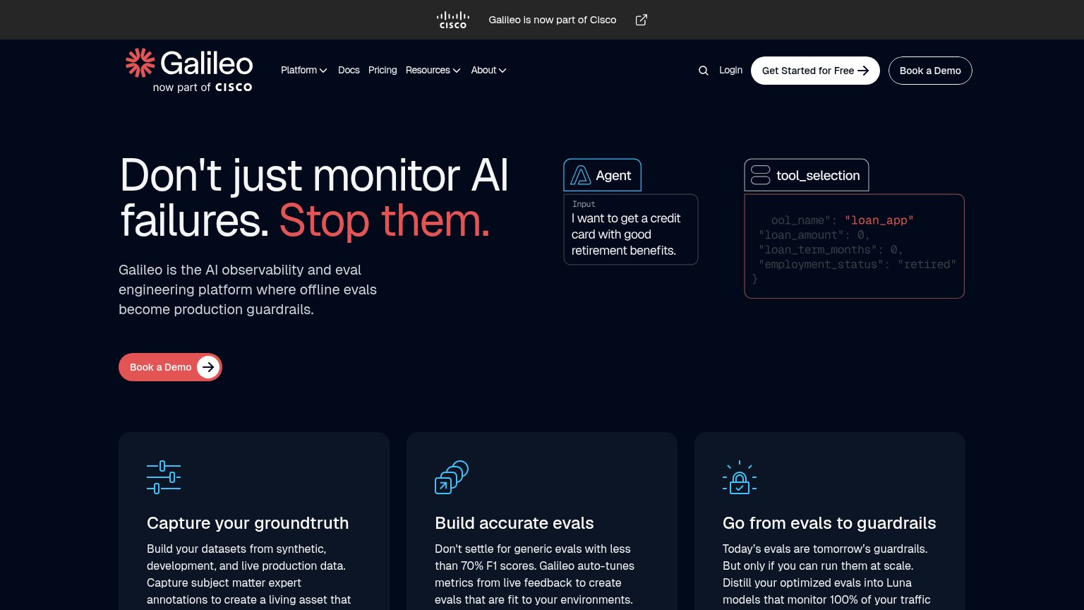
| "Galileo is now part of Cisco" banner with Cisco logo |
CTA
68FairCopy, size, verb, cost-feel — does the primary CTA earn the click?
Problems
- 'Request' feels like waiting, not value
- nav says 'Book a demo' — label mismatch
- no self-serve or in-product path
Information hierarchy
76FairDoes the design help or inhibit what the page is trying to say?
123- Request a demo button — Small dark pill with muted contrast; duplicates the nav's 'Book a demo' under a different label, splitting the primary action.
- Nav link row — Five links plus Login sit at equal weight beside the demo CTA, offering exits before the pitch lands.
- Eyebrow pill link — Clickable chevron pill sits directly above the headline, adding an exit inside the primary scan path.
Value props
76FairTitle, subtitle, hero — do they sell the product's true value?
Papaya’s headline undersells
Optimize your agents at scale.
Papaya proactively monitors your agents, finds the optimizations you didn't know to look for, and opens the PR — every fix ranked by quality, latency, and cost impact.
Working
- Subhead names concrete outcome: opens the PR
- Hero image demonstrates the pipeline
- Findings labeled with cost/latency deltas
Could improve
- Headline is generic agent-ops copy
- No numbers or proof points in the fold
- 'At scale' is filler, not a claim
Mobile web
78FairThe phone experience as a first-class citizen.
 12
- Request a demo button — Desktop-proportioned button at half column width; should be near-full-bleed for thumb reach.
- Illustration metric chips — Chips like "Cost -21%" render at unreadable sizes on the phone, adding visual noise without meaning.