
Your landing page’s weakest score is Trust.
How Lambda Robotics ranks
62Growth scoreupdated
category scores
category scoresShowHide
Score over time
Trust
38PoorProof that the product is real, competent, and safe to try.


| Trust read | |
|---|---|
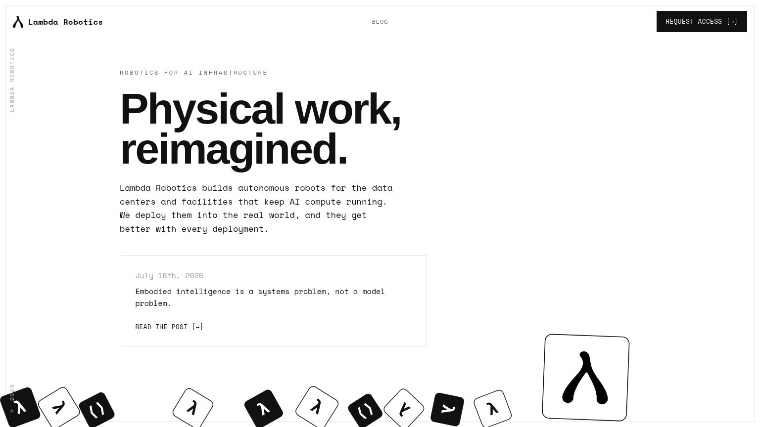
| Lambda Robotics | Dated blog post card: "Embodied intelligence is a systems problem, not a model problem." (July 18th, 2026) |
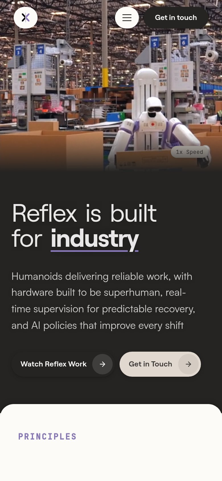
| Hero video of the Reflex humanoid robot working a live warehouse packing line alongside human workers | |
| implicit context Figure may benefit from pre-existing familiarity among its target audience. | |
| Hero photo of the Apollo robot performing real warehouse pick-and-pack work | |
| "Digit is a humanoid robot with 65,000 hours of real production experience" (mobile fold) | |
| Hero photography of the NEO robot in three colorways |
Value props
58FairTitle, subtitle, hero — do they sell the product's true value?
Lambda Robotics’s headline vague
Physical work, reimagined.
Lambda Robotics builds autonomous robots for the data centers and facilities that keep AI compute running. We deploy them into the real world, and they get better with every deployment.
Working
- Subhead names buyer: data centers, AI compute
- 'Better with every deployment' implies moat
- Eyebrow anchors category: AI infrastructure
Could improve
- H1 is an abstraction; fits any product
- Zero numbers or proof points in the fold
- Hero art decorates, never shows a robot
Information hierarchy
68FairDoes the design help or inhibit what the page is trying to say?
123- Blog post card — Same-weight bordered card with 'READ THE POST' link competes with 'Request Access' and pulls first clicks toward the blog.
- Large lambda tile — The oversized glyph tile dominates the right column above the fold yet communicates nothing about robots or data centers.
- Blog nav link — Centered 'BLOG' link sits alone mid-header in the scan path to the CTA, an exit with no conversion payoff.
CTA
68FairCopy, size, verb, cost-feel — does the primary CTA earn the click?
Problems
- 'Request' feels gated, high-cost
- no CTA in the hero itself
- blog card outcompetes CTA on desktop
- small nav footprint on desktop
Mobile web
78FairThe phone experience as a first-class citizen.
 12
- Body paragraph — Eight lines of wide-tracked monospace copy eat most of the fold and bury the blog card.
- Request Access button — Desktop-proportioned header button; not full-width or thumb-sized for mobile.