
Your landing page’s weakest score is Trust.
How Ignition Benefits ranks
- 1.
Ignition Benefits70
- 2.
Nava Benefits66
- 3.
Sana Benefits66
- 4.
Newfront64
- 5.
Nayya60
70Growth scoreupdated
category scores
category scoresShowHide
Score over time
Trust
64FairProof that the product is real, competent, and safe to try.
| Trust read | |
|---|---|
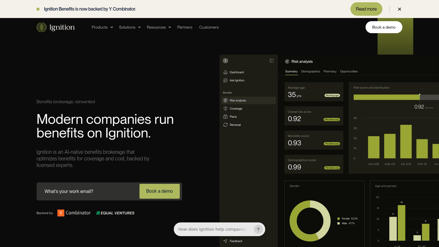
| Ignition Benefits | "Backed by" Y Combinator and Equal Ventures investor logos beneath the demo CTA |
| No visible trust signal identified. | |
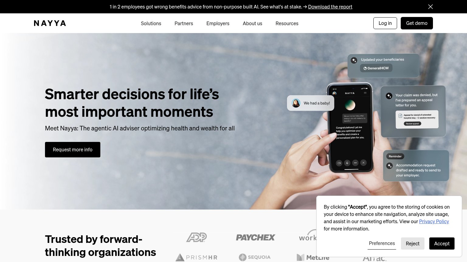
| Announcement banner: "Newfront has officially joined WTW, combining a technology-native approach with global expertise t | |
| No visible trust signal identified. | |
| "Trusted by forward-thinking organizations" logo strip with ADP, Paychex, PrismHR, Sequoia, MetLife, Aflac |
Value props
68FairTitle, subtitle, hero — do they sell the product's true value?
Ignition Benefits’s headline undersells
Modern companies run benefits on Ignition.
Ignition is an AI-native benefits brokerage that optimizes benefits for coverage and cost, backed by licensed experts.
Working
- Subhead names category, mechanism, and trust anchor
- Hero image demonstrates real product with risk scores
- YC + Equal Ventures logos add credibility
Could improve
- Headline states adoption, not outcome
- No savings number or concrete metric
- No emotional hook on broker pain
Information hierarchy
72FairDoes the design help or inhibit what the page is trying to say?
1234- YC announcement banner — Full-width banner with its own "Read more" button sits above the logo and steals the first scan before the headline.
- Cropped product screenshot — Dense dashboard with charts and eight menu items is clipped at both edges, adding cognitive load without a legible outcome.
- Floating chat prompt — "How does Ignition help companies…" pill overlaps the product visual and competes with the email capture directly above it.
- Duplicate demo buttons — Nav "Book a demo" repeats the hero CTA at similar weight, splitting the click between two identical actions.
CTA
72FairCopy, size, verb, cost-feel — does the primary CTA earn the click?
Problems
- demo booking feels costly
- email gate before any value
- chat input buried, arrow-only submit
Mobile web
72FairThe phone experience as a first-class citizen.
 123
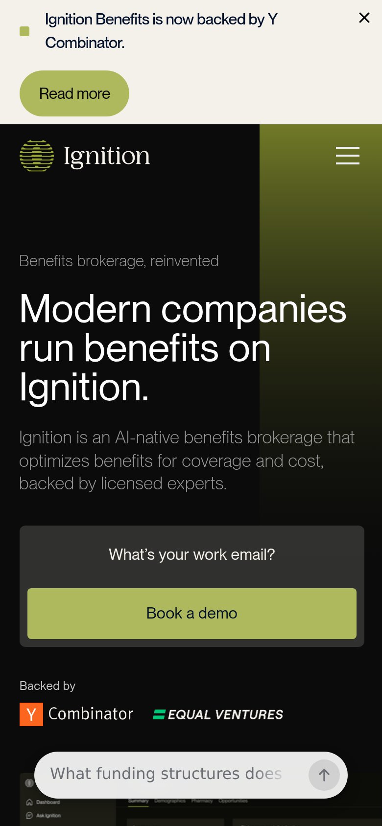
- YC announcement banner — Wraps to two lines plus a stacked Read more pill, eating the top of the mobile fold before the hero.
- Floating chat bar — Pinned prompt bar competes with the Book a demo CTA and covers content at the fold edge.
- Email field styling — Placeholder-only dark box reads as text, not an input, weakening the capture step above the CTA.