
Your landing page’s weakest score is Trust.
How Hickory & Company ranks
- 1.
Greenlite67
- 2.
Cable65
- 3.
Hickory & Company64
- 4.
Parcha64
- 5.
Hummingbird61
64Growth scoreupdated
category scores
category scoresShowHide
Score over time
Trust
38PoorProof that the product is real, competent, and safe to try.
| Trust read | |
|---|---|
| Hickory & Company | No visible trust signal identified. |
| No visible trust signal identified. | |
| No visible trust signal identified. | |
| No visible trust signal identified. | |
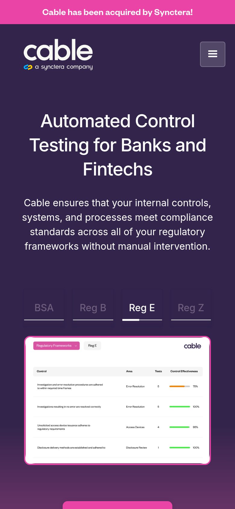
| Product screenshot of the Reg E control-testing dashboard showing named controls, test counts, and effectiveness scores |
Value props
54FairTitle, subtitle, hero — do they sell the product's true value?
Hickory & Company’s headline vague
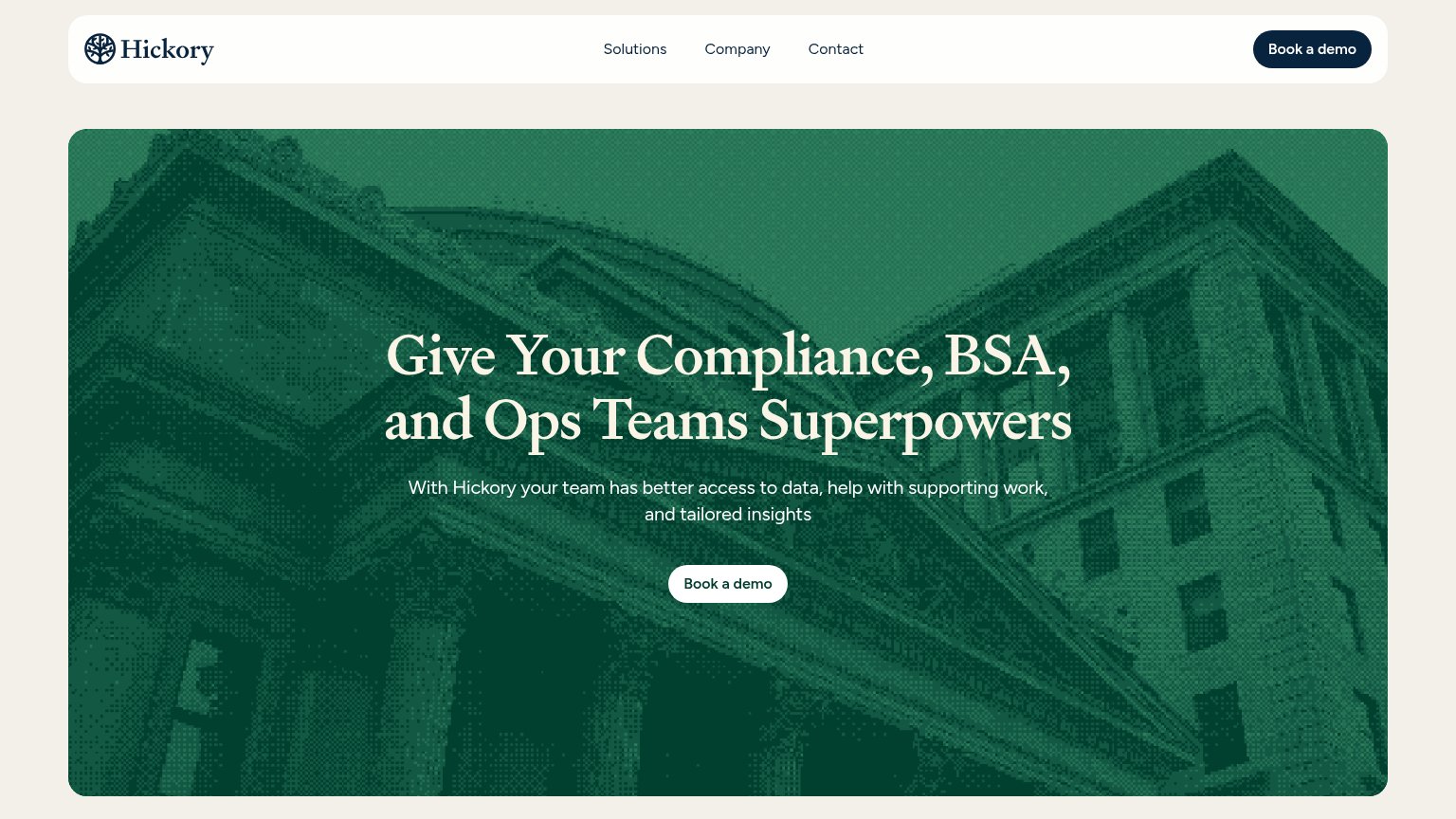
Give Your Compliance, BSA, and Ops Teams Superpowers
With Hickory your team has better access to data, help with supporting work, and tailored insights
Working
- Names exact audience: compliance, BSA, ops
- BSA jargon signals banking-domain credibility
- Clean single CTA repeated in nav and hero
Could improve
- "Superpowers" is an abstraction stack
- Subhead lists features with zero specificity
- Hero image decorates, never shows product
CTA
70FairCopy, size, verb, cost-feel — does the primary CTA earn the click?
Problems
- 'Book' feels like a time commitment
- hero button small vs huge headline
- no low-friction alternative CTA
Mobile web
74FairThe phone experience as a first-class citizen.
 12
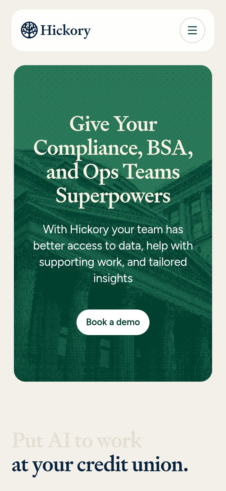
- Hero headline wrap — Serif headline barely scales down and wraps into four tall lines, dominating the hero and pushing the CTA to the fold edge.
- Book a demo button — Desktop-proportioned pill floats narrow in the column instead of a near-full-bleed thumb target.
Information hierarchy
86StrongDoes the design help or inhibit what the page is trying to say?
12- Hero Book a demo — Small footprint versus the oversized headline weakens the action step, and it duplicates the nav pill at similar weight.
- Hero subheadline text — White text on mid-green halftone texture has borderline contrast, softening the supporting message.
Competitors
inferred from product, audience, and value prop#1Greenlitegreenlite.ai67
#2Cablecable.tech65
Parchaparcha.ai64
#5Hummingbirdhummingbird.co61
#3Hickory & Company64
#4