
Your landing page’s weakest score is Trust.
How Capveon ranks
64Growth scoreupdated
category scores
category scoresShowHide
Score over time
Trust
52FairProof that the product is real, competent, and safe to try.
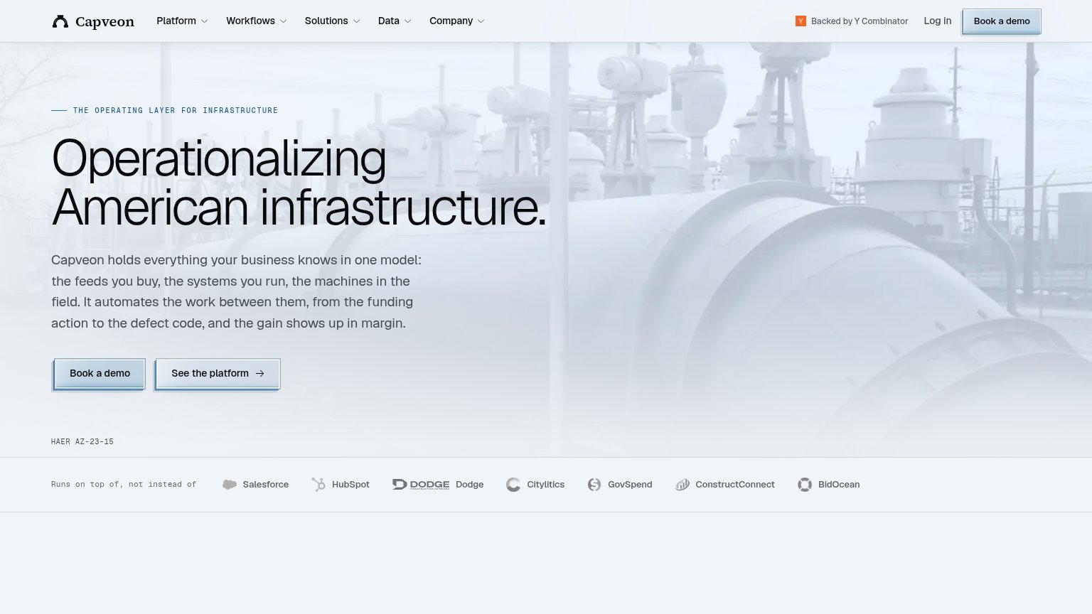
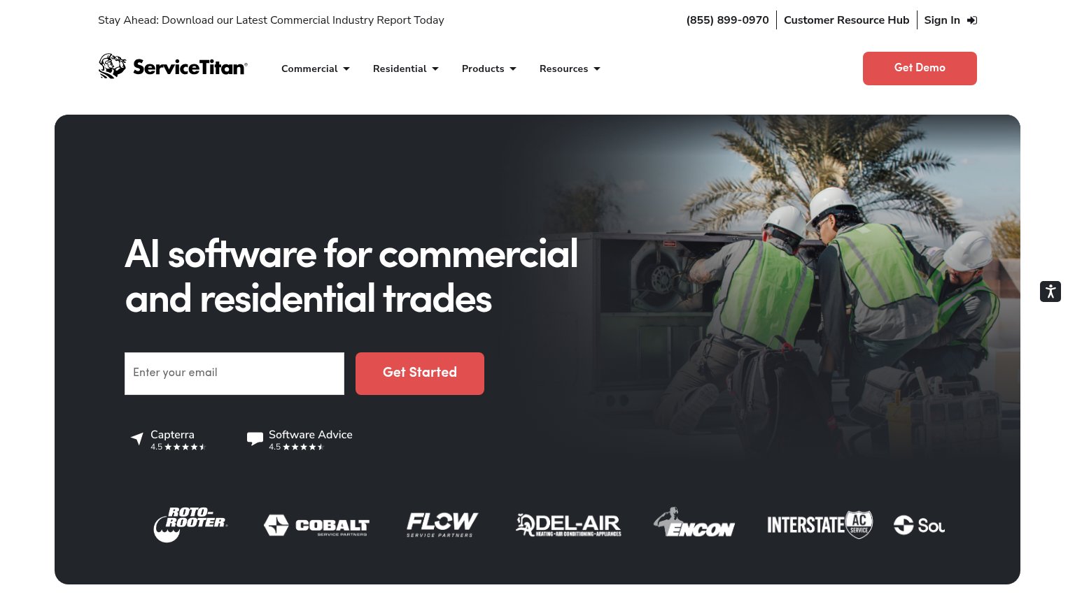
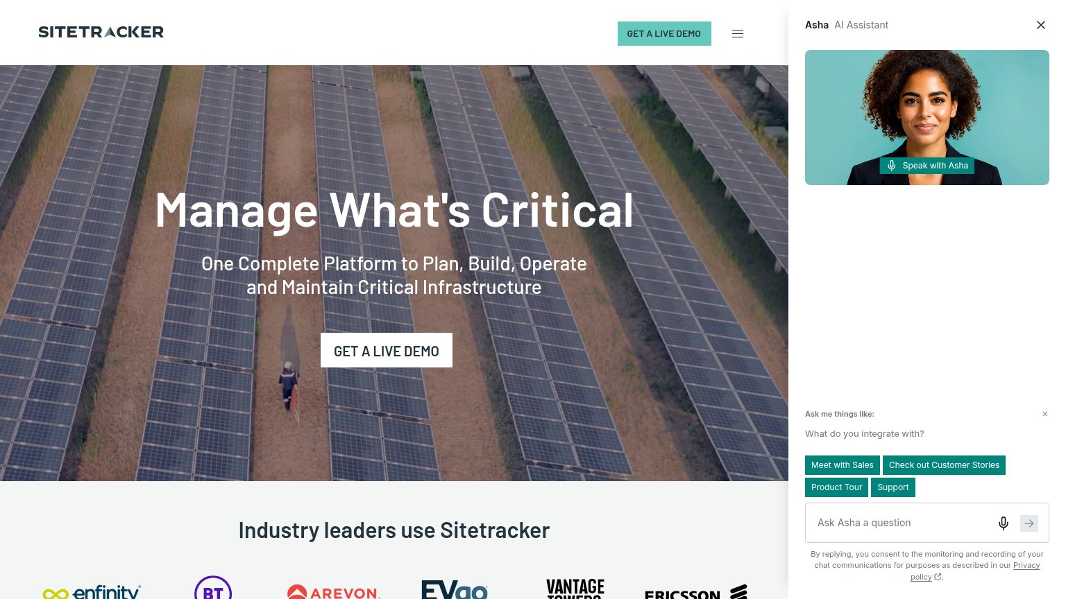

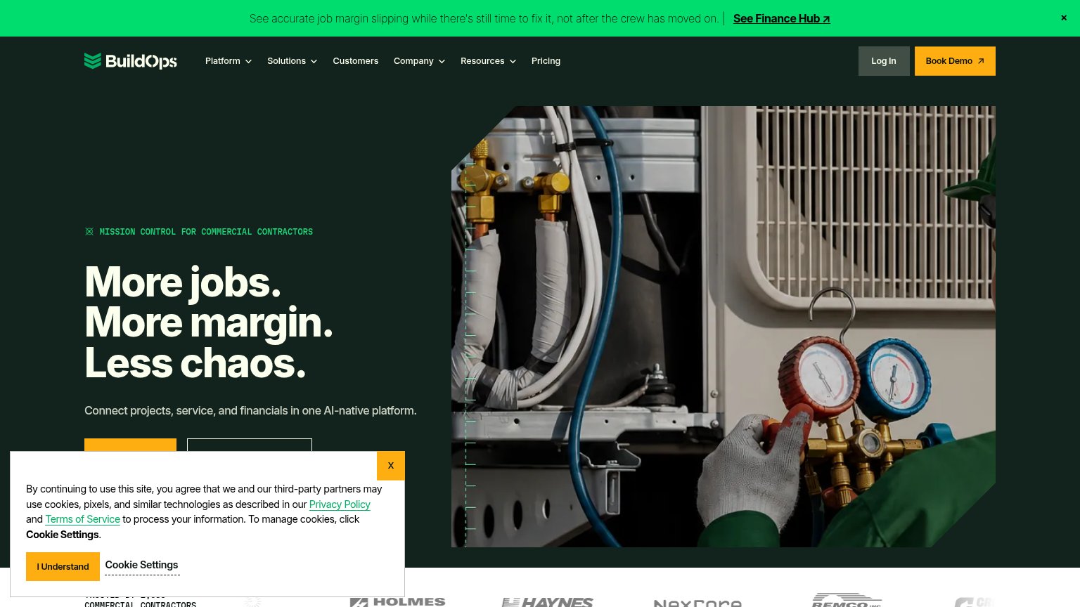
| Trust read | |
|---|---|
| Capveon | "Backed by Y Combinator" badge in the header |
| Customer logo strip (Kohler, Neighborly, Groundworks) under "Trusted by leading sales teams in home improvement, home bu | |
| Capterra 4.5-star and Software Advice 4.5-star review badges below the Get Started CTA | |
| Customer logo strip (Holmes, Haynes, NexCore, Remco) with a partial "TRUSTED BY... COMMERCIAL CONTRACTORS" count at the | |
| No visible trust signal identified. | |
| "Industry leaders use Sitetracker" logo wall (Ericsson, BT, EVgo, Vantage Towers, Telefónica) |
Value props
58FairTitle, subtitle, hero — do they sell the product's true value?
Capveon’s headline vague
Operationalizing American infrastructure.
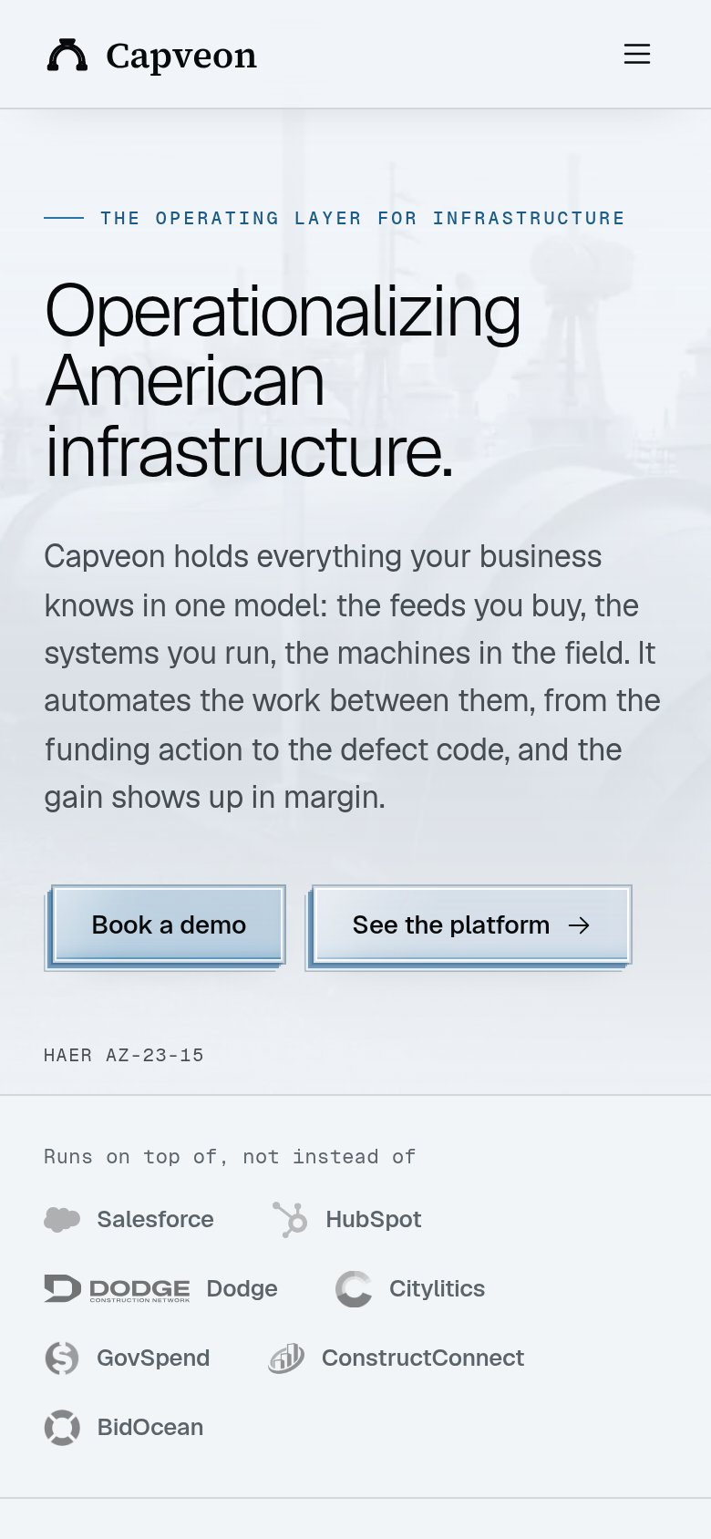
Capveon holds everything your business knows in one model: the feeds you buy, the systems you run, the machines in the field. It automates the work between them, from the funding action to the defect code, and the gain shows up in margin.
Working
- Subhead names concrete objects and workflows
- "Gain shows up in margin" names an outcome
- "Runs on top of, not instead of" kills objection
Could improve
- Headline could caption any infra company
- No numbers or proof metrics anywhere
- Hero photo decorates instead of demonstrates
CTA
64FairCopy, size, verb, cost-feel — does the primary CTA earn the click?
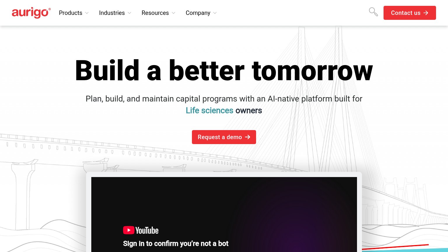
Problems
- click feels costly — demo booking
- no self-serve or instant-value path
- small footprint vs huge headline
Mobile web
68FairThe phone experience as a first-class citizen.
 123
- Body paragraph too long — The nine-line paragraph beginning "Capveon holds everything" pushes both CTAs down and stacks too much reading before the first tap.
- Side-by-side CTA buttons — "Book a demo" and "See the platform" split the row instead of stacking full-width, leaving each button under thumb-friendly width.
- Cryptic caption text — The "HAER AZ-23-15" label adds noise below the CTAs with no meaning for a mobile visitor.
Information hierarchy
76FairDoes the design help or inhibit what the page is trying to say?
1234- Twin hero buttons — "See the platform" is styled at the same weight and size as "Book a demo", so neither reads as the primary action.
- Five-dropdown nav row — Platform, Workflows, Solutions, Data, and Company dropdowns plus Log in offer six exit paths before the visitor reaches the headline.
- Partner logo strip — Seven equal-weight integration logos pull the eye across the bottom of the fold instead of toward the CTA.
- Y Combinator badge — The "Backed by Y Combinator" element sits directly beside the nav CTA and dilutes its visual isolation.