antimattrYC F26 landing page report.
← Back to YC F26

Your landing page’s weakest score is Trust.

Fix Trust

Score over time

8070605040Limitless (Pendant) 48 on Sep 22 (Live)Plaud 73 on Sep 7 (Wayback)Plaud 75 on Sep 20 (Live)Bee 67 on May 16 (Wayback)Bee 66 on May 25 (Wayback)Bee 67 on Jun 18 (Wayback)Bee 66 on Jul 12 (Wayback)Bee 65 on Jul 25 (Wayback)Bee 67 on Aug 16 (Wayback)Bee 62 on Sep 20 (Live)Friend 60 on May 14 (Wayback)Friend 60 on May 31 (Wayback)Friend 57 on Jun 17 (Wayback)Friend 58 on Jul 12 (Wayback)Friend 61 on Aug 8 (Wayback)Friend 58 on Aug 23 (Wayback)Friend 63 on Sep 20 (Live)Omi 68 on Mar 22 (Wayback)Omi 52 on Jul 1 (Wayback)Omi 67 on Aug 11 (Wayback)Omi 71 on Sep 8 (Wayback)Omi 72 on Sep 20 (Live)antimattr 49 on May 25 (Wayback)antimattr 63 on Aug 16 (Wayback)antimattr 65 on Aug 28 (Wayback)antimattr 62 on Sep 20 (Live)May 25Aug 16Aug 28Sep 20
Past reportsShow past reportsHide past reports
  1. Sep 20, 202662LiveOverall −3 · Information hierarchy −10 · Value props −6Viewing
  2. Aug 28, 202665Overall +2 · Value props +6 · Information hierarchy +2View →
  3. Aug 16, 202663Overall +14 · CTA +30 · Information hierarchy +22View →
  4. May 25, 202649First tracked report — strongest Value props 58, weakest Trust 32View →

Trust

44Poor

Proof that the product is real, competent, and safe to try.

antimattr
Plaud
Limitless (Pendant)
Omi
Bee
Trust read
antimattr"backed by Y" investor badge next to the antimattr logo
Limitless (Pendant)Headline "Limitless has been acquired by Meta" paired with the founder video "Message from Dan Siroker, Co-Founder & CEO
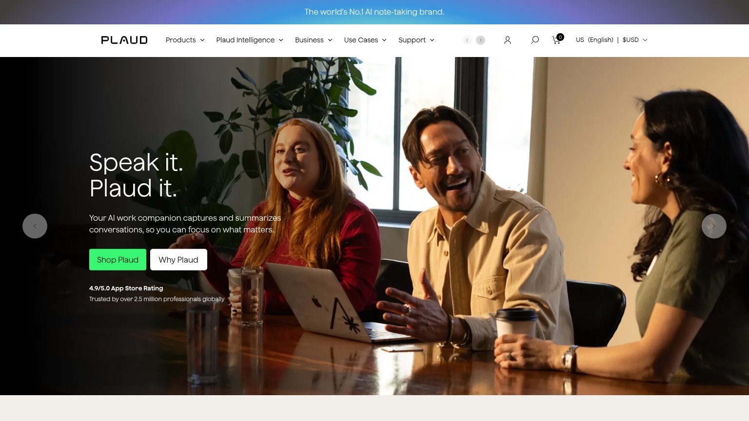
Plaud"4.9/5.0 App Store Rating — Trusted by over 2.5 million professionals globally" under the Shop Plaud CTA
BeeAmazon logo paired with the Bee mark in the "Bee is hiring" banner
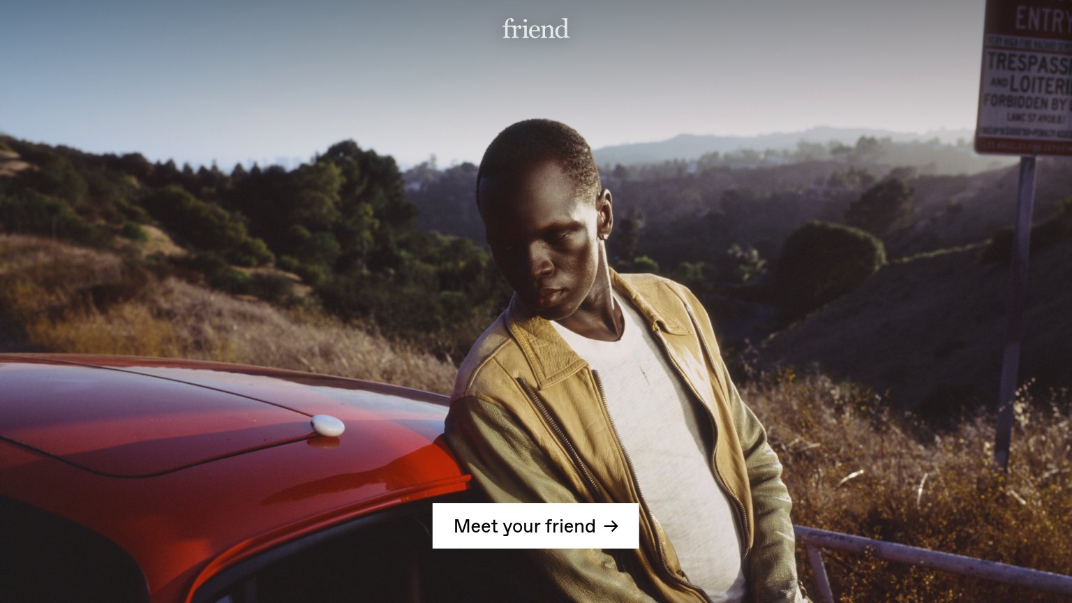
FriendThe Friend pendant device shown worn in the mobile hero photo
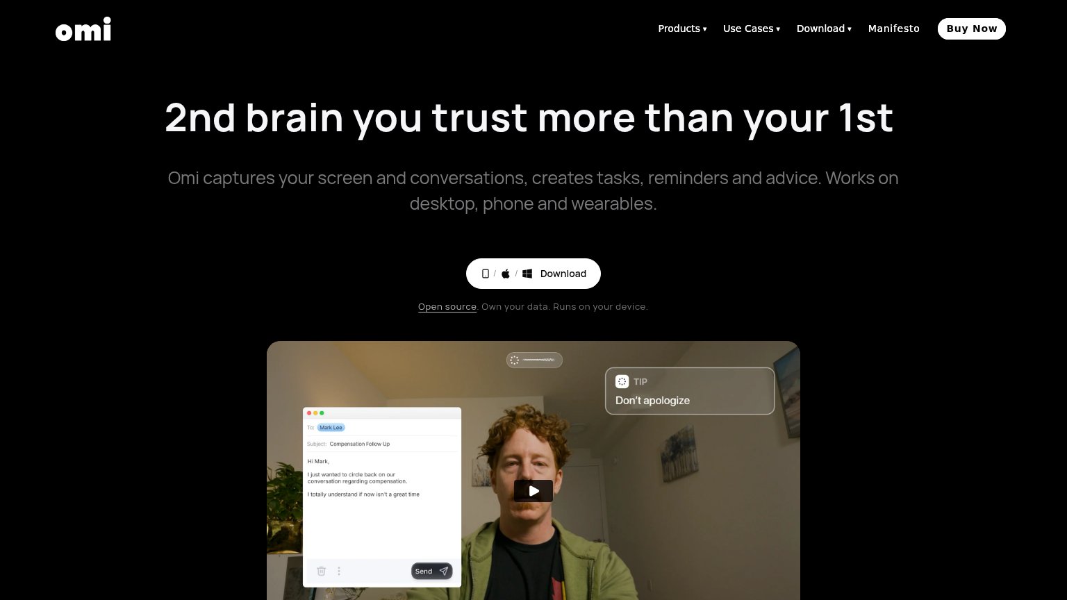
Omi"Open source. Own your data. Runs on your device." beneath the Download CTA, paired with a demo video showing the live "

Value props

52Fair

Title, subtitle, hero — do they sell the product's true value?

antimattr’s headline vaguenext-gen of human-machine interaction starts herethe interface purpose-built for memory and voice productivity

Working

  • Annotated diagram shows real jobs
  • Subhead names memory + voice use case
  • Callouts add concrete feature detail

Could improve

  • H1 is generic category buzz
  • No numbers or measurable outcomes
  • No emotional hook for lost thoughts

Information hierarchy

68Fair

Does the design help or inhibit what the page is trying to say?

Information hierarchy annotations on the desktop capture1234
  1. Dual footer buttons — "learn more" sits left of "reserve early access" in the scan path at near-equal size, splitting the final click.
  2. Shipping date pill — Red-outlined "[shipping starts Q4-2026]" pill is styled like a button and outranks the actual CTA in color salience.
  3. Five-item nav bar — [project mnemosyne], [experience], [essays], [mission] offer four equal-weight exits before the visitor reaches the CTA.
  4. Serif hero headline — "next-gen of human-machine interaction" is visually detached from "project mnemosyne" 500px below, splitting the value prop into two competing anchors.

CTA

72Fair

Copy, size, verb, cost-feel — does the primary CTA earn the click?

antimattr
Friend
Omi

Problems

  • 'reserve' feels committal
  • small vs headline on desktop
  • no payoff or price cue near CTA

Mobile web

72Fair

The phone experience as a first-class citizen.

Mobile web annotations on the mobile capture123
  1. Product diagram callouts — The tall annotated diagram consumes most of the mobile fold, pushing the reserve CTA below the first viewport.
  2. Reserve early access button — The primary CTA sits far below the fold, invisible to visitors who land and never scroll.
  3. Left callout text — Tiny mono callout text wraps into four cramped lines and is hard to read at arm's length.

Competitors

inferred from product, audience, and value prop